Warpspeed confidence what is credible? -- Part 2
In my last post I started exploring a basic statistical analysis of how confident we should feel about the effectiveness of a vaccine for COVID-19 (Operation Warpspeed). A reminder I’m not an epidemiologist, I don’t have any data for safety, and we’re still quite early in the Phase III trials – just approaching the point at which they can take a first “peek” at the data (which is doubleblind). You’ll be best served if you’ve already read the previous post.
The three key conditions that have to be (there are certainly other conditions as well):
- 53 confirmed covid-19 cases among the 30,000 participants
- At least five severe cases of covid-19 among people who receive the placebo
- That there be at least two months of follow-up on half the study participants.
Regulators will require that the vaccine be at least 50 percent effective before the manufacturer can seek emergency use authorization.
Last time
Last time we used a variety of frequentist tools and tests to model our potential results, including a handy table that maps effectiveness to the number of the 53 cases in the placebo and vaccine conditions. We want our vaccine to be at least 50% effective. We can operationalize that most simply with \[\frac{placebo~cases - vaccinated~cases}{placebo~cases}\] So for example if 19 of the 53 cases had received the vaccine our effectiveness is \[\frac{placebo~cases - vaccinated~cases}{placebo~cases} = (34-19)/34 = 0.4411765\] which is very close to what we need. So in the best possible scenario (remember we require that at least 5 people who got the vaccine contract COVID before we can run the numbers) our effectiveness is ~90%. We need the number of people who received the vaccine and still contracted COVID to be 17 or less.
After our classical frequentist efforts we began a journey of exploring bayesian tools and techniques. That’s where we’ll pick up in this post. First let’s load some essential libraries.
library(dplyr)
library(ggplot2)
library(kableExtra)
theme_set(theme_bw())
Last post
we ventured as far as building a simple model with a flat prior
and treating the outcomes as simple binomial equations (a coin flip if you)
will. We built the model in the JAGS language and fed it to run.jags for
40,000 MCMC iterations. We used tidybayes::tidy_draws to extract the
chains/draws. That gave us estimates for the rate of infection for both
those who received the placebo and those who received the actual vaccine.
\[\frac{placebo~infection~rate - vaccinated~infection~rate}{placebo~infection~rate} * 100\]
gives us what we really want to investigate which is the percentage difference in
infection rates. We’re looking for (since we multiplied by 100) a number that is
around 50. Which in essence is a 50% effectiveness rating. We kept it simple
assuming both subject pools (the number who received placebo versus the real
vaccine was an even split 15,000 each). A simple call to bayestestR::hdi
gives us a graphical portrayal of what we want to know. Even with a simple 19/34
split we have mounting evidence that the vaccine is working. We’re not at all
totally convinced it’s 50% or more. But we can take heart with the fact that
95% of our draws wind up in the region 7.7% to 71.1% effectiveness. N.B.
yes we’d really like to see a split like 17/36 or even lower to boost our
credibility, I’m using lower numbers simply to make it more “exciting”, we all
have to wait on the real data.
## Calling 4 simulations using the parallel method...
## All chains have finished
## Simulation complete.  Reading coda files...
## Coda files loaded successfully
## Finished running the simulation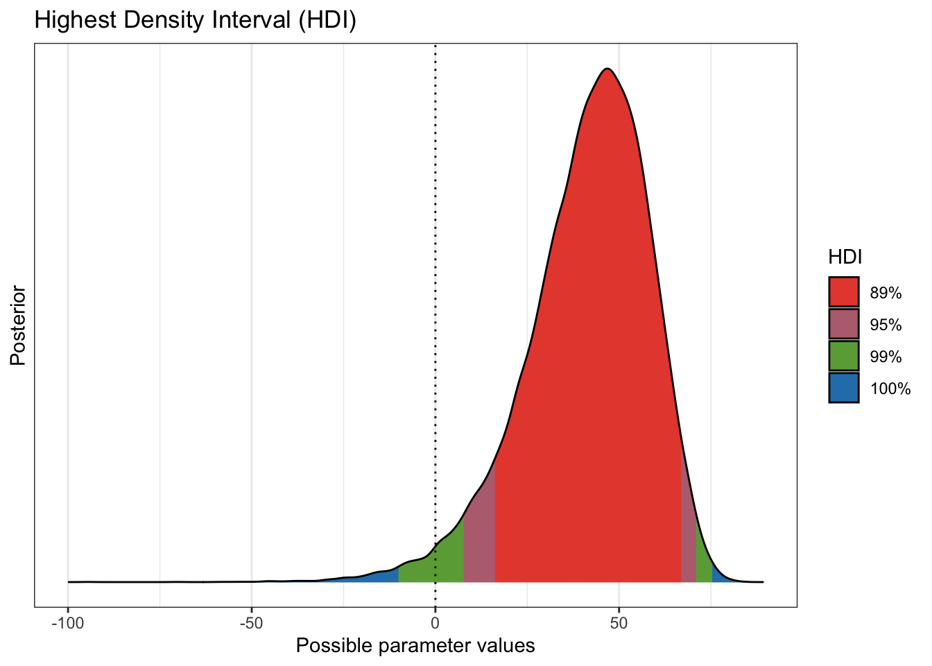
Okay now that you’re caught up let’s push our bayesian skills even farther.
More credibility for our results
The analysis last time was based upon a
very nice function
bayes.prop.test
contained in a package
called bayesian_first_aid. It was the first thing I stumbled upon that was a near
equivalent to the frequentist tests we were using. Let’s investigate some other tools.
Fair warning in advance they will give us similar results, but you’re reading
this to learn right? Personally I find it satisfying to know that no matter which
R tool I choose I get the same answer.
The next tool we’ll use is bayesAB. This package is on CRAN
and recent. For those of you steeped in other disciplines AB testing generally
seeks to ask questions about whether option A or option B is “better”. It is
often used in marketing for example presenting users with two different versions
of a website or ad and seeking to determine which option yields the most
purchases. Hopefully the analog to our vaccine trial is readily apparent. You
can read more about the package here.
bayesAB expects its input as a pair of vectors one for option A and one for option B.
Instead of MCMC methods
it uses random sampling from a limited set of distributions. That means it is faster to
run but not suitable for very complex models like runjags, or brms or STAN.
But for our relatively simple problem it is quite useful.
Let’s make two vectors labeled vaccinated and placebo with the right
quantities (again assuming an equal 15,000 in each category). The authors
have decided to calculate and plot (A - B) / B with no way to easily
customize. Since we require placebo in the denominator that simply means
by default we get the right value but with a negative sign. We’ll “correct”
that in a bit. By default it samples 100,000 times. It has a custom
summary and plot method we’ll display. As with our earlier example we’ll
use a flat uninformative pretending we have no information about the
effectiveness of the vaccine.
vaccinated <- c(rep(0, 15000 - 19), rep(1, 19))
placebo <- c(rep(0, 15000 - 34), rep(1, 34))

AB1 <-
   bayesAB::bayesTest(B_data = placebo,
                      A_data = vaccinated,
                      priors = c('alpha' = 1, 'beta' = 1),
                      distribution = 'bernoulli')

summary(AB1)
## Quantiles of posteriors for A and B:
##
## $Probability
## $Probability$A
## 0% 25% 50% 75% 100%
## 0.0004575392 0.0011201359 0.0013089507 0.0015199810 0.0030369367
##
## $Probability$B
## 0% 25% 50% 75% 100%
## 0.0009776941 0.0020570086 0.0023106757 0.0025868629 0.0045641318
##
##
## --------------------------------------------
##
## P(A > B) by (0)%:
##
## $Probability
## [1] 0.0199
##
## --------------------------------------------
##
## Credible Interval on (A - B) / B for interval length(s) (0.9) :
##
## $Probability
## 5% 95%
## -0.6473618 -0.1075419
##
## --------------------------------------------
##
## Posterior Expected Loss for choosing B over A:
##
## $Probability
## [1] 0.8460082plot(AB1)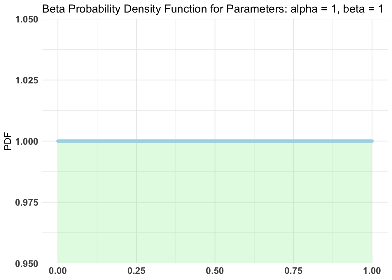
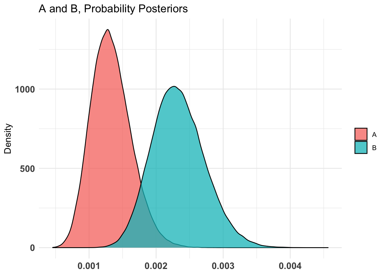
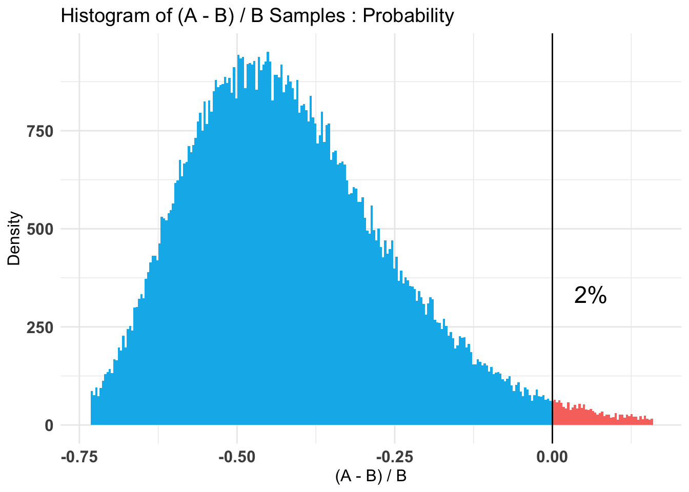
Again I’ll remind you the sign is reversed, but you can clearly see that except for the sign the results are comparable to our earlier results. The plots (3) are informative, displaying our prior, the A & B superimposed and our coveted % difference in infection rate.
The third plot explicitly calls out the fact that ~98% of the time our data shows the vaccine to be effective. With the peak (high density) occurring near 50% effective.
The plots are good, but I’m fussy. It used to be slightly complex to get the
draws or chains from a bayesian model. It’s getting easier and easier. In this
case a quick look at our AB1 object tells us they are in AB1$posteriors$Probability.
This is a list with two vectors A & B. Let’s convert to a tibble and rename
them back to what they actually are vaccinated = A, placebo = B. Now if
we tidyr::pivot_longer(everything(), names_to = "group") we have a nice tibble
we can easily send to ggplot and format our (my) way.
ggdist has a variety of nice functions
for summarizing and displaying draws and chains. stat_halfeye not only
plots it as a density curve but allows us to add per group credible intervals. If
we leave the data “wide” we can compute our diff_rate and plot it. If we prefer a
text table bayestestR::describe_posterior(ci = c(0.89, 0.95))
as_tibble(AB1$posteriors$Probability) %>%
   rename(vaccinated = A, placebo = B) %>%
   tidyr::pivot_longer(everything(), names_to = "group") %>%
   ggplot(aes(x = value, fill = group)) +
   ggdist::stat_halfeye(.width = c(0.89, 0.95),
                        alpha = .8,
                        slab_colour = "black",
                        slab_size = .5) +
   ggtitle("Infection rates for vaccine and placebo groups (N = 30,000)") +
   xlab("Infection rate") +
   theme(axis.title.y = element_blank(),
        axis.text.y = element_blank(),
        axis.ticks.y = element_blank(),
        panel.grid.major.y = element_blank(),
        panel.grid.minor.y = element_blank())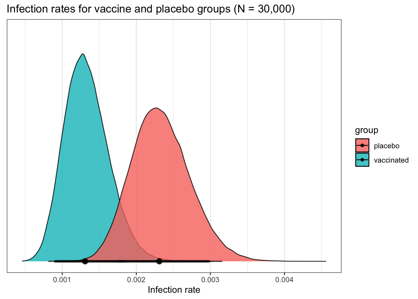
as_tibble(AB1$posteriors$Probability) %>%
   rename(vaccinated = A, placebo = B) %>%
   mutate(diff_rate = (placebo - vaccinated) / placebo * 100) %>%
   ggplot(aes(x = diff_rate)) +
   ggdist::stat_halfeye(.width = c(0.89, 0.95),
                        alpha = .9,
                        slab_fill = "dark green",
                        slab_colour = "black",
                        slab_size = .5) +
   ggtitle("% Difference in Infection rates for vaccine and placebo groups (N = 30,000)") +
   xlab("% Difference in Infection Rates") +
   theme(axis.title.y = element_blank(),
        axis.text.y = element_blank(),
        axis.ticks.y = element_blank(),
        panel.grid.major.y = element_blank(),
        panel.grid.minor.y = element_blank())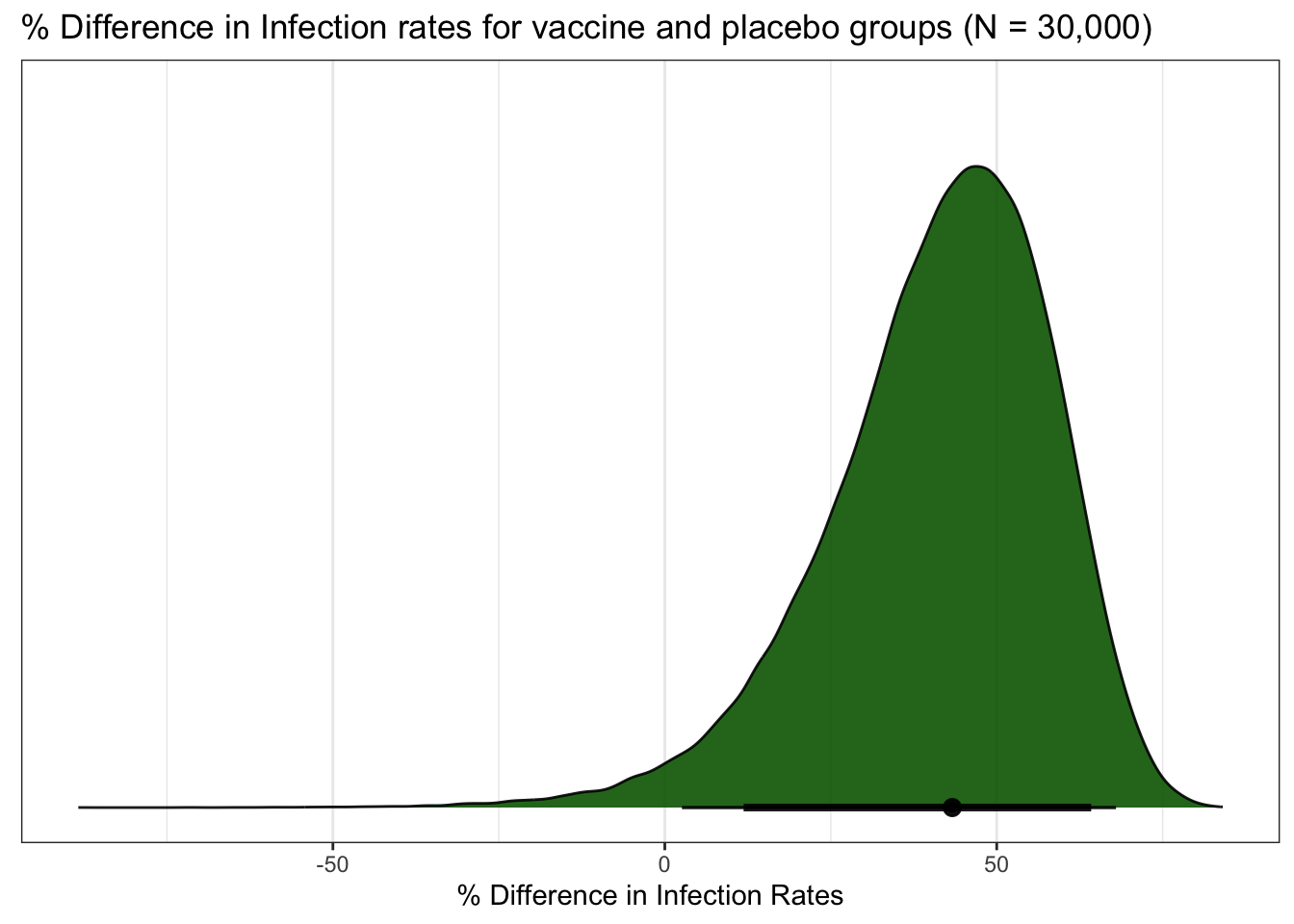
as_tibble(AB1$posteriors$Probability) %>%
   rename(vaccinated = A, placebo = B) %>%
   mutate(diff_rate = (placebo - vaccinated) / placebo * 100) %>%
   bayestestR::describe_posterior(ci = c(0.89, 0.95))
## # Description of Posterior Distributions
##
## Parameter | Median | CI | pd | 89% ROPE | % in ROPE
## -------------------------------------------------------------------------------------
## vaccinated | 0.001 | 89% CI [ 0.001, 0.002] | 100.00% | [-0.100, 0.100] | 100
## vaccinated | 0.001 | 95% CI [ 0.001, 0.002] | 100.00% | [-0.100, 0.100] | 100
## placebo | 0.002 | 89% CI [ 0.002, 0.003] | 100.00% | [-0.100, 0.100] | 100
## placebo | 0.002 | 95% CI [ 0.002, 0.003] | 100.00% | [-0.100, 0.100] | 100
## diff_rate | 43.305 | 89% CI [16.664, 67.485] | 98.01% | [-0.100, 0.100] | 0
## diff_rate | 43.305 | 95% CI [ 8.100, 71.230] | 98.01% | [-0.100, 0.100] | 0Actually let’s go ahead and save the results in a tibble named
diff_rate_results and showcase the functions in bayestestR. Rather than
explain each function and what they mean. I’m going to refer you to their
website which does a great job of explaining it..
The bottom line is that the results are comparable to our two earlier explorations.
diff_rate_results <-
   as_tibble(AB1$posteriors$Probability) %>%
   rename(vaccinated = A, placebo = B) %>%
   mutate(diff_rate = (placebo - vaccinated) / placebo * 100)

bayestestR::describe_posterior(diff_rate_results$diff_rate)
## # Description of Posterior Distributions
##
## Parameter | Median | 89% CI | pd | 89% ROPE | % in ROPE
## ----------------------------------------------------------------------------
## Posterior | 43.305 | [16.664, 67.485] | 98.01% | [-0.100, 0.100] | 0bayestestR::ci(diff_rate_results$diff_rate, method = "HDI", ci = c(0.005,0.025,0.5,0.975,0.995)) %>% plot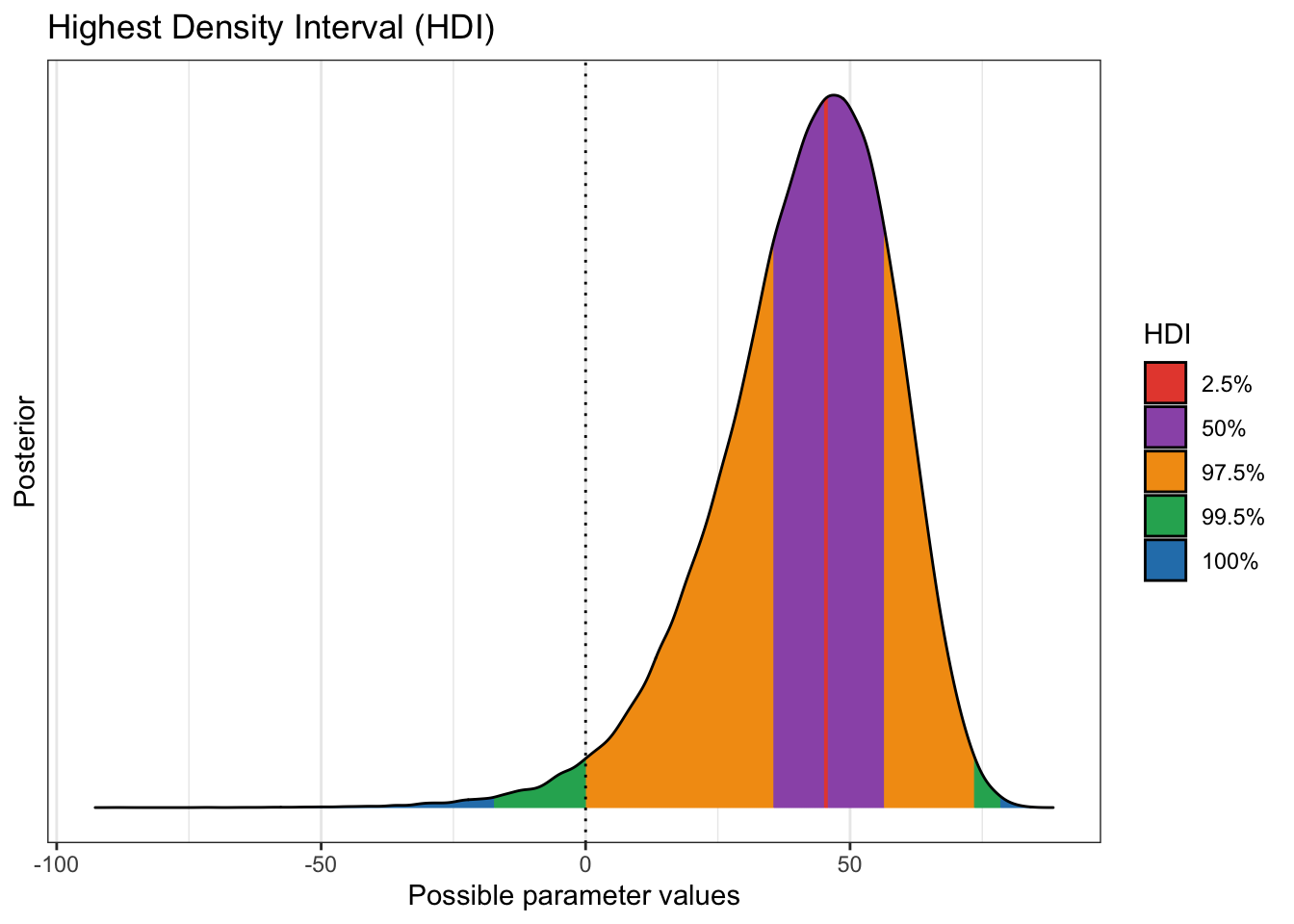
bayestestR::p_direction(diff_rate_results$diff_rate) %>% plot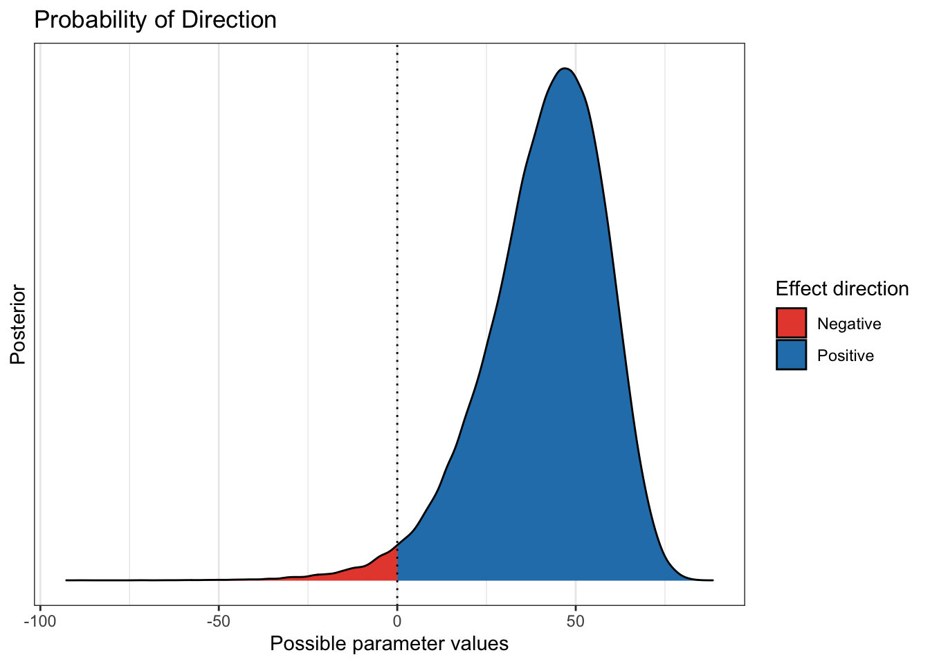
bayestestR::p_significance(diff_rate_results$diff_rate) %>% plot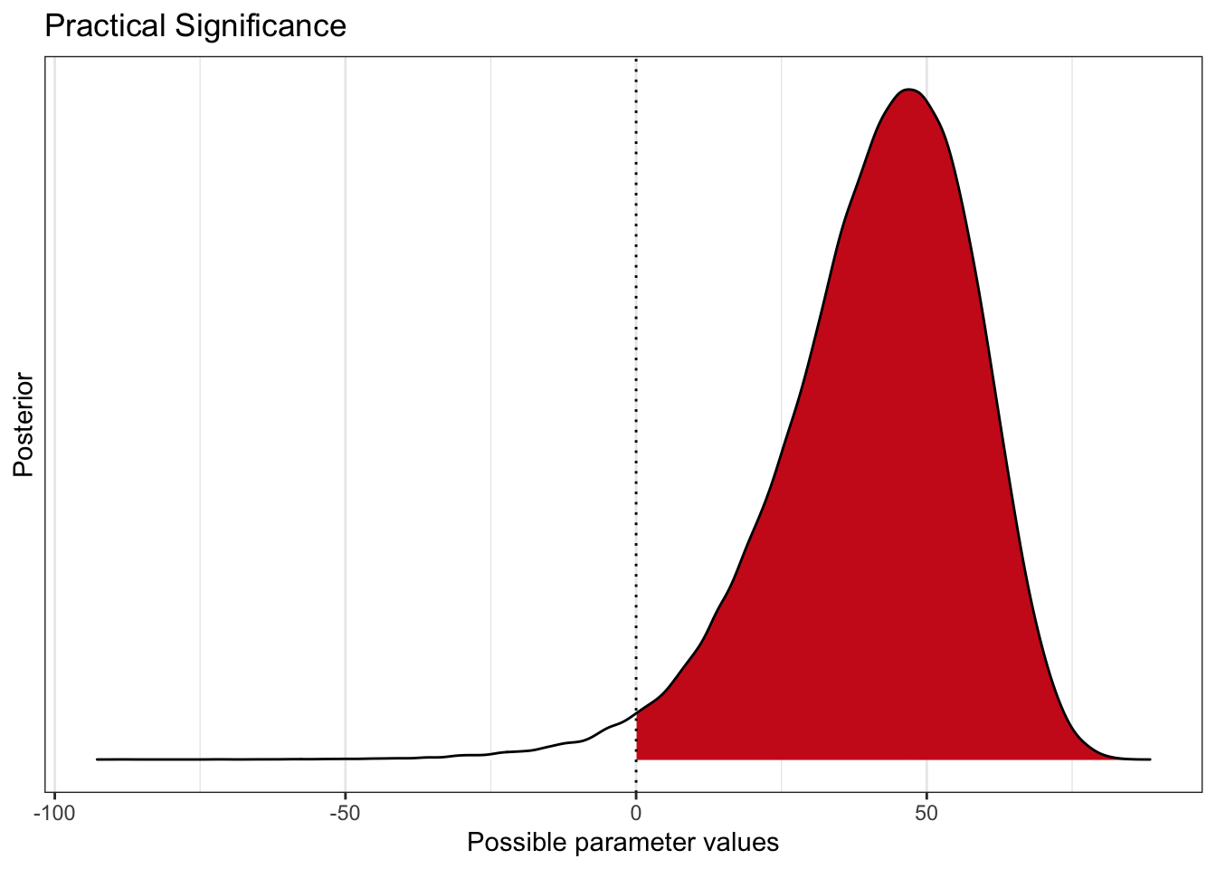
bayestestR::rope(diff_rate_results$diff_rate, ci = c(0.9, 0.95)) %>% plot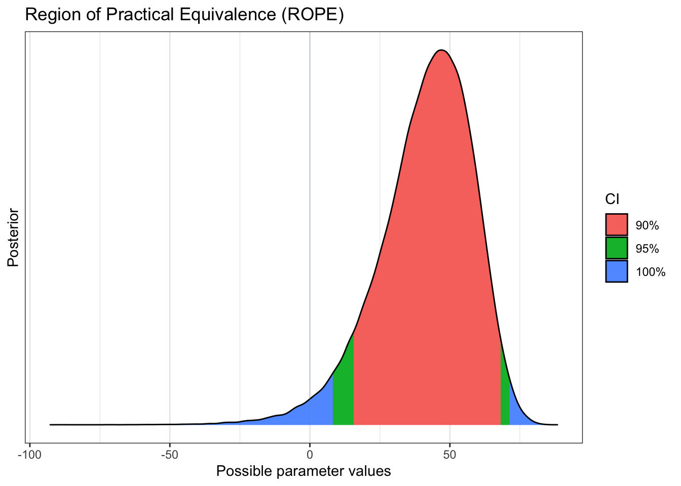
One final bayesian tool (this post)
Okay one more set of analyses using brms.
The brms package provides an interface to fit Bayesian generalized (non-)linear multivariate multilevel models using Stan, which is a C++ package for performing full Bayesian inference (see https://mc-stan.org/).
Quite frankly it is more than we need for our simple little analysis. A bit like
using a sledge hammer as a fly-swatter. Besides the simple joy of learning about
it however, there is one practical reason to use it. As our data grows and we
inevitably want to conduct more sophisticated analysis factoring things in like
gender, age and race. It is likely to become the tool of choice. I’m not going
to dwell on it but it’s worthy to note that
STAN uses different method for
its markov chains.
First we need to put the data in the preferred format which is actually
a simple one row tibble. Then we put things in a format brms can understand.
A bit of an oddity here, because we are moving to a GLM model
we’re not operating on the binomial distribution directly rather transforming back
and forth through logit and inverse_logit`.
We’ll run ~50,000 across 5 cores and get our summary and diagnostic plots.
library(brms)
d2 <-
   tibble(placebo = 34,
          vaccine = 19,
          n1 = 15000,
          n2 = 15000)

model_1 <- bf(placebo | trials(n1) ~ 1)
model_2 <- bf(vaccine | trials(n2) ~ 1)

priors <- get_prior(data = d2,
                    family = binomial(),
                    formula = model_1 + model_2)

priors$prior[2] <- "normal(0, 1)"
priors$prior[3] <- "normal(0, 1)"
priors
## prior class coef group resp dpar nlpar bound source
## (flat) Intercept default
## normal(0, 1) Intercept placebo default
## normal(0, 1) Intercept vaccine defaultfit2 <-
brm(data = d2, family = binomial(),
model_1 + model_2,
prior = priors,
iter = 10000,
warmup = 1000,
cores = 6,
chains = 6,
seed = 7)
fit2## Family: MV(binomial, binomial)
## Links: mu = logit
## mu = logit
## Formula: placebo | trials(n1) ~ 1
## vaccine | trials(n2) ~ 1
## Data: d2 (Number of observations: 1)
## Samples: 6 chains, each with iter = 10000; warmup = 1000; thin = 1;
## total post-warmup samples = 54000
##
## Population-Level Effects:
## Estimate Est.Error l-95% CI u-95% CI Rhat Bulk_ESS Tail_ESS
## placebo_Intercept -5.94 0.16 -6.26 -5.64 1.00 41344 33647
## vaccine_Intercept -6.40 0.20 -6.80 -6.03 1.00 48654 36148
##
## Samples were drawn using sampling(NUTS). For each parameter, Bulk_ESS
## and Tail_ESS are effective sample size measures, and Rhat is the potential
## scale reduction factor on split chains (at convergence, Rhat = 1).plot(fit2)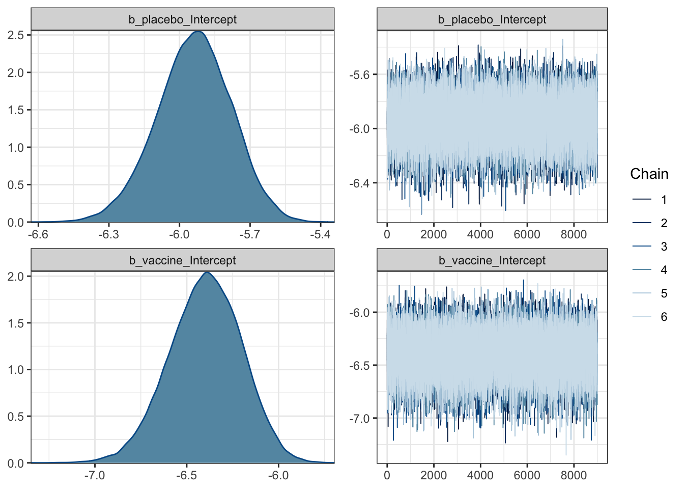
Everything looks good except for the funny scale we’re operating on.
Rather than use tidybayes::tidy_draws to extract the results of our chains
we’ll use posterior_samples(fit2, add_chain = FALSE).
We’ll use transmute to convert back to our original scale and get names we prefer.
As we did earlier we’ll use tidyr::pivot_longer to convert to long format and
pipe it through to ggplot to compare the two distributions. Then we’ll
plot the effectiveness (diff_rate) estimate much as we have done before.
Finally we pipe this cleaned up data to bayestestR::describe_posterior()
we get back a table that is a little easier to read. Focus on just the
line for diff_rate. We can of course also pipe it into other plotting
functions if you have favorites.
library(tidybayes)
theme_set(theme_bw())
post2 <- posterior_samples(fit2, add_chain = FALSE)

post2 %>%
   transmute(placebo = inv_logit_scaled(b_placebo_Intercept),
             vaccine = inv_logit_scaled(b_vaccine_Intercept)) %>%
   tidyr::pivot_longer(cols = everything()) %>%
   ggplot(aes(x = value, y = name)) +
   tidybayes::stat_halfeye(point_interval = mode_hdi,
                           .width = c(.5, .95)) +
   scale_y_discrete(NULL) +
   scale_x_continuous(labels = scales::label_percent()) +
   xlab("Percent Infected") +
   theme(panel.grid = element_blank())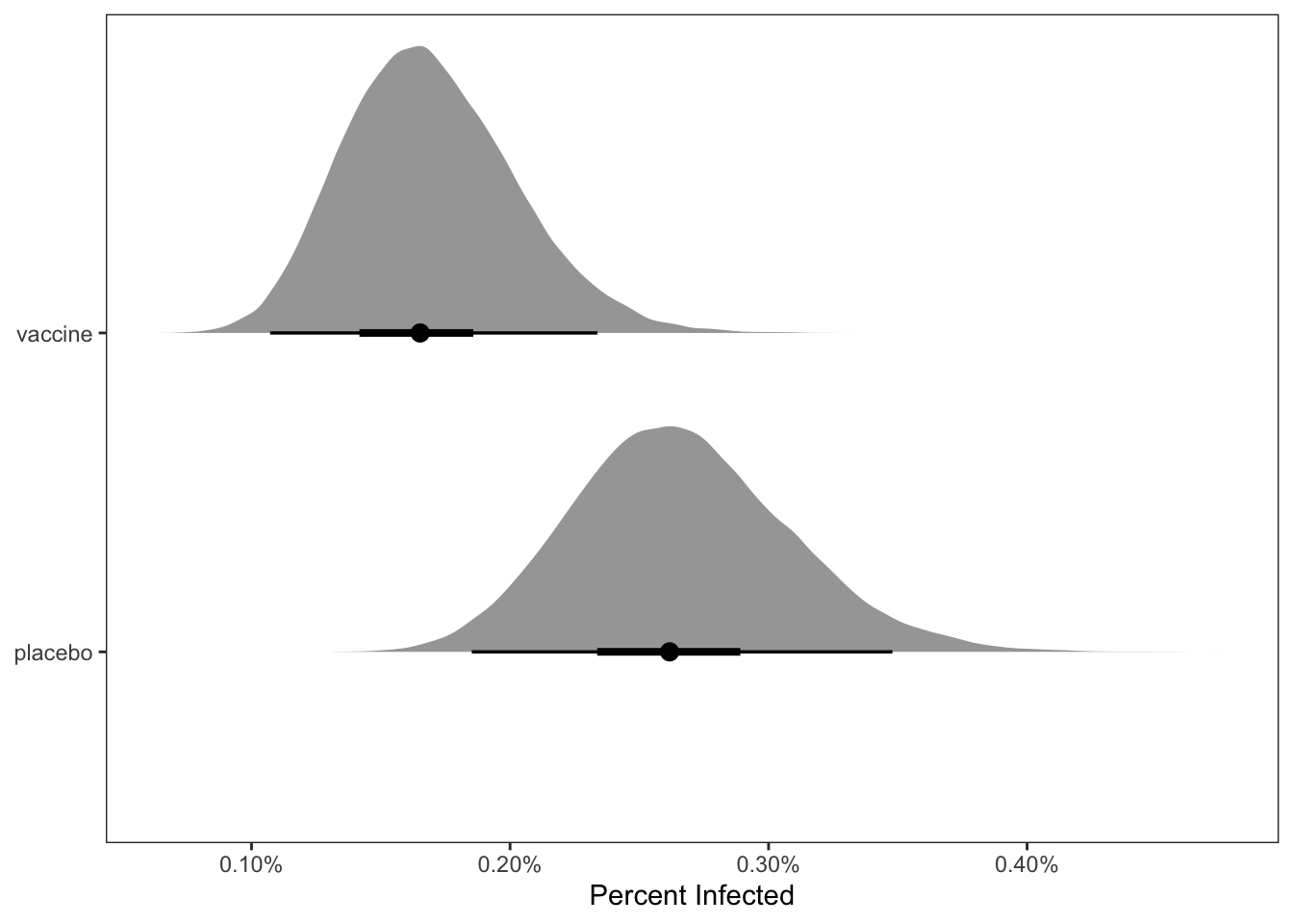
post2 %>%
   mutate(placebo = inv_logit_scaled(b_placebo_Intercept),
          vaccine = inv_logit_scaled(b_vaccine_Intercept)) %>%
   mutate(diff_rate = (placebo - vaccine) / placebo) %>%

   ggplot(aes(x = diff_rate)) +
   geom_histogram(color = "grey92", fill = "grey67",
                  size = .2, bins = 40) +
   tidybayes::stat_pointinterval(aes(y = 0),
                       point_interval = mode_hdi, .width = .95) +
   scale_y_continuous(NULL, breaks = NULL) +
   scale_x_continuous(labels = scales::label_percent()) +
   xlab("Percent Difference in rate of infection") +
   theme(panel.grid = element_blank())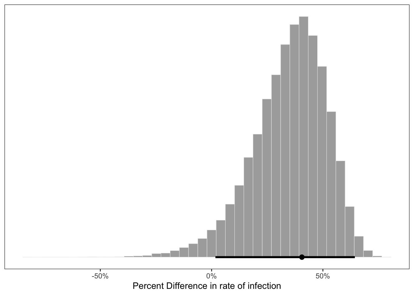
post2 %>%
   mutate(placebo = inv_logit_scaled(b_placebo_Intercept),
          vaccine = inv_logit_scaled(b_vaccine_Intercept)) %>%
   mutate(diff_rate = (placebo - vaccine) / placebo) %>%
   bayestestR::describe_posterior()
## # Description of Posterior Distributions
##
## Parameter | Median | 89% CI | pd | 89% ROPE | % in ROPE
## ----------------------------------------------------------------------------------------
## placebo_Intercept | -5.934 | [ -6.191, -5.686] | 100.00% | [-0.100, 0.100] | 0
## vaccine_Intercept | -6.393 | [ -6.710, -6.086] | 100.00% | [-0.100, 0.100] | 0
## lp__ | -46.880 | [-48.398, -46.174] | 100.00% | [-0.100, 0.100] | 0
## placebo | 0.003 | [ 0.002, 0.003] | 100.00% | [-0.100, 0.100] | 100
## vaccine | 0.002 | [ 0.001, 0.002] | 100.00% | [-0.100, 0.100] | 100
## diff_rate | 0.368 | [ 0.101, 0.604] | 96.73% | [-0.100, 0.100] | 0preplot <-
post2 %>%
mutate(placebo = inv_logit_scaled(b_placebo_Intercept),
vaccine = inv_logit_scaled(b_vaccine_Intercept)) %>%
mutate(diff_rate = (placebo - vaccine) / placebo) %>%
select(diff_rate)
plot(bayestestR::hdi(preplot, ci = c(.89, .95, .99)))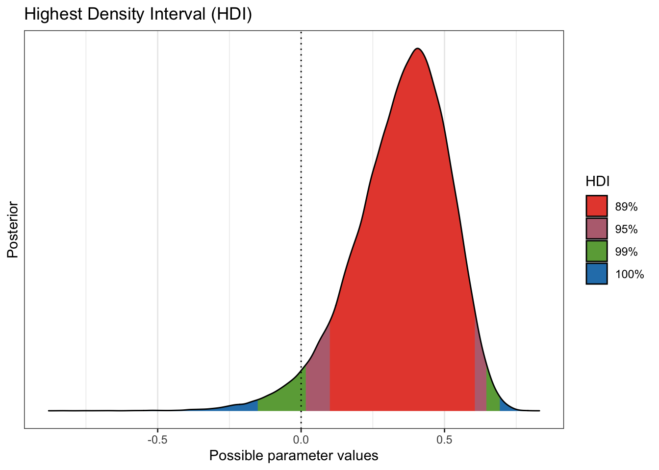
Done
I’ve decided to make this a three parter. Please hang in there more bayesian “magic” follows soon. Probably next week.
Hope you enjoyed the post. Comments always welcomed. Especially please let me know if you actually use the tools and find them useful.
Extra credit for me for not expressing a political view at any point. Let the data speak and the counting continue.
Chuck
This work is licensed under a Creative Commons Attribution-ShareAlike 4.0 International License

