Displaying increasing U.S. eligible voter diversity with a slopegraph in R
I maintain small package CGPfunctions on Github
as well as CRAN. I know a
few people use it because occasionally I get feedback (usually accompanied by
feature requests :-) ). I am absolutely sure that it’s in no danger of “going
viral” but the discipline of maintaining does me some good at least, and it’s
nice to know a few people find it helpful.
Over the summer I managed to make a few tweaks to various functions and add some new features and functionality. This post documents a few of those as well as touching on an interesting election topic (no worries no political lobbying will be found here).
The genesis of the data is The Pew Research Center a “reliable source” if you will. The data and the report titled “The Changing Racial and Ethnic Composition of the U.S. Electorate” were published September 23rd. The site has lots of great graphics and analysis but I was drawn to one set of tabular data that cried out for a visual. The table tracks by state changes in the composition of eligible voters from 2000 through 2010 to 2018.
I wanted to use my newslopegraph function to make a more informative visual
of the data, while showcasing some of the recent tweaks and existing
functionality.
Setup and data
First step is to grab the latest version of the package from GitHub. I’ll push the changes to CRAN in the not too distant future.
devtools::install_github("ibecav/CGPfunctions",
                         build_vignettes = TRUE,
                         upgrade = "ask",
                         force = TRUE)
Next load a few libraries we need.
library(dplyr)
library(tidyr)
library(readr)
library(CGPfunctions)
I was too lazy to do a lot of web scraping so I simply cut and
paste from the web page into a plain text file then eliminated
the commas and percent signs and cleaned up the header line. I
actually did the work in a text editor but a series of gsub
would have worked. It’s a wide table with one row per state
plus D.C.. After reading it in with readr::read_tsv I checked the math
(2552000 / 3713000 = 69%) so since we are interested in using percents
the columns that contain the word “share” are what we want.
data <- readr::read_tsv(file="vote_eligible.txt")##
## ── Column specification ────────────────────────────────────────────────────────
## cols(
## State = col_character(),
## Total_eligible_voter_2018 = col_double(),
## White_eligible_voter_pop_2018 = col_double(),
## White_share_eligible_voters_2018 = col_double(),
## White_eligible_voter_pop_2010 = col_double(),
## White_share_eligible_voters_2010 = col_double(),
## White_eligible_voter_pop_2000 = col_double(),
## White_share_eligible_voters_2000 = col_double(),
## change_00_18 = col_double()
## )data## # A tibble: 51 x 9
## State Total_eligible_… White_eligible_… White_share_eli… White_eligible_…
## <chr> <dbl> <dbl> <dbl> <dbl>
## 1 Alab… 3713000 2552000 69 2522000
## 2 Alas… 535000 351000 66 354000
## 3 Ariz… 5042000 3192000 63 2968000
## 4 Arka… 2219000 1724000 78 1704000
## 5 Cali… 25869000 11750000 45 11950000
## 6 Colo… 4147000 3110000 75 2777000
## 7 Conn… 2614000 1917000 73 1982000
## 8 Dela… 721000 496000 69 476000
## 9 Dist… 527000 220000 42 181000
## 10 Flor… 15342000 9325000 61 8799000
## # … with 41 more rows, and 4 more variables:
## # White_share_eligible_voters_2010 <dbl>,
## # White_eligible_voter_pop_2000 <dbl>,
## # White_share_eligible_voters_2000 <dbl>, change_00_18 <dbl>So we’ll select(State, contains("share")) to eliminate what we don’t need
and pivot from wide to long with tidyr::pivot_longer for each
of the columns that starts with “White_share” we’ll pivot and call
the values “percent” (which they are). Since “White share of eligible voters
2018” is more than a little ungainly we’ll use names_pattern = “([0-9]{4})”
to extract just the four digit year.
data <- data %>%
   select(State, contains("share")) %>%
   tidyr::pivot_longer(cols = starts_with("White_share"),
                       names_to = "year",
                       values_to = "percent",
                       names_pattern = "([0-9]{4})"
                       )

data
## # A tibble: 153 x 3
## State year percent
## <chr> <chr> <dbl>
## 1 Alabama 2018 69
## 2 Alabama 2010 71
## 3 Alabama 2000 73
## 4 Alaska 2018 66
## 5 Alaska 2010 70
## 6 Alaska 2000 73
## 7 Arizona 2018 63
## 8 Arizona 2010 69
## 9 Arizona 2000 75
## 10 Arkansas 2018 78
## # … with 143 more rowsSince we’re interested in diversity, not the percent white eligible voters we’ll flip things around.
data <- data %>% mutate(percent = as.integer(100 - percent))

data
## # A tibble: 153 x 3
## State year percent
## <chr> <chr> <int>
## 1 Alabama 2018 31
## 2 Alabama 2010 29
## 3 Alabama 2000 27
## 4 Alaska 2018 34
## 5 Alaska 2010 30
## 6 Alaska 2000 27
## 7 Arizona 2018 37
## 8 Arizona 2010 31
## 9 Arizona 2000 25
## 10 Arkansas 2018 22
## # … with 143 more rowsFirst plot
Now that the data is in long format, we can visualize it. We’ll
add an informative Title, SubTitle and Caption and let the
defaults take over.
newggslopegraph(dataframe = data,
                Times = year,
                Measurement = percent,
                Grouping = State,
                Title = "Eligible non-white voters per state 2000- 2018",
                SubTitle = "Expressed as a percent of total eligible voters",
                Caption = "Retrieved from https://www.pewresearch.org/2020/09/23/the-changing-racial-and-ethnic-composition-of-the-u-s-electorate/ on Oct 23, 2020")
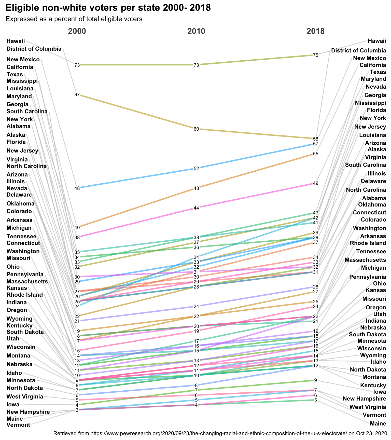
Not bad. The function’s defaults work very hard to deconflict labeling, while making sure things are proportional, and properly aligned. The gaps you see between lines are proportional to the data, and the ordering of the left and right axis is correct. New Hampshire surpassed Maine and Vermont in terms of diversity. We can do a lot better though.
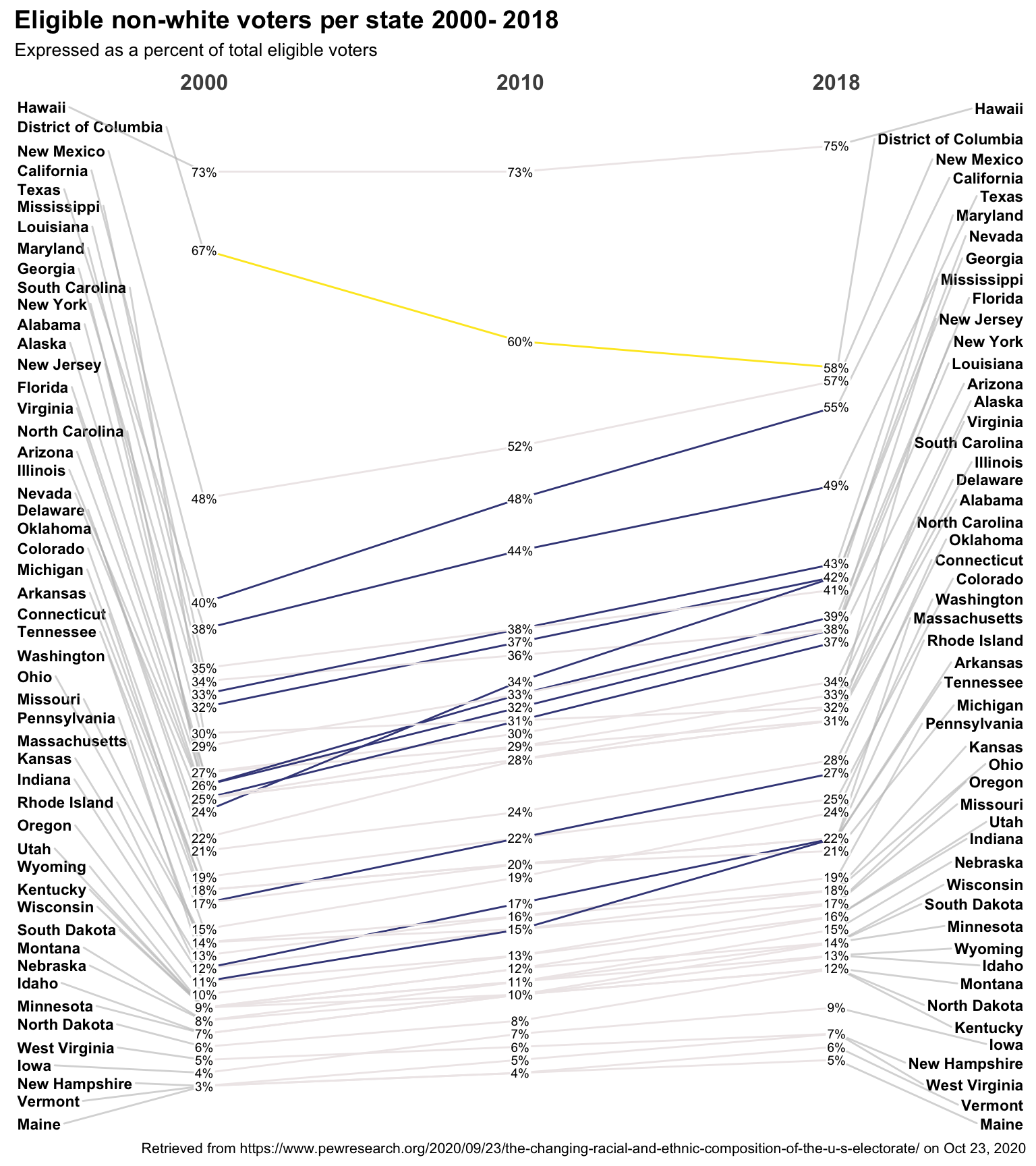
One easy improvement is to make use of the Data.label argument. Normally
we simply use the Measurement as a string. But Data.label let’s
you make it any character value you like. As a simple example let’s add
a percent sign.
To draw our viewers eyes to big changes in slope (percent difference between)
2000 and 2018 let’s make the lines reflect that. Increases in diversity
greater than 10% will get one color from the viridis scale and those less
than -5% the other end of the spectrum. States with no strong trend get a shade very
close to white. I avoid red and green because of colorblindeness.
data$datalabel <- paste0(data$percent, "%")

custom_colors <-
   tidyr::pivot_wider(data,
                   id_cols = State,
                   names_from = year,
                   values_from = percent) %>%
   mutate(difference = `2018` - `2000`) %>%
   mutate(trend = case_when(
      difference >= 10 ~ "#404788ff",
      difference <= -5 ~ "#fde725ff",
      TRUE ~ "snow2"
   )
   ) %>%
   select(State, trend) %>%
   tibble::deframe()

newggslopegraph(dataframe = data,
                Times = year,
                Measurement = percent,
                Grouping = State,
                Data.label = datalabel,
                Title = "Eligible non-white voters per state 2000- 2018",
                SubTitle = "Expressed as a percent of total eligible voters",
                Caption = "Retrieved from https://www.pewresearch.org/2020/09/23/the-changing-racial-and-ethnic-composition-of-the-u-s-electorate/ on Oct 23, 2020",
                LineThickness = .5,
                LineColor = custom_colors
)
Just because you can doesn’t mean you should
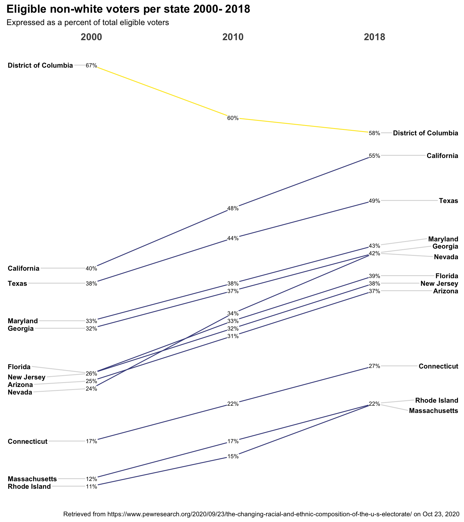
We could keep tweaking but quite frankly 51 lines is probably too many
let’s back up and focus on a more select number. I’m going to proceed
much faster this time. Reread the original tsv file. Add a mutate to
find the overall change from 2000 to 2018 call it changes. Filter for
just the big change states changes >= 5 | changes <= -10. Then the same
old steps to pivot mutate and plot.
data <- readr::read_tsv(file="vote_eligible.txt")
data <- data %>%
   mutate(changes = White_share_eligible_voters_2018 - White_share_eligible_voters_2000) %>%
   filter(changes >= 5 | changes <= -10) %>%
   select(State, contains("share")) %>%
   tidyr::pivot_longer(cols = starts_with("White_share"),
                       names_to = "year",
                       values_to = "percent",
                       names_pattern = "([0-9]{4})"
                       ) %>%
   mutate(percent = as.integer(100 - percent))


data$datalabel <- paste0(data$percent, "%")

custom_colors <-
   tidyr::pivot_wider(data,
                   id_cols = State,
                   names_from = year,
                   values_from = percent) %>%
   mutate(difference = `2018` - `2000`) %>%
   mutate(trend = case_when(
      difference >= 10 ~ "#404788ff",
      difference <= -5 ~ "#fde725ff",
      TRUE ~ "snow2"
   )
   ) %>%
   select(State, trend) %>%
   tibble::deframe()

newggslopegraph(dataframe = data,
                Times = year,
                Measurement = percent,
                Grouping = State,
                Data.label = datalabel,
                Title = "Eligible non-white voters per state 2000- 2018",
                SubTitle = "Expressed as a percent of total eligible voters",
                Caption = "Retrieved from https://www.pewresearch.org/2020/09/23/the-changing-racial-and-ethnic-composition-of-the-u-s-electorate/ on Oct 23, 2020",
                LineThickness = .5,
                LineColor = custom_colors
)
Done
Hope you enjoyed the post. Comments always welcomed. Especially please let me know if you actually use the tools and find them useful.
Extra credit for me for not expressing a political view at any point. Let the data speak.
Chuck
This work is licensed under a Creative Commons Attribution-ShareAlike 4.0 International License

