Oneway ANOVA Explanation and Example in R
See this datascience+ https://datascienceplus.com/one-way-anova-in-r/ for the original work that inspired my efforts. Credit to Bidyut Ghosh (Assistant Professor at Symbiosis International University, India) for the original posting.
Special thanks also to Dani Navarro, The University of New South Wales (Sydney) for the book Learning Statistics with R http://dj-navarro.appspot.com/lsr/lsr-0.5.1.pdf (hereafter simply LSR) and the lsr packages available through CRAN. I highly recommend it.
Let’s load the required R packages. See https://github.com/cran/lsr for more on lsr.
library(ggplot2)
library(lsr)
library(psych)
library(car)
library(tidyverse)
library(dunn.test)
library(BayesFactor)
library(scales)
library(knitr)
library(kableExtra)
options(width = 130)
options(knitr.table.format = "html")
The Oneway Analysis of Variance (ANOVA)
The Oneway ANOVA is a statistical technique that allows us to compare mean differences of one outcome (dependent) variable across two or more groups (levels) of one independent variable (factor). If there are only two levels (e.g. Male/Female) of the independent (predictor) variable the results are analogous to Student’s t test. It is also true that ANOVA is a special case of the GLM or regression models so as the number of levels increase it might make more sense to try one of those approaches. ANOVA also allows for comparisons of mean differences across multiple factors (Factorial or Nway ANOVA) which we won’t address here.
Our scenario and data
Professor Ghosh’s original scenario can be summarized this way. Imagine that you are interested in understanding whether knowing the brand of car tire can help you predict whether you will get more or less mileage before you need to replace them. We’ll draw what is hopefully a random sample of 60 tires from four different manufacturers and use the mean mileage by brand to help inform our thinking. While we expect variation across our sample we’re interested in whether the differences between the tire brands (the groups) is significantly different than what we would expect in random variation within the groups.
Our research or testable hypothesis is then described \[\mu_{Apollo} \ne \mu_{Bridgestone} \ne \mu_{CEAT} \ne \mu_{Falken}\] as at least one of the tire brand populations is different than the other three. Our null is basically “nope, brand doesn’t matter in predicting tire mileage – all brands are the same”.
He provides the following data set with 60 observations. I’ve chosen to download directly but you could of course park the file locally and work from there.
| Column | Contains | Type |
|---|---|---|
| Brands | What brand tyre | factor |
| Mileage | Tyre life in thousands | num |
tyre<-read.csv("https://datascienceplus.com/wp-content/uploads/2017/08/tyre.csv",
               stringsAsFactors = TRUE)
# tyre<-read.csv("tyre.csv") # if you have it on your local hard drive
str(tyre)
## 'data.frame': 60 obs. of 2 variables:
## $ Brands : Factor w/ 4 levels "Apollo","Bridgestone",..: 1 1 1 1 1 1 1 1 1 1 ...
## $ Mileage: num 33 36.4 32.8 37.6 36.3 ...summary(tyre)## Brands Mileage
## Apollo :15 Min. :27.88
## Bridgestone:15 1st Qu.:32.69
## CEAT :15 Median :34.84
## Falken :15 Mean :34.74
## 3rd Qu.:36.77
## Max. :41.05head(tyre)## Brands Mileage
## 1 Apollo 32.998
## 2 Apollo 36.435
## 3 Apollo 32.777
## 4 Apollo 37.637
## 5 Apollo 36.304
## 6 Apollo 35.915# View(tyre) # if you use RStudio this is a nice way to see the data in spreadsheet formatThe data set contains what we expected. The dependent variable Mileage is numeric and the independent variable Brand is of type factor. R is usually adept at coercing a chr string or an integer as the independent variable but I find it best to explicitly make it a factor when you’re working on ANOVAs.
Let’s graph and describe the basics. First a simple boxplot of all 60 data points along with a summary using the describe command from the package psych. Then in reverse order lets describe describeBy and boxplot breaking it down by group (in our case tire brand).
boxplot(tyre$Mileage,
        horizontal = TRUE,
        main="Mileage distribution across all brands",
        col = "blue")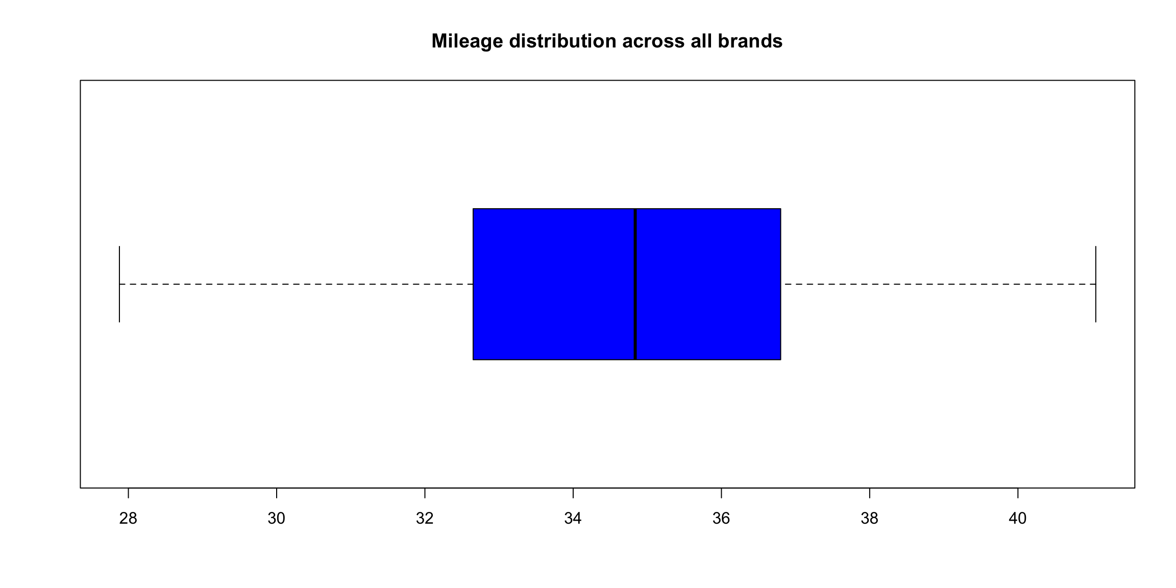
describe(tyre) # the * behind Brands reminds us it's a factor and some of the numbers are nonsensical## vars n mean sd median trimmed mad min max range skew kurtosis se
## Brands* 1 60 2.50 1.13 2.50 2.50 1.48 1.00 4.00 3.00 0.00 -1.41 0.15
## Mileage 2 60 34.74 2.98 34.84 34.76 3.09 27.88 41.05 13.17 -0.11 -0.44 0.38describeBy(tyre$Mileage,group = tyre$Brand, mat = TRUE, digits = 2)## item group1 vars n mean sd median trimmed mad min max range skew kurtosis se
## X11 1 Apollo 1 15 34.80 2.22 34.84 34.85 2.37 30.62 38.33 7.71 -0.18 -1.24 0.57
## X12 2 Bridgestone 1 15 31.78 2.20 32.00 31.83 1.65 27.88 35.01 7.13 -0.29 -1.05 0.57
## X13 3 CEAT 1 15 34.76 2.53 34.78 34.61 2.03 30.43 41.05 10.62 0.64 0.33 0.65
## X14 4 Falken 1 15 37.62 1.70 37.38 37.65 1.18 34.31 40.66 6.35 0.13 -0.69 0.44boxplot(tyre$Mileage~tyre$Brands,
main="Boxplot comparing Mileage of Four Brands of Tyre",
col= rainbow(4),
horizontal = TRUE)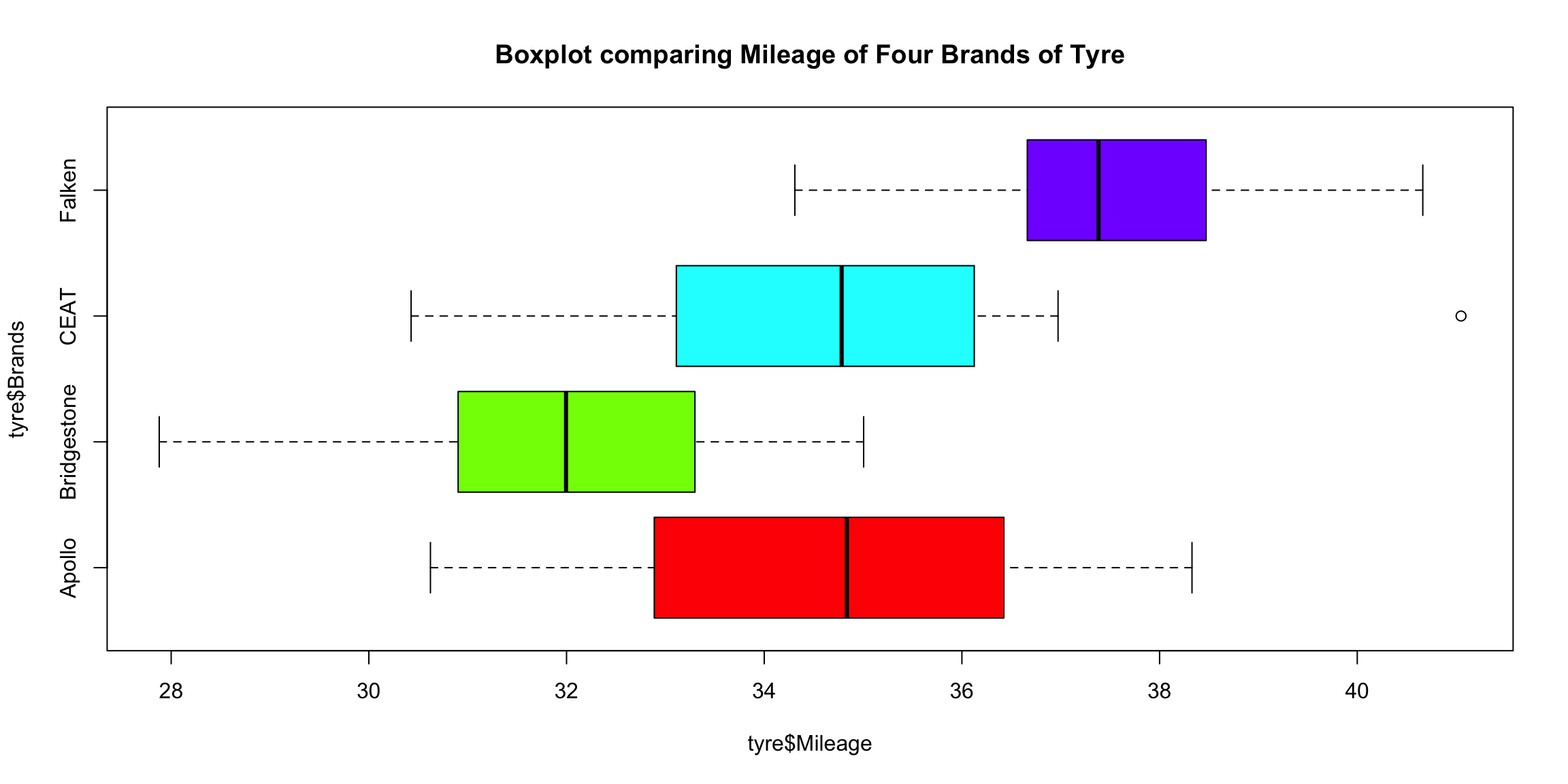
Let’s format the table describeby generates to make it a little nicer using the kable package. Luckily describeby generates a dataframe with mat=TRUE and after that we can select which columns to publish (dropping some of the less used) as well as changing the column labels as desired.
describeBy(tyre$Mileage,group = tyre$Brand, mat = TRUE) %>% #create dataframe
  select(Brand=group1, N=n, Mean=mean, SD=sd, Median=median, Min=min, Max=max,
                Skew=skew, Kurtosis=kurtosis, SEM=se) %>%
  kable(align=c("lrrrrrrrr"), digits=2, row.names = FALSE,
        caption="Tire Mileage Brand Descriptive Statistics") %>%
kable_styling(bootstrap_options=c("bordered", "responsive","striped"), full_width = FALSE)| Brand | N | Mean | SD | Median | Min | Max | Skew | Kurtosis | SEM |
|---|---|---|---|---|---|---|---|---|---|
| Apollo | 15 | 34.80 | 2.22 | 34.84 | 30.62 | 38.33 | -0.18 | -1.24 | 0.57 |
| Bridgestone | 15 | 31.78 | 2.20 | 32.00 | 27.88 | 35.01 | -0.29 | -1.05 | 0.57 |
| CEAT | 15 | 34.76 | 2.53 | 34.78 | 30.43 | 41.05 | 0.64 | 0.33 | 0.65 |
| Falken | 15 | 37.62 | 1.70 | 37.38 | 34.31 | 40.66 | 0.13 | -0.69 | 0.44 |
Certainly much nicer looking and I only scratched the surface of the options available. We can certainly look at the numbers and learn a lot. But let’s see if we can also improve our plotting to be more informative.
The more I use ggplot2 the more I love the ability to use it to customize the presentation of the data to optimize understanding! The next plot might be accused of being a little “busy” but essentially answers our Oneway ANOVA question in one picture (note that I have stayed with the original decision to set \(\alpha\) = 0.01 significance level (99% confidence intervals)).
ggplot(tyre, aes(reorder(Brands,Mileage),Mileage,fill=Brands))+
# ggplot(tyre, aes(Brands,Mileage,fill=Brands))+ # if you want to leave them alphabetic
  geom_jitter(colour = "dark gray",width=.1) +
  stat_boxplot(geom ='errorbar',width = 0.4) +
  geom_boxplot()+
  labs(title="Boxplot, dotplot and SEM plot of mileage for four brands of tyres",
       x = "Brands (sorted)",
       y = "Mileage (in thousands)",
       subtitle ="Gray dots=sample data points, Black dot=outlier, Blue dot=mean, Red=99% confidence interval",
       caption = "Data from https://datascienceplus.com/one-way-anova-in-r/") +
  guides(fill=FALSE) +
  stat_summary(fun.data = "mean_cl_normal", colour = "red", size = 1.5, fun.args = list(conf.int=.99)) +
  stat_summary(geom="point", fun.y=mean, color="blue") +
  theme_bw()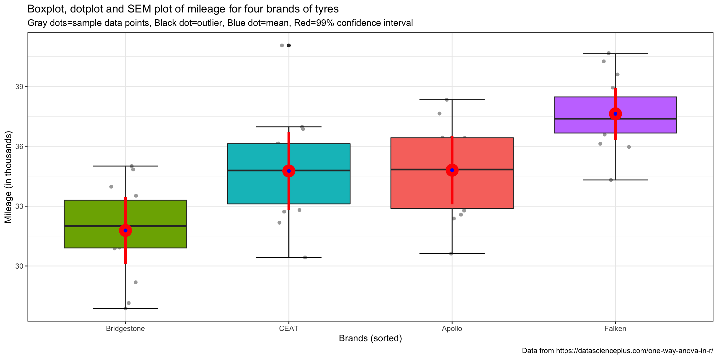
By simple visual inspection it certainly appears that we have evidence of the effect of tire brand on mileage. There is one outlier for the CEAT brand but little cause for concern. Means and medians are close together so no major concerns about skewness. Different brands have differing amounts of variability but nothing shocking visually.
Oneway ANOVA Test & Results
So the heart of this post is to actually execute the Oneway ANOVA in R. There are several ways to do so but let’s start with the simplest from the base R first aov. While it’s possible to wrap the command in a summary or print statement I recommend you always save the results out to an R object in this case tyres.aov. It’s almost inevitable that further analysis will ensue and the tyres.aov object has a wealth of useful information. If you’re new to R a couple of quick notes. The dependent variable goes to the left of the tilde and our independent or predictor variable to the right. aov is not limited to Oneway ANOVA so adding additional factors is possible.
As I mentioned earlier ANOVA is a specialized case of the GLM and therefore the list object returned tyres.aov is actually of both aov and lm class. The names command will give you some sense of all the information contained in the list object. We’ll access some of this later as we continue to analyze our data. The summary command gives us the key ANOVA data we need and produces a classic ANOVA table. If you’re unfamiliar with them and want to know more especially where the numbers come from I recommend a good introductory stats text. As noted earlier I recommend Learning Statistics with R LSR see Table 14-1 on page 432.
tyres.aov<- aov(Mileage~Brands, tyre)
class(tyres.aov)
## [1] "aov" "lm"typeof(tyres.aov)## [1] "list"names(tyres.aov)## [1] "coefficients" "residuals" "effects" "rank" "fitted.values" "assign" "qr"
## [8] "df.residual" "contrasts" "xlevels" "call" "terms" "model"summary(tyres.aov)## Df Sum Sq Mean Sq F value Pr(>F)
## Brands 3 256.3 85.43 17.94 2.78e-08 ***
## Residuals 56 266.6 4.76
## ---
## Signif. codes: 0 '***' 0.001 '**' 0.01 '*' 0.05 '.' 0.1 ' ' 1We can reject the null hypothesis at the \(\alpha\) = 0.01 significance level (99% confidence). The F statistic is calculated as \[F = \frac{MS_{between}}{MS_{within}}\] and the table gives us the precise p value and the common asterisks to show “success”.
In published results format that probably looks like “a Oneway ANOVA showed a significant effect for brand on tire mileage, F(3,56)=17.94, p<.01”. In other words, we can reject the null hypothesis that these data came from brand tire populations where the average tire mileage life was the same! Making it a prediction statement, we can see that brand type helps predict mileage life.
That’s exciting news, but leaves us with some other unanswered questions.
The data provide support for the hypothesis that the means aren’t all equal – that’s called the omnibus test. We have support for rejecting \[\mu_{Apollo} = \mu_{Bridgestone} = \mu_{CEAT} = \mu_{Falken}\] but at this point we can’t state with any authority which specific pairs are different, all we can say is that at least one is different! When we look at the graph we made earlier we can guess we know but let’s do better than that. How can we use confidence intervals to help us understand whether the data are indicating simple random variation or whether the underlying population is different. We just need to compute the confidence interval for each brand’s mean and then see which brand means lie inside or outside the confidence interval of the others. We would expect that if we ran our experiment 100 times with our sample size numbers for each brand the mileage mean would lie inside the upper and lower limit of our confidence interval 99 times (with \(\alpha\) = 0.01) out of those 100 times. If our data shows it outside the confidence interval that is evidence of a statistically significant difference for that specific pairing.
But we don’t have to rely on our graph, we can be more precise and test it in a very controlled fashion.
A priori and post hoc comparisons
We could just take mileage and brands and run all the possible t tests. There would be 6 of them; Apollo -v- Bridgestone, Apollo -v- CEAT, Apollo -v- Falken, Bridgestone -v- CEAT, Bridgestone -v- Falken, and CEAT -v- Falken. Base R provides pairwise.t.test to feed it the data and allow it to rapidly make all the relevant comparisons. lsr provides a helper function that makes it possible to simply feed it the aov object and do the same.
The “answers” appear to support our read of the graph. All of the possible pairs seem to be different other than Apollo -v- CEAT which is what the graph shows. The significance levels R spits out are all much smaller than p<.01. Break out the champagne start the victory dance.
pairwise.t.test(tyre$Mileage,tyre$Brands,p.adjust.method = "none")##
## Pairwise comparisons using t tests with pooled SD
##
## data: tyre$Mileage and tyre$Brands
##
## Apollo Bridgestone CEAT
## Bridgestone 0.00037 - -
## CEAT 0.96221 0.00043 -
## Falken 0.00080 9.7e-10 0.00069
##
## P value adjustment method: none# unfortunately pairwise.t.test doesn't accept formula style or an aov object
# lsr library to the rescue
posthocPairwiseT(tyres.aov,p.adjust.method = "none") #equivalent just easier to use the aov object ##
## Pairwise comparisons using t tests with pooled SD
##
## data: Mileage and Brands
##
## Apollo Bridgestone CEAT
## Bridgestone 0.00037 - -
## CEAT 0.96221 0.00043 -
## Falken 0.00080 9.7e-10 0.00069
##
## P value adjustment method: noneBut that would be wrong and here’s why. Assuming we want to have 99% confidence again, across all six unique pairings, we are “cheating” if we don’t adjust the rejection region (and our confidence intervals) and just run the test six times. It’s analogous to rolling the die six times instead of once. The more simultaneous tests we run the more likely we are to find a difference even though none exists. We need to adjust our thinking and our confidence to account for the fact that we are making multiple comparisons (a.k.a. simultaneous comparisons). Our confidence interval must be made wider (more conservative) to account for the fact we are making multiple simultaneous comparisons. Thank goodness the tools exist to do this for us. As a matter of fact there is no one single way to make the adjustment… there are many.
One starting position is that it makes a difference whether you have specified (hypothesized) some specific relationships a priori (in advance) or whether you’re exploring posthoc (after the fact also called “fishing”). The traditional position is that a priori grants you more latitude and less need to be conservative. The only thing that is certain is that some adjustment is necessary. In his original post Professor Ghosh applied one of the classical choices for making an adjustment Tukey’s Honestly Significant Difference (HSD) https://en.wikipedia.org/wiki/Tukey%27s_range_test. Let’s reproduce his work first as two tables at two confidence levels.
TukeyHSD(tyres.aov, conf.level = 0.95)## Tukey multiple comparisons of means
## 95% family-wise confidence level
##
## Fit: aov(formula = Mileage ~ Brands, data = tyre)
##
## $Brands
## diff lwr upr p adj
## Bridgestone-Apollo -3.01900000 -5.1288190 -0.909181 0.0020527
## CEAT-Apollo -0.03792661 -2.1477456 2.071892 0.9999608
## Falken-Apollo 2.82553333 0.7157143 4.935352 0.0043198
## CEAT-Bridgestone 2.98107339 0.8712544 5.090892 0.0023806
## Falken-Bridgestone 5.84453333 3.7347143 7.954352 0.0000000
## Falken-CEAT 2.86345994 0.7536409 4.973279 0.0037424TukeyHSD(tyres.aov, conf.level = 0.99)## Tukey multiple comparisons of means
## 99% family-wise confidence level
##
## Fit: aov(formula = Mileage ~ Brands, data = tyre)
##
## $Brands
## diff lwr upr p adj
## Bridgestone-Apollo -3.01900000 -5.6155816 -0.4224184 0.0020527
## CEAT-Apollo -0.03792661 -2.6345082 2.5586550 0.9999608
## Falken-Apollo 2.82553333 0.2289517 5.4221149 0.0043198
## CEAT-Bridgestone 2.98107339 0.3844918 5.5776550 0.0023806
## Falken-Bridgestone 5.84453333 3.2479517 8.4411149 0.0000000
## Falken-CEAT 2.86345994 0.2668783 5.4600415 0.0037424A lot of output there but not too difficult to understand. We can see the 6 pairings we have been tracking listed in the first column. The diff column is the difference between the means of the two brands listed. So the mean for Bridgestone is 3,019 miles less than Apollo. The lwr and upr columns show the lower and upper CI limits. Notice they change between the two different confidence levels we’ve run, whereas the mean difference and exact p value do not. So good news here is that even with our more conservative Tukey HSD test we have empirical support for 5 out of the 6 possible differences.
Now let’s graph just the .99 CI version.
par()$oma # current margins## [1] 0 0 0 0par(oma=c(0,5,0,0)) # adjust the margins because the factor names are long
plot(TukeyHSD(tyres.aov, conf.level = 0.99),las=1, col = "red")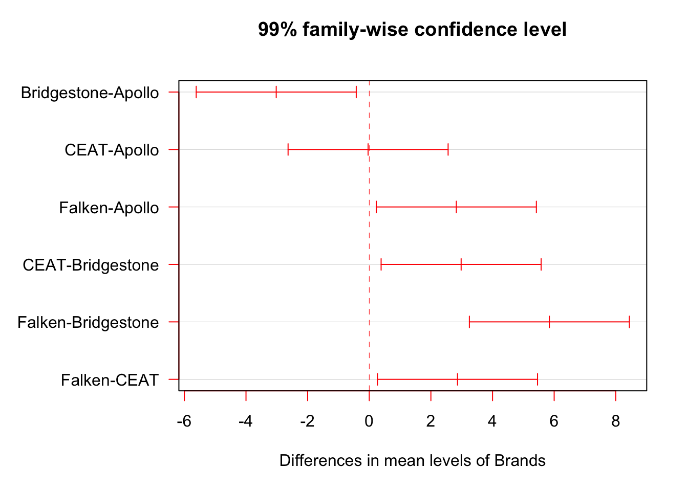
par(oma=c(0,0,0,0)) # put the margins backIf you’re a visual learner, as I am, this helps. We’re looking at the differences in means amongst the pairs of brands. 0 on the x axis means no difference at all and the red horizontals denote 99% confidence intervals.
Finally, as I mentioned earlier there are many different ways (tests) for adjusting. Tukey HSD is very common and is easy to access and graph. But two others worth noting are the Bonferroni and it’s successor the Holm. Let’s go back to our earlier use of the pairwise.t.test. We’ll use it again (as well as the lsr wrapper function posthocPairwise). You can use the built-in R help for p.adjust to see all the methods available. I recommend holm as a general position but know your options.
pairwise.t.test(tyre$Mileage,tyre$Brands,p.adjust.method = "bonferroni")##
## Pairwise comparisons using t tests with pooled SD
##
## data: tyre$Mileage and tyre$Brands
##
## Apollo Bridgestone CEAT
## Bridgestone 0.0022 - -
## CEAT 1.0000 0.0026 -
## Falken 0.0048 5.8e-09 0.0041
##
## P value adjustment method: bonferronipairwise.t.test(tyre$Mileage,tyre$Brands,p.adjust.method = "holm")##
## Pairwise comparisons using t tests with pooled SD
##
## data: tyre$Mileage and tyre$Brands
##
## Apollo Bridgestone CEAT
## Bridgestone 0.0019 - -
## CEAT 0.9622 0.0019 -
## Falken 0.0021 5.8e-09 0.0021
##
## P value adjustment method: holmposthocPairwiseT(tyres.aov) # default is Holm##
## Pairwise comparisons using t tests with pooled SD
##
## data: Mileage and Brands
##
## Apollo Bridgestone CEAT
## Bridgestone 0.0019 - -
## CEAT 0.9622 0.0019 -
## Falken 0.0021 5.8e-09 0.0021
##
## P value adjustment method: holmHappily, given our data, we get the same overall answer with very slightly different numbers. As it turns out we have very strong effect sizes and the tests don’t change our overall answers. Wait what’s an effect size you ask? That’s our next question.
Effect sizes and the strength of our prediction
One relatively common question in statistics or data science is, how “big” is the difference or the effect? At this point we can state with some statistical confidence that tire brand matters in predicting tire mileage life, it isn’t likely given our data that we would see results like these by chance. But… Is this a really big difference between the brands? Often this is the most important question in our research. After all if it’s a big difference we might change our shopping habits and/or pay more. Is there a way of knowing how big this difference is?
Effect size is a measure we use in statistics to express how big the differences are. For this Oneway ANOVA the appropriate measure of effect size is eta squared (\(\eta^2\)) which can be calculated as:
\[\eta^2 = \frac{SS_{between}}{SS_{total}}\]
So while our F value is the ratio of brand and residuals of the mean squares, \(\eta^2\) is between over total for the sums of squares. Essentially, \(\eta^2\) is a measure of how much of the total variation in our data we can attribute to Brand and how much is just good old fashioned random variation. If \(\eta^2\) is one (which would be suspicious with real data) then 100% of the data is explainable if you know the brand. The more variance you explain the bigger the effect.
So how to get the number \(\eta^2\) from our data? We could just go back and do the work manually, you can see an example of that in LSR in section 14.2.5. You can save a LOT of typing by using this equivalent formula \(\eta^2\) = var(predict(tyres.aov)) / var(tyre$Mileage) = 0.4900957 . But that looks tedious to type even once so let’s use the etaSquared function provided in lsr.
ETASQUARED <- var(predict(tyres.aov)) / var(tyre$Mileage)
ETASQUARED
## [1] 0.4900957etaSquared(tyres.aov)## eta.sq eta.sq.part
## Brands 0.4900957 0.4900957round(etaSquared(tyres.aov,anova = TRUE),2) # tidy up a bit include full table## eta.sq eta.sq.part SS df MS F p
## Brands 0.49 0.49 256.29 3 85.43 17.94 0
## Residuals 0.51 NA 266.65 56 4.76 NA NASo our value for eta squared is \(\eta^2\) = 0.4900957 . Obviously you should exercise professional judgment in interpreting effect size but it does appear that brand matters… Eta squared is even more useful as we add more factors to our ANOVA and allows us to make direct comparisons about factors relative contributions to explanation.
Probably more than needed for a simple Oneway but as a gateway to looking at more complex results in the future we can graph \(\eta^2\) as well. First we’ll use a pie to show relative contributions to variance. But since pie charts tend to be discouraged we’ll also do a bar graph.
First step we need data to graph. As usual I’ll try and get there with the fewest and simplest commands possible in R. If you remember above we used the etaSquared function from package lsr to get results. But ggplot2 prefers data frames. Rather than using something from base R or the tidyverse why don’t we simply coerce the results of our previous work into a data frame. I prefer to make the row.name into a neatly labelled column. The comments show you the same process skipping lsr and computing \(\eta^2\) on the fly.
dddd<-as.data.frame((etaSquared(tyres.aov,anova = TRUE)))
dddd$Factor<-row.names(dddd)
# dddd<-as.data.frame(anova(tyres.aov))
# dddd$Factor<-row.names(dddd)
# dddd$eta.sq<-dddd$`Sum Sq` / sum(dddd$`Sum Sq`)
Given this data frame we can start with a pie chart. To overcome any objection that humans can’t accurately divine the proportions I’ve labelled them. I will admit though that that’s quite a bit of code to make a pie chart.
ggplot(dddd, aes(x = 1,y= eta.sq,fill=Factor)) +
  geom_col() +
  geom_label(aes(
    label = scales::percent(eta.sq)),
    position = position_stack(vjust = 0.5),
    show.legend = FALSE) +
  coord_polar(theta='y') +
  theme_bw() +
  theme(axis.ticks=element_blank(),
        axis.title=element_blank(),
        panel.grid = element_blank(),
        axis.text.y=element_blank(),
        axis.text.x=element_blank()) +
  ggtitle("Percentage of the variance explained by source (factor)")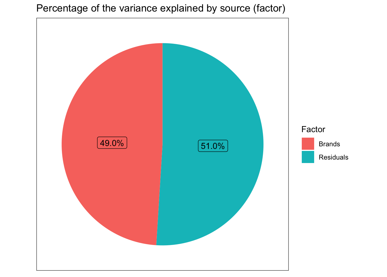
## Simple bar with percents
ggplot(dddd, aes(x = Factor,y= eta.sq,fill=Factor)) +
  geom_col() +
  geom_text(aes(y = eta.sq, label = scales::percent(eta.sq)), vjust = -0.25) +
  scale_y_continuous(labels = scales::percent) +
  ggtitle("Percentage of the variance explained by source (factor)") +
  ylab("Percent variance (eta squared)") +
  xlab("Factor or Source") +
  guides(fill=FALSE) +
  theme_bw()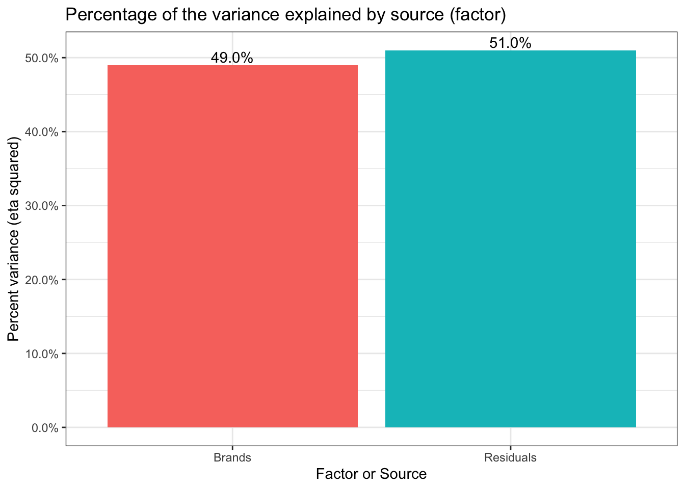
We now know that we have significant test results both from the overall omnibus test and that 5 of the 6 pairs are significantly different. We have a good sense of how strong the relationship is between Brand and Mileage via the amount of the variance explained. But, before we close out our efforts we would do well to check our statistical assumptions.
Checking our assumptions
Most statistical tests results rest on meeting certain assumptions when we run the test. A Oneway ANOVA is no exception. We have assumed 3 things; independence, homogeneity of variance (homoscedasticity) and normality. We should see to these assumptions before we use or publish our results. Independence doesn’t have a simple answer in this case. The direct threat would be if there were some undisclosed/unknown dependence (for example two of the brands were manufactured in the same plant using the same equipment and simply branded differently). For now there doesn’t seem to be any reason to believe that we have violated this assumption.
Next let’s address the assumption that our errors or residuals are normally distributed. We’re looking for evidence that our residuals are skewed or tailed or otherwise misshapen in a way that would influence our results. Surprisingly, there is actually quite a bit of controversy on this point since on the one hand we have strong reason to believe that our sample will be imperfect and that our population will not necessarily be “perfectly normal” either. Some argue that some simple plotting is all that is necessary looking for an unspecifiable amount of non normality that will trigger a search for the source. Other prefer a more formal approach using one or more statistical tests. We’ll address both.
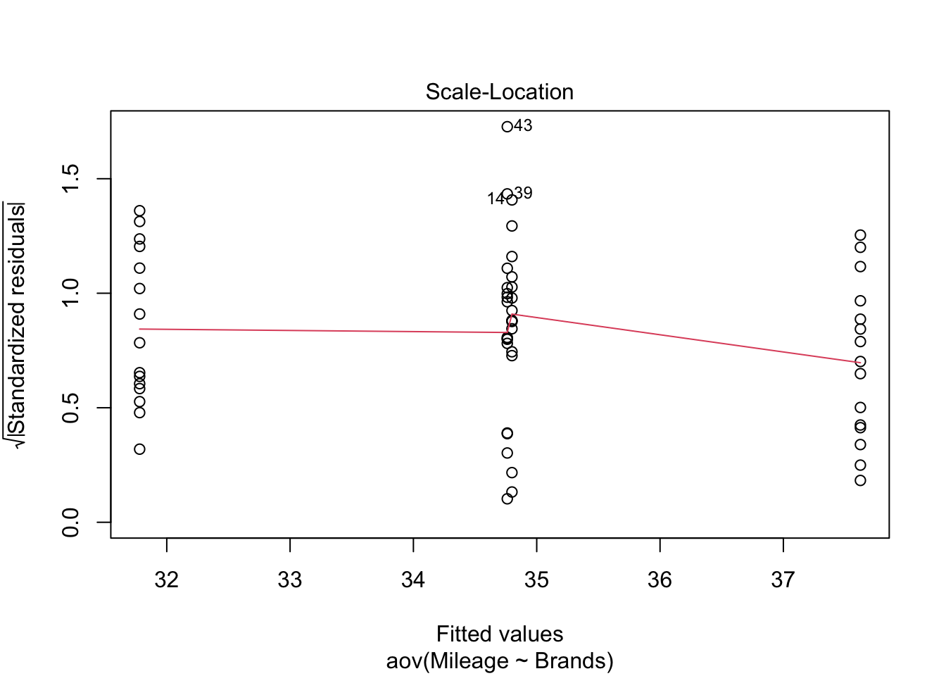
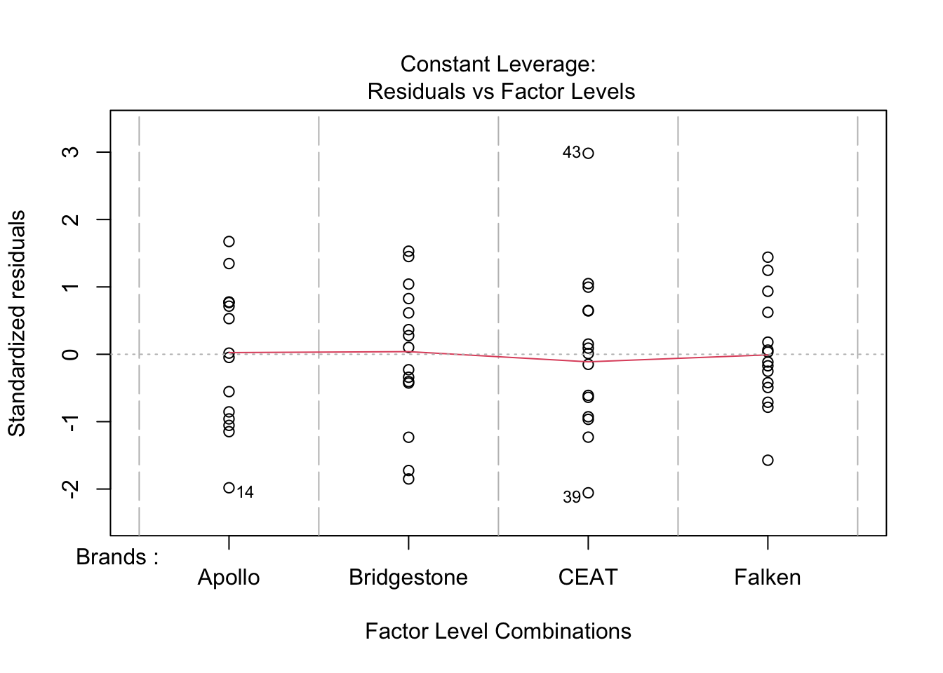
First we can plot the residuals using either a QQ plot or a histogram of the residuals themselves. In R we’ll code this as:
# Plot each one by one
plot(tyres.aov)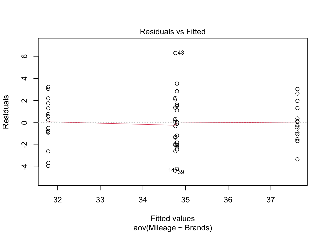
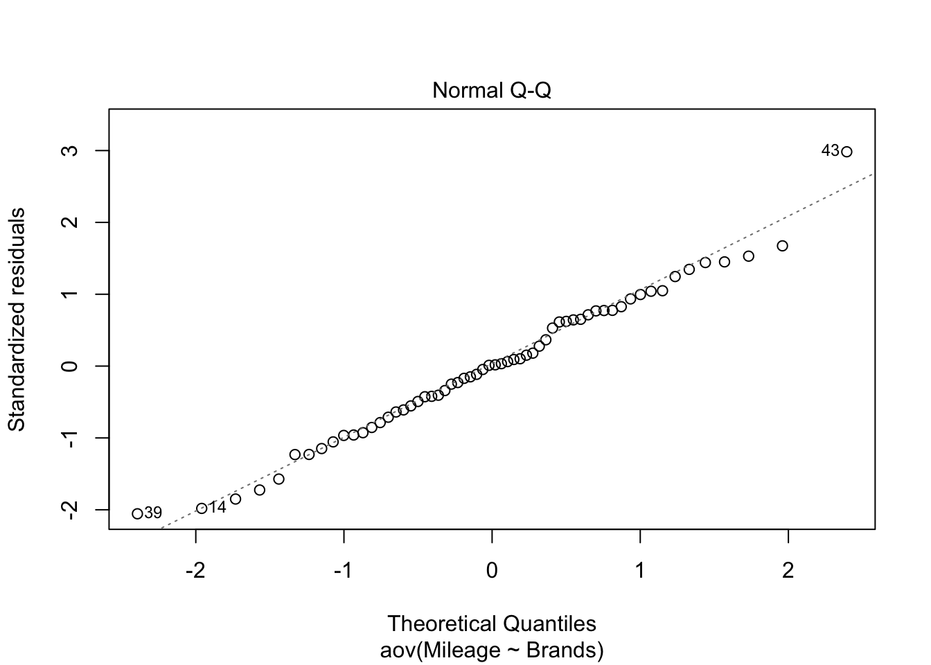
# Plot all 4 at once
par(mfrow=c(2,2))
plot(tyres.aov)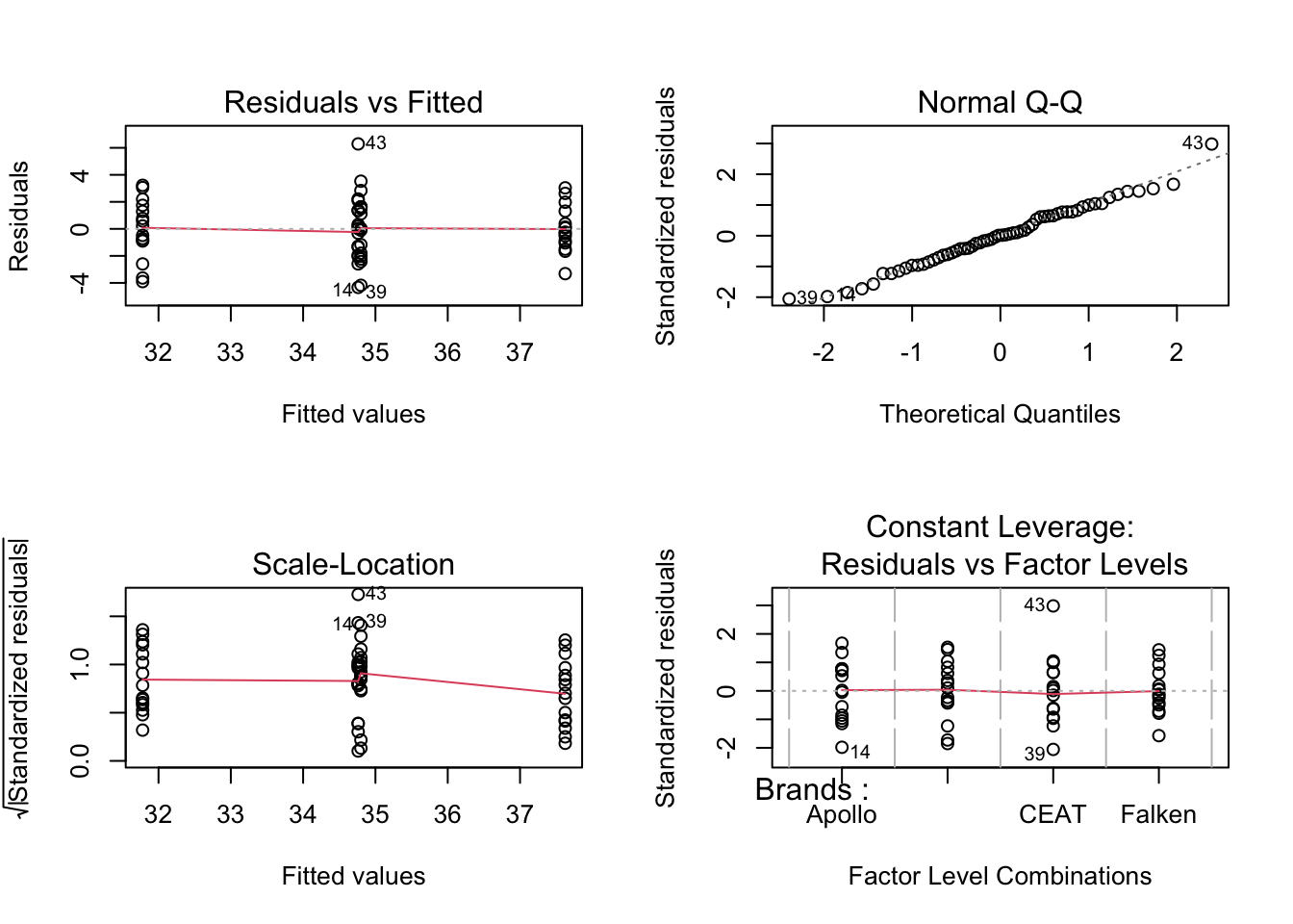
par(mfrow=c(1,1))
# let's grab the residuals from our model
tyre.anova.residuals <- residuals( object = tyres.aov ) # extract the residuals
# A simple histogram
hist( x = tyre.anova.residuals ) # another way of seeing them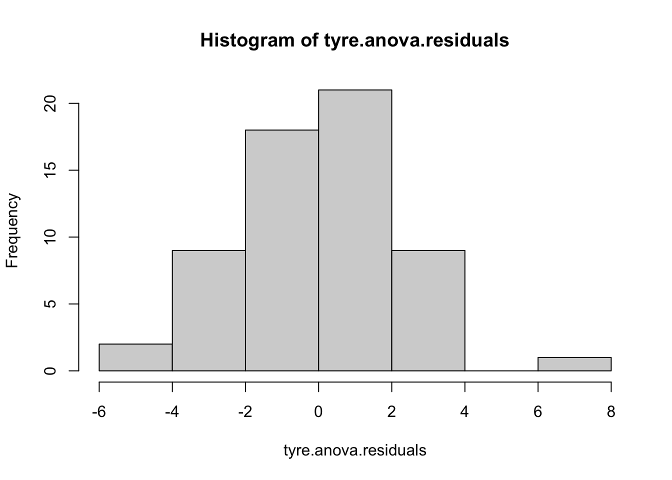
Nothing in these plots indicates we have a major violation. We can confirm that to some degree numerically by simply describing the residuals (describe command results). Let’s also run the two most common tests of the normality assumption (as usual there are others). First the Shapiro-Wilk test and then the Kolmogorov-Smirnov test (against a normal distribution). The summary statistics look good, low skew and kurtosis. The Shapiro-Wilks is simple to run. Feed it our residuals and it answers. Kolmogorov-Smirnov is a little more difficult to set up. It has many more potential uses so we have to feed it not just our data but also the fact that we are comparing to a theoretically cumulative normal distribution with our mean and our standard deviation.
describe(tyre.anova.residuals)## vars n mean sd median trimmed mad min max range skew kurtosis se
## X1 1 60 0 2.13 0.03 0 2.23 -4.33 6.29 10.62 0.15 -0.01 0.27shapiro.test( x = tyre.anova.residuals ) # run Shapiro-Wilk test##
## Shapiro-Wilk normality test
##
## data: tyre.anova.residuals
## W = 0.9872, p-value = 0.7826ks.test(tyre.anova.residuals, "pnorm", mean(tyre.anova.residuals), sd(tyre.anova.residuals) )##
## One-sample Kolmogorov-Smirnov test
##
## data: tyre.anova.residuals
## D = 0.062101, p-value = 0.9637
## alternative hypothesis: two-sidedThe results are opposite of our usual thinking. Usually we would like to reject the null hypothesis. In this case we are glad to see that we can not reject the null. While it doesn’t prove “normality” (you can’t “prove” the null) it does allow us to say we have no reason to suspect our data are significantly non normal.
That’s two of three assumptions checked. The final is homogeneity of variance also known as (homoscedasticity). Since the math in our tests rely on the assumption that the variance for the different brands of tires is more or less equal. We need to check that assumption. I’ll tell you about what to do if it isn’t in a succeeding section.
In his post Professor Ghosh shows the Levene and Bartlett tests. Let’s replicate those and also visit a nuance about the Brown Forsyth test as well. All three tests help us test whether the variances amongst the groups are significantly different. Bartlett is the oldest and most complex mathematically and is sensitive to violations of normality. Levene tests using differences from the mean and Brown Forsyth differences from the median (making it more robust). When you run the leveneTest in R the default is actually a Brown Forsyth to get a true Levene you must specify center = mean.
leveneTest(tyres.aov, center = mean) # traditional Levene## Levene's Test for Homogeneity of Variance (center = mean)
## Df F value Pr(>F)
## group 3 0.6878 0.5633
## 56leveneTest(tyres.aov) # technically a Brown Forsyth## Levene's Test for Homogeneity of Variance (center = median)
## Df F value Pr(>F)
## group 3 0.6946 0.5592
## 56bartlett.test(Mileage~Brands,tyre) # yet another way of testing##
## Bartlett test of homogeneity of variances
##
## data: Mileage by Brands
## Bartlett's K-squared = 2.1496, df = 3, p-value = 0.5419Happily all the results are similar. We can not reject the null therefore we have no reason to question our assumption. The data have been good to us so far. But what should we do if we start having concerns about violating assumptions?
One of the common cases, for example, is just failing to have homogeneity of variance across our factor levels (in this case tire brand). There is a special variation of the ANOVA as well as the t test which allows us to drop the assumption and run the test. If you’ve never seen one you will be surprised that the degrees of freedom may be a decimal and likely quite different from your original. To use it we simply use oneway.test(Mileage ~ Brands, tyre) instead of our original aov(Mileage~Brands, tyre) the one downside is that it does not provide the full classic ANOVA table. It only tests the hypothesis and returns the results.
So in the code below I’ve run the Welch’s, then used oneway.test to run a classic ANOVA with var.equal = TRUE and finally for your convenience a summary of the original.
oneway.test(Mileage ~ Brands, tyre)##
## One-way analysis of means (not assuming equal variances)
##
## data: Mileage and Brands
## F = 21.686, num df = 3.000, denom df = 30.773, p-value = 9.72e-08# versus this which is what we've done so far
oneway.test(Mileage ~ Brands, tyre, var.equal = TRUE)##
## One-way analysis of means
##
## data: Mileage and Brands
## F = 17.942, num df = 3, denom df = 56, p-value = 2.781e-08# versus our original
summary(tyres.aov)## Df Sum Sq Mean Sq F value Pr(>F)
## Brands 3 256.3 85.43 17.94 2.78e-08 ***
## Residuals 56 266.6 4.76
## ---
## Signif. codes: 0 '***' 0.001 '**' 0.01 '*' 0.05 '.' 0.1 ' ' 1Other (Non-parametric) options?
Of course if you really want to be cautious about all of your assumptions (normality and homoscedasticity) then the non-parametric Kruskal-Wallis rank sum test is the way to go. As the name implies it uses ranks for the dependent variable mileage rather than the number of miles itself. What the test essentially does is test the hypothesis that all the group medians are equal. That is the equivalent omnibus test to a traditional Oneway ANOVA. The Dunn test is the analog to the post hoc pairwise comparisons we ran earlier. I’ve shown both separately but conveniently R reports both if you just run the second command.
kruskal.test(Mileage~Brands,tyre)##
## Kruskal-Wallis rank sum test
##
## data: Mileage by Brands
## Kruskal-Wallis chi-squared = 29.733, df = 3, p-value = 1.57e-06dunn.test(tyre$Mileage,tyre$Brands,method = "holm",alpha = 0.01)## Kruskal-Wallis rank sum test
##
## data: x and group
## Kruskal-Wallis chi-squared = 29.7331, df = 3, p-value = 0
##
##
## Comparison of x by group
## (Holm)
## Col Mean-|
## Row Mean | Apollo Bridgest CEAT
## ---------+---------------------------------
## Bridgest | 2.655358
## | 0.0119
## |
## CEAT | 0.156812 -2.498546
## | 0.4377 0.0125
## |
## Falken | -2.791262 -5.446621 -2.948075
## | 0.0105 0.0000* 0.0080
##
## alpha = 0.01
## Reject Ho if p <= alpha/2Clearly we can continue to reject the overall null hypothesis that the brand populations are all equal. But notice that the Dunn test does NOT support the conclusion that 5 out of 6 pairings are different at \(\alpha\) = 0.01. Clearly everything is tantalizingly close and if we were to run the test with the more traditional \(\alpha\) = 0.05 we’re fine right?
Well not exactly and that’s the last thing we’ll cover.
Plot twist – A Bayesian perspective
So up until now we have approaching our work from a strictly frequentist approach (for a great discussion of what that means see LSR pp 555 (and specifically starting at page 581 for ANOVA).
That means we have to be very careful to not talk about our tests returning probabilities (as opposed to setting decision boundaries). Briefly Bayesian methods allow us to calculate the probability or the odds that the mean mileage for Brands is different. If that’s what you’d really like to know in this case please read on.
If we choose a Bayesian approach to our research question we will wind up with something called a Bayes Factor (how original right?). If the Bayes Factor is for example 5 we would say that the odds are 5:1 in favor of the hypothesis that Brands matter. Quite useful if you ask me. We’d need some guidance on how to interpret how strong the odds are (in words) and Kass and Raftery (1995) {quoted in LSR} have provided those:
| Bayes factor | Interpretation | |
|---|---|---|
| 1 - 3 | Negligible evidence | . |
| 3 - 20 | Positive evidence | |
| 20 - 150 | Strong evidence | |
| 150 and above | Very strong evidence |
These seem pretty reasonable. What do we get for a Bayes Factor from our data? The BayesFactor package will tell us. The commands look very similar to what we used earlier.
tyres.bf.aov<- anovaBF(Mileage~Brands, tyre)
summary(tyres.bf.aov)
## Bayes factor analysis
## --------------
## [1] Brands : 435470.5 ±0%
##
## Against denominator:
## Intercept only
## ---
## Bayes factor type: BFlinearModel, JZSThe odds are enormous that brand has an effect on mileage 435,470:1 and that’s a nice statement to be able to make. While covering the Bayesian approach is well beyond this tutorial I do encourage folks to have a look.
I hope you’ve found this useful. I simply built on another’s work and am open to comments, corrections and suggestions.
Chuck
