More On Slopegraphs
About a week ago Bob Rudis created a nice blog post that I saw on my R Bloggers feed that simultaneously:
- Threw a bit of “shade” on the ToS for Axios (well done Bob)
- Showed how to use
EtherCalcas a data entry tool - And, most importantly to me, showed how to make great use of a slopegraph
I happened to be on vacation at the time but as soon as I got back and caught up I vowed to follow up since slopegraphs have always fascinated me and I happened to write a function to make them, about a year back. I wanted to look at Bob’s post in detail after very quickly agreeing with his premise that it was a much better choice than a “dumbbell chart”. So this post is about what I learned and the adjustments I made to my own function.
This post assumes that you’ve read the earlier posts.
Let’s quickly recreate the dataset Bob created in EtherCalc keeping it simple
using the str function and choosing to make it a dataframe not a tibble.
library(tidyverse)
# Get the latest version from GitHub
# install.packages("devtools")
# devtools::install_github("ibecav/CGPfunctions")
library(CGPfunctions)

thedata <- structure(list(
  topic = structure(c(6L, 3L, 5L, 4L, 11L, 13L,
                      2L, 8L, 9L, 12L, 7L, 1L, 14L, 10L),
          .Label = c("Arts & entertainment",
                    "Business", "Climate change", "Economics", "Education", "Health care",
                    "Immigration", "National Security", "Politics", "Religion", "Science",
                    "Sports", "Technology", "U.S. foreign policy"),
           class = "factor"),
          actually_read = c(7L, 5L, 11L, 6L, 10L, 14L, 13L, 1L, 2L, 3L, 4L, 8L, 9L, 12L),
          say_want_covered = c(1L, 2L, 3L, 4L, 7L, 8L, 11L, 5L, 10L, 14L, 6L, 13L, 9L, 12L)),
          class = "data.frame", row.names = c(NA, -14L))
thedata
## topic actually_read say_want_covered
## 1 Health care 7 1
## 2 Climate change 5 2
## 3 Education 11 3
## 4 Economics 6 4
## 5 Science 10 7
## 6 Technology 14 8
## 7 Business 13 11
## 8 National Security 1 5
## 9 Politics 2 10
## 10 Sports 3 14
## 11 Immigration 4 6
## 12 Arts & entertainment 8 13
## 13 U.S. foreign policy 9 9
## 14 Religion 12 12Making slopegraphs easy
When you look at Bob’s post there’s actually a lot of code in there to make a
very nice graphic. Being extraordinarily lazy I wrote my function to get a
slopegraph with the least amount of work possible. The first step, which is
unavoidable if you want to make use of newggslopegraph, though is to reshape
the data into a “longer” format. We’ll use reshape2::melt and keep the topic
column but collapse the other two columns into a factor called Saydo and put the
actual “rank” into a column called Rank. Since “actually_read” and
“say_want_covered” are now factor levels instead of column names we can use
forcats::fct_recode to make them much nicer built in labels when we make our
plot. Voila a new dataframe called temp.
temp <- reshape2::melt(data = thedata,
                       id = "topic",
                       variable.name = "Saydo",
                       value.name = "Rank")
temp$Saydo <- forcats::fct_recode(temp$Saydo,
                                  "Actually read" = "actually_read",
                                  "Say they want" = "say_want_covered")
temp
## topic Saydo Rank
## 1 Health care Actually read 7
## 2 Climate change Actually read 5
## 3 Education Actually read 11
## 4 Economics Actually read 6
## 5 Science Actually read 10
## 6 Technology Actually read 14
## 7 Business Actually read 13
## 8 National Security Actually read 1
## 9 Politics Actually read 2
## 10 Sports Actually read 3
## 11 Immigration Actually read 4
## 12 Arts & entertainment Actually read 8
## 13 U.S. foreign policy Actually read 9
## 14 Religion Actually read 12
## 15 Health care Say they want 1
## 16 Climate change Say they want 2
## 17 Education Say they want 3
## 18 Economics Say they want 4
## 19 Science Say they want 7
## 20 Technology Say they want 8
## 21 Business Say they want 11
## 22 National Security Say they want 5
## 23 Politics Say they want 10
## 24 Sports Say they want 14
## 25 Immigration Say they want 6
## 26 Arts & entertainment Say they want 13
## 27 U.S. foreign policy Say they want 9
## 28 Religion Say they want 12Once we get the data in the right shape I tried to make newggslopegraph as
simple and intuitive as possible. I love working with ggplot but I will admit
it can get quite complex. So to create the default plot all we need to do is:
newggslopegraph(dataframe = temp,
                Times = Saydo,
                Measurement = Rank,
                Grouping = topic)
##
## Converting 'Saydo' to an ordered factor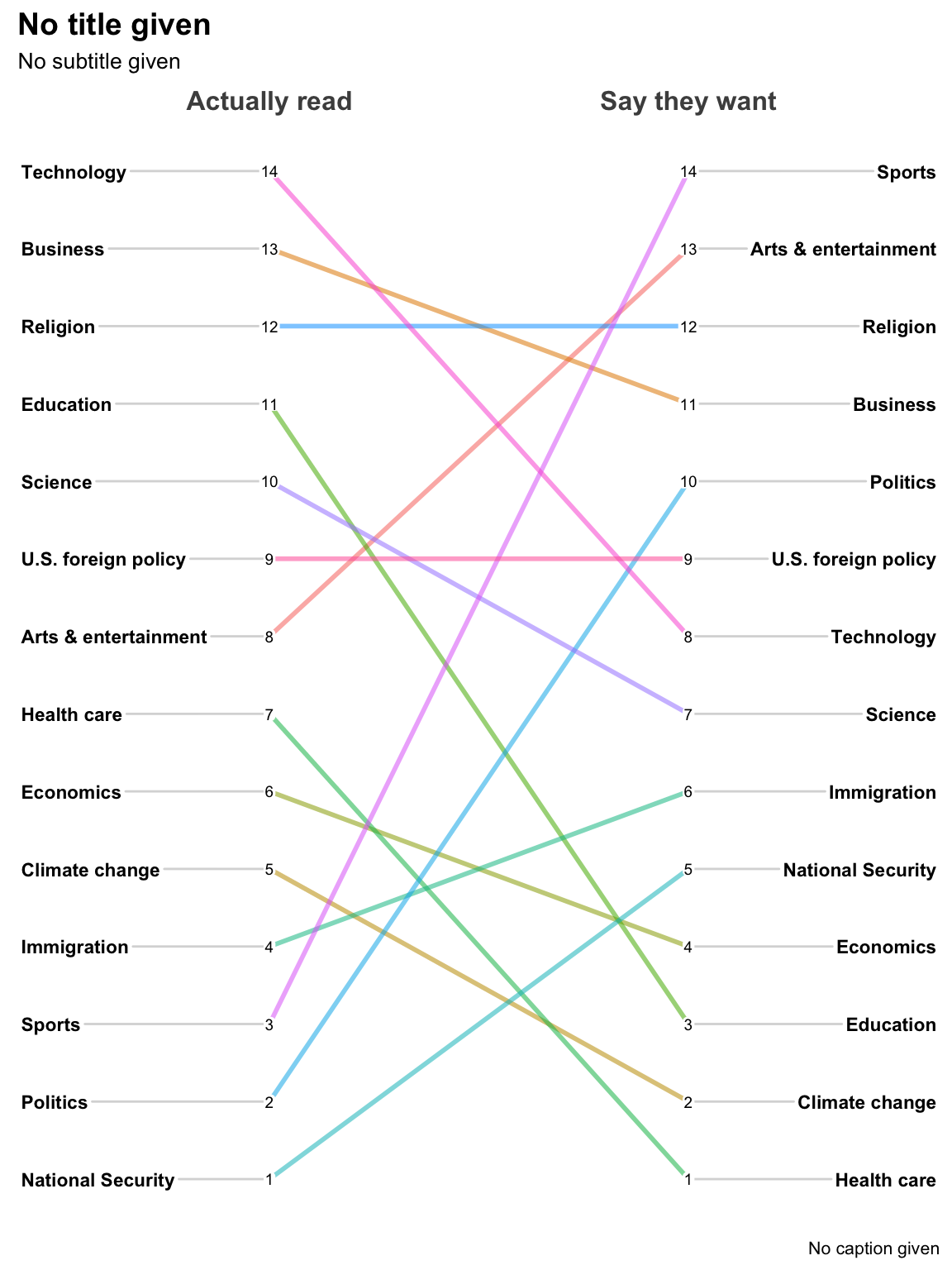
That was pretty painless wasn’t it? But clearly there’s a lot of room for tweaking! Let’s make it better!
Tweaking
Whole books can and have been written just on the issue of graphic design so I’m not going to try and summarize it all in one little blog post. I will however, for the impatient reader, immediately take care of a few key things:
Titles, subtitles and captions are important! Don’t ignore them or give them short change. You’ll notice that since we didn’t initially specify them, placeholders appear. That’s to be shameless about making you think about them even if you eventually decide to turn them “off” (read the doco)
The default is that every line is it’s own color. That’s seldom a good choice for telling a story unless the number of topics (a.k.a.
Groups) is very small. For now let’s make them all “black” and come back to this in a bit.By default
Measurementis treated as a real number so the highest values are on the top of the graph. Makes more sense here to reverse the scale and put the highest ranked “1” at he top.ReverseYAxis = TRUE. If we needed or wanted toReverseXAxis = TRUEmight be useful.
Our second attempt looks like this:
newggslopegraph(dataframe = temp,
                Times = Saydo,
                Measurement = Rank,
                Grouping = topic,
                ReverseYAxis = TRUE,
                Title = "14 Topics Ranked by What Americans Read vs Want Covered",
                SubTitle = "'Read' rank from Parse.ly May 2019 data.\n'Want covered' rank from Axios/SurveyMonkey poll conducted May 17-20, 2019",
                Caption = "Source: Axios <https://www.axios.com/news-consumption-read-topics-56467fe6-81bd-4ae5-9173-cdff9865deda.html>\nMakeover by @hrbrmstr",
                LineColor = "black"
                )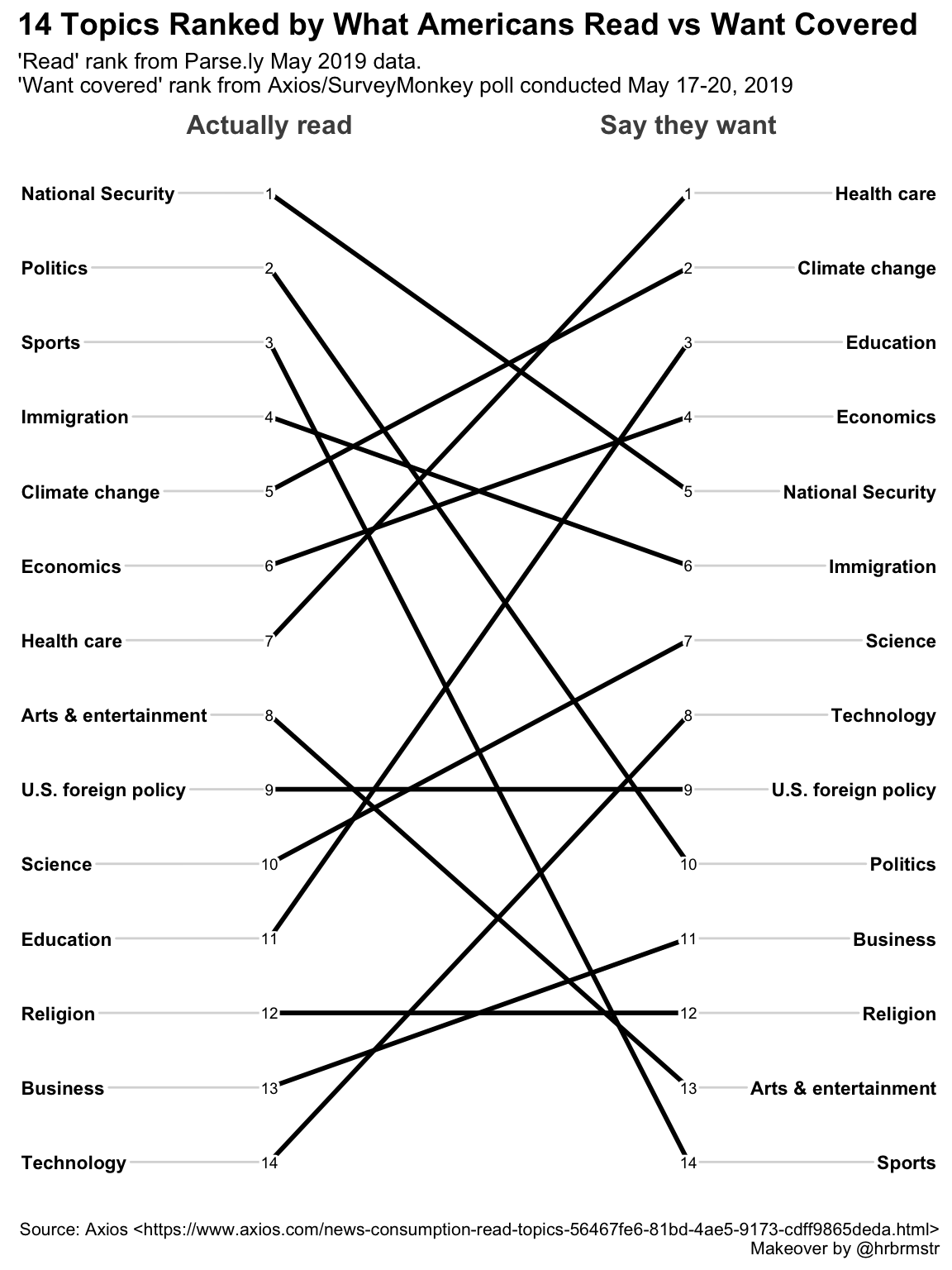
Alright, that’s looking a little bit better for basic layout. But it doesn’t yet tell the reader a story and focus their attention on the message we want to convey. To be honest I’m not a huge fan of adding a lot of annotations to a plot so let’s first try to catch the readers attention by using color selectively.
Emphasizing the “slope” in slopegraph
As the name implies slopegraphs get the reader to attend to relative differences
in slope, right now our choice of “black” as the only color is marginally better
than our original multicolor mess but still falls far short of conveying a
message. The LineColor parameter is quite flexible. The default is suitable
for a small number of topics, a single color can be the right choice on occasion,
but we can also pass it a character vector of colors that is as customized as we
like. For example LineColor = c("black", "red") would recycle the colors red
and black to create an alternating pattern. We could even build a named list
that associates a color to each of the topic areas if we desired (see the
vignette
for an example). But right now, that is too much effort and I’d like to
handle this by algorithm not by manually entry.
As a start point let’s assume we’d like to get the reader to focus on
understanding which topics increase in rank, decrease in rank or stay the same.
We’ll color increase as black, decreases as red and things that remain level as
light gray. We can accomplish that through a series of pipes and dplyr
verbs.
colorvect <- temp %>% group_by(topic) %>%
  summarise(difference = diff(Rank)) %>%
  mutate(whatcolor = case_when(
    difference == 0 ~ "light gray",
    difference > 0 ~ "red",
    difference < 0 ~ "black"
  )) %>%
  select(topic, whatcolor) %>%
  tibble::deframe()
## `summarise()` ungrouping output (override with `.groups` argument)colorvect## Arts & entertainment Business Climate change
## "red" "black" "black"
## Economics Education Health care
## "black" "black" "black"
## Immigration National Security Politics
## "red" "red" "red"
## Religion Science Sports
## "light gray" "black" "red"
## Technology U.S. foreign policy
## "black" "light gray"Each topic now has a color assigned, and it’s trivial to pass our color vector
to newggslopegraph. While we’re at it we can showcase some of the other
formatting options, like changing font sizes for the labels. DataLabelPadding
is important if you are likely to have datapoints close together (see the
vignette
for the cancer data) but in this case we can be more generous since
ranks won’t overlap.
newggslopegraph(dataframe = temp,
                Times = Saydo,
                Measurement = Rank,
                Grouping = topic,
                ReverseYAxis = TRUE,
                DataTextSize = 3.5,
                YTextSize = 4,
                XTextSize = 16,
                DataLabelPadding = .2,
                Title = "Topic Rankings Compared Between\nWhat Americans Actually Read vs Want Covered",
                SubTitle = "'Actually Read' rank from Parse.ly May 2019 data.\n'Want covered' rank from Axios/SurveyMonkey poll conducted May 17-20, 2019",
                Caption = "Source: Axios <https://www.axios.com/news-consumption-read-topics-56467fe6-81bd-4ae5-9173-cdff9865deda.html>\nMakeover by @hrbrmstr",
                LineColor = colorvect
)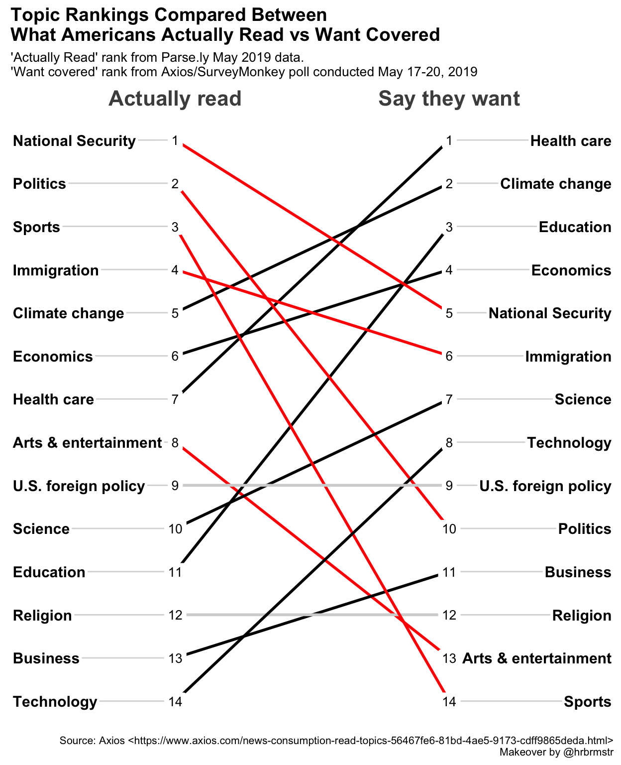
Very nice looking, but I think it is still too crowded with colors. Let’s adjust our coloring to highlight only the larger rank differences. It’s a matter of personal taste but easy to adjust our little script and test, rinse and repeat until we’re happy. Let’s adjust so that changes of greater than 4 or less than 4 are highlighted and the rest are gray.
colorvect <- temp %>% group_by(topic) %>%
  summarise(difference = diff(Rank)) %>%
  mutate(whatcolor = case_when(
    difference >= 4 ~ "red",
    difference <= -4 ~ "black",
    TRUE ~ "light gray"
  )) %>%
  select(topic, whatcolor) %>%
  tibble::deframe()
## `summarise()` ungrouping output (override with `.groups` argument)Then we can run the same lines into newggslopegraph.
newggslopegraph(dataframe = temp,
                Times = Saydo,
                Measurement = Rank,
                Grouping = topic,
                ReverseYAxis = TRUE,
                DataTextSize = 3.5,
                YTextSize = 4,
                XTextSize = 16,
                DataLabelPadding = .2,
                Title = "Topic Rankings Compared Between\nWhat Americans Actually Read vs Want Covered",
                SubTitle = "'Actually Read' rank from Parse.ly May 2019 data.\n'Want covered' rank from Axios/SurveyMonkey poll conducted May 17-20, 2019",
                Caption = "Source: Axios <https://www.axios.com/news-consumption-read-topics-56467fe6-81bd-4ae5-9173-cdff9865deda.html>\nMakeover by @hrbrmstr",
                LineColor = colorvect
)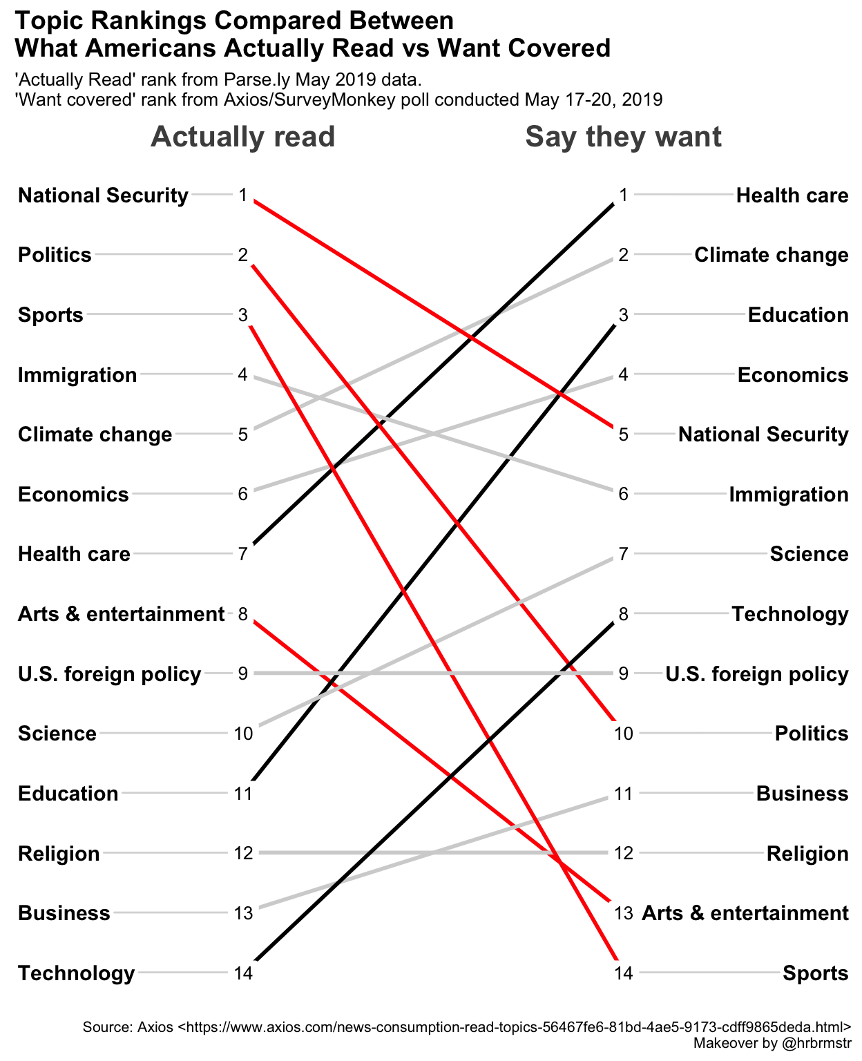
Personally, I think that even 7 topics may be too much, but hopefully you’re getting the point that while we’re not losing any information, we’re making it easier for the reader to focus on the big changes in the data. It’s easy to discern the pattern whether it’s answering a simple question, such as what is the number one thing they say they want to read about (Health care), or a more complex question such as which topic has the biggest disparity (Sports).
Use titles, subtitles and captions well
One thing we can do to make our message clearer is make better use of the title and subtitle areas. It seems simple but is too often forgotten. While we’re at it I’ll highlight a couple of new capabilities I added to the function:
The ability to choose from a select number of
ggplotthemes. In this case Bob Rudisipsum_rctheme.Control the justification of the titles and subtitles and caption.
But the most important change here IMHO is simply choosing words for the title and subtitle that convey what we want to look for in the plot or think about.
newggslopegraph(dataframe = temp,
                Times = Saydo,
                Measurement = Rank,
                Grouping = topic,
                ReverseYAxis = TRUE,
                DataTextSize = 3.5,
                YTextSize = 3.2,
                XTextSize = 14,
                DataLabelPadding = .2,
                Title = "Americans Don't Actually Read the News They Say They Want",
                SubTitle = "Many sharp differences in rankings in both directions. Hypocrisy, laziness or gratification?",
                Caption = "Source: Rud.is <https://rud.is/b/2019/06/11/makeover-jumbalaya-beating-dumbbells-into-slopegraphs-whilst-orchestrating-ethercalc/>\nMakeover by @hrbrmstr",
                LineColor = colorvect,
                ThemeChoice = "ipsum",
                TitleTextSize = 18,
                SubTitleTextSize = 12,
                SubTitleJustify = "right")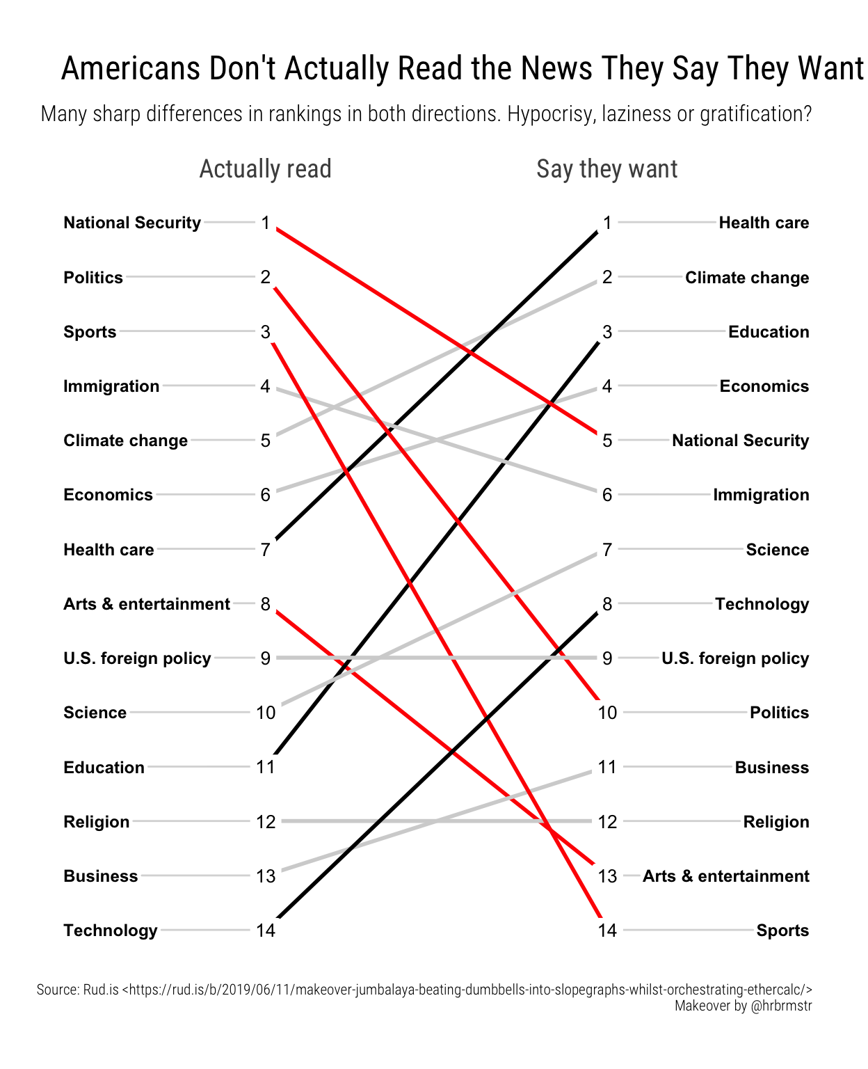
The same plot in Wall Street Journal style (wsj)
newggslopegraph(dataframe = temp,
                Times = Saydo,
                Measurement = Rank,
                Grouping = topic,
                ReverseYAxis = TRUE,
                ReverseXAxis = TRUE,
                DataTextSize = 3.5,
                YTextSize = 4,
                XTextSize = 13,
                DataLabelPadding = .2,
                Title = "Americans Don't Actually Read the News They Say They Want",
                SubTitle = "Many sharp differences in rankings in both directions.\nHypocrisy or laziness or gratification?",
                Caption = "Source: Rud.is <https://rud.is/b/2019/06/11/makeover-jumbalaya-beating-dumbbells-into-slopegraphs-whilst-orchestrating-ethercalc/>\nMakeover by @hrbrmstr",
                LineColor = colorvect,
                ThemeChoice = "wsj",
                TitleTextSize = 15,
                CaptionTextSize = 6,
                SubTitleTextSize = 11,
                SubTitleJustify = "right"
)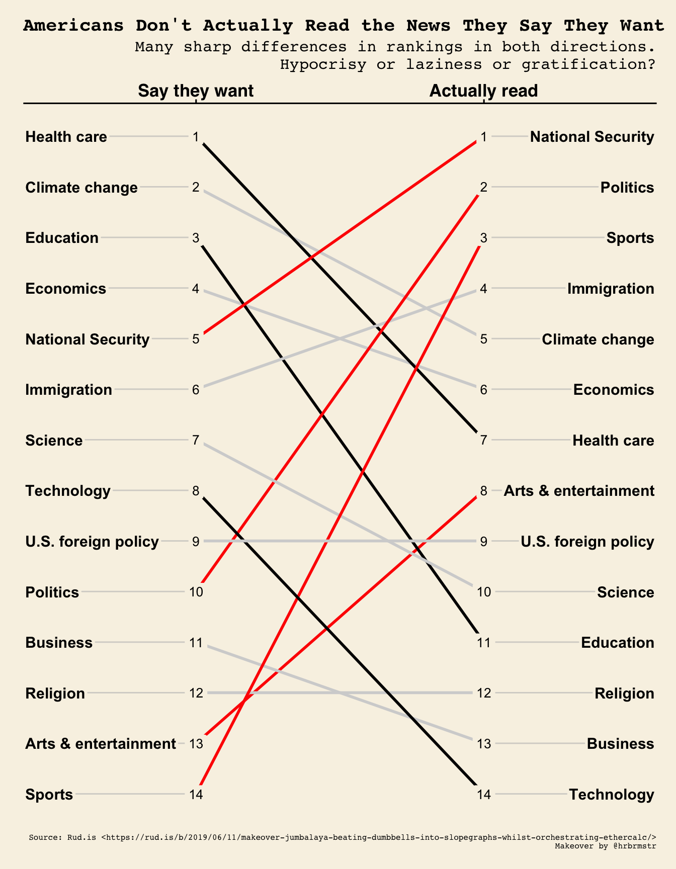
I’m not actually sure I like it better at all but simply demonstrating capability
A final example
In Bob’s blog post he demonstrated how to add lines and arrows and text to add
annotation to his plot. I’m of the mindset that less is more and too much
annotation can be a distraction not an aid to telling our story. As you can see
from his code it is also relatively complex using native ggplot::geom_*’s to
place things exactly right.
I actually find cowplot easier to use for simple annotation. In the example
below I’ll shift to the gdocs theme. Save the plot and then use cowplot to add
one important factoid!
p <- newggslopegraph(dataframe = temp,
                Times = Saydo,
                Measurement = Rank,
                Grouping = topic,
                ReverseYAxis = TRUE,
                DataTextSize = 3.5,
                YTextSize = 4,
                XTextSize = 14,
                DataLabelPadding = .2,
                Title = "Americans Don't Actually Read the News They Say They Want",
                SubTitle = "Many sharp differences in rankings in both directions. Hypocrisy, laziness or gratification?",
                Caption = "Source: Rud.is <https://rud.is/b/2019/06/11/makeover-jumbalaya-beating-dumbbells-into-slopegraphs-whilst-orchestrating-ethercalc/>\nMakeover by @hrbrmstr",
                LineColor = colorvect,
                ThemeChoice = "gdocs",
                TitleTextSize = 16,
                TitleJustify = "center",
                SubTitleTextSize = 12,
                SubTitleJustify = "center"
)

cowplot::ggdraw(p) +
  cowplot::draw_label(label = "Reading about sports shows the\nlargest difference in ranking --\n11 places!",
                      colour = "dark blue",
                      size = 10,
                      y = .10,
                      x = .53,
                      fontface = "italic")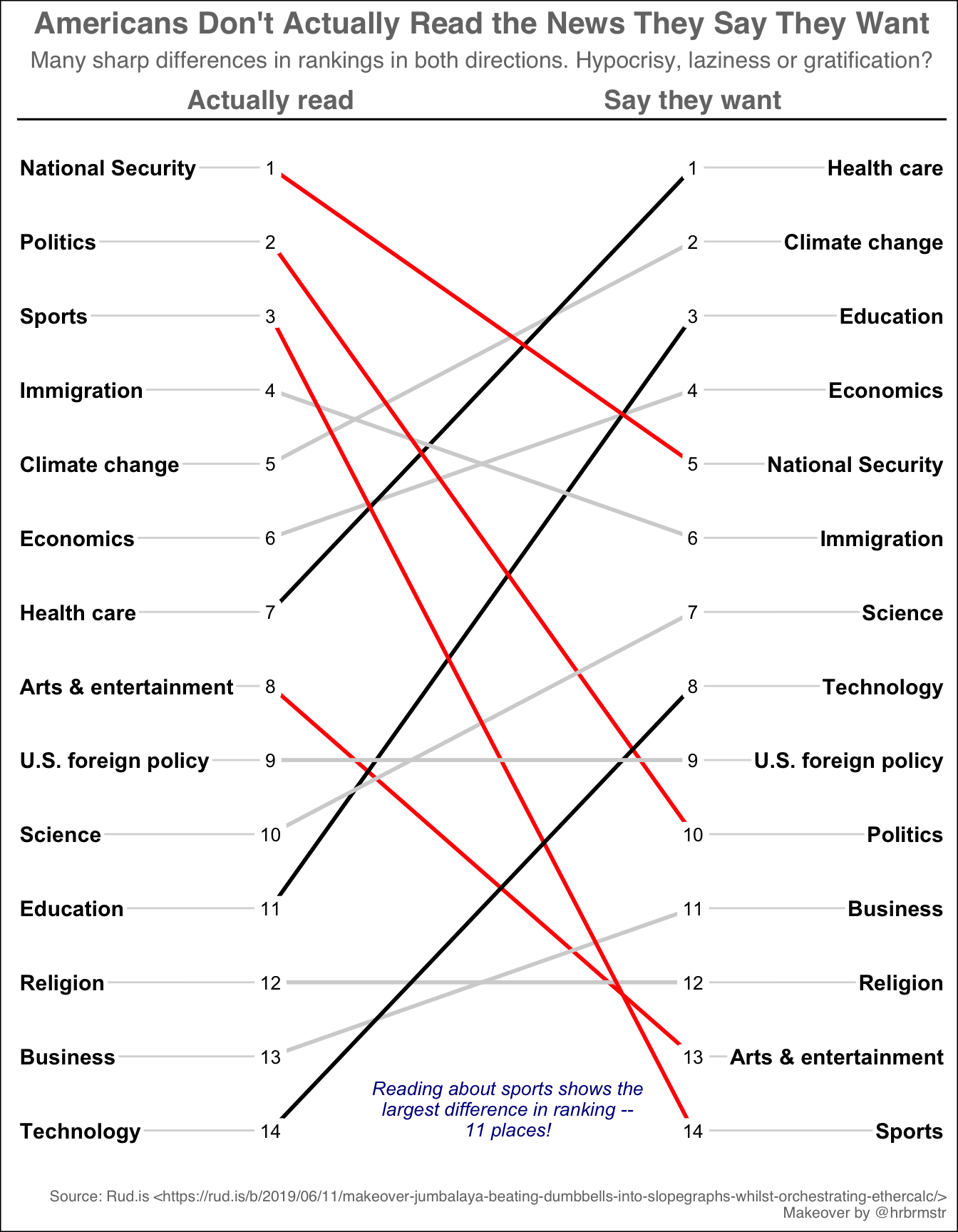
Done
I really enjoyed Bob’s original post and was happy to be inspired to make a few
changes to newggslopegraph to hopefully make it more useful . I am always open
to comments, corrections and suggestions. Feel free to leave a comment in disqus
or send me an email.
Chuck
This work is licensed under a Creative Commons Attribution-ShareAlike 4.0 International License

