I didn't mean() to ignore the median()
This week’s post follows directly from last week’s
investigation
of data from the 2016 US Census Bureau’s American Community Survey (ACS) Public
Use Microdata Sample
(PUMS). We explored
mean differences in income across several different types of employment status
(self-employed, private sector, government, etc.). We found, using bayesian
methods, strong evidence for differences across the categories and were able to
plot them in a variety of formats using ggplot2 and ggsignif.
While I was very happy with the plot results (which was my primary interest)
something was nagging me the whole time I was writing the post. Our outcome
measure was income and both our data and the prevailing wisdom from a vast
amount of research is that income data tend to be skewed or suffer from a floor
effect or any number of ways of saying that perhaps the median (or some other
measure of central tendency) is a much better measure than the mean.
Ironically, it is actually very common for income to be an exemplar in
undergraduate statistics texts to be discussed in context of the dangers of
using the mean. Here’s an example from my favorite undergrad text book Learning
Statistics with R - section
5.1.5.
As you look at our data plot  it is pretty clear that the string of data points on the high end of income in
several categories may be unduly influencing our results. The risk wouldn’t be
quite so bad if the data were consistent across employment categories but a
visual inspection makes us wonder, especially since we can “see” the difference
between the median (the solid black line near the center of the boxplot) and the
mean (plotted here as a dark red box).
For this post then, we’re going to explore comparing medians in a bayesian
framework and along the way spend a minute or two on credible intervals.
Read on! I’ll say it again below but comments and critique are always welcomed
via disqus or email. You’ll have no trouble finding the icon links in a couple
of places.
To the data cave!
A colleague of mine loves to call her office her “data cave”. I love the term and it reminds me of the old school Batman series on television, “To the Bat Cave, Robin”. So let’s go to our virtual data cave and get things setup.
We’ll once again grab the data set from the WinVector Github site, load the packages we need (hiding the load messages), set my favorite ggplot theme, and do a little factor cleanup. If you need a refresher see the last post for details.
library(tidyverse)
library(BayesFactor)
library(ggsignif)
library(scales)

theme_set(theme_bw()) # set theme

location <- "https://github.com/WinVector/PDSwR2/raw/master/PUMS/incomedata.rds"
incomedata <- readRDS(url(location))

incomedata$gp <- NULL

incomedata$employment <- fct_recode(incomedata$employment,
  "Self Not Inc" = "Self employed not incorporated",
  "Self Incorporated" = "Self employed incorporated",
  "Private for Profit" = "Employee of a private for profit",
  "Private Non Profit" = "Private not-for-profit employee",
  "Federal Government" = "Federal government employee",
  "State Government" = "State government employee",
  "Local Government" = "Local government employee"
)

incomedata$employment <- forcats::fct_reorder(
  .f = incomedata$employment,
  .x = incomedata$income,
  .fun = mean
)


# In case I want to reduce down to 3 more fundamental
# categories Private, Government, or self employed
incomedata$empcategory <- fct_collapse(incomedata$employment,
  "Self" = c("Self Not Inc", "Self Incorporated"),
  "Private" = c("Private for Profit", "Private Non Profit"),
  "Government" = c("Federal Government", "State Government", "Local Government")
)

str(incomedata)
## 'data.frame': 22241 obs. of 6 variables:
## $ income : num 22000 21000 25800 25000 20200 36000 20000 30000 23000 5000 ...
## $ age : num 24 31 26 27 27 47 24 41 43 21 ...
## $ sex : Factor w/ 2 levels "Male","Female": 1 2 2 2 2 1 1 1 2 2 ...
## $ employment : Factor w/ 7 levels "Self Not Inc",..: 2 4 2 2 4 2 2 2 2 2 ...
## $ education : Factor w/ 9 levels "no high school diploma",..: 1 4 4 6 4 2 1 1 6 2 ...
## $ empcategory: Factor w/ 3 levels "Self","Private",..: 2 2 2 2 2 2 2 2 2 2 ...Okay we have the data we need. For those who cynically believe that visual
inspection may be an aphorism for “draw any conclusion you like from the
picture” let’s just quickly confirm we have a positive skew with psych::skew
(rounded). In our case the answer is round(psych::skew(incomedata$income), 2)
= 1.78. While we’re at it let’s confirm
my allegation that skewness varies by group using psych::describeBy. I wasn’t
making it up!
psych::describeBy(incomedata$income,
                  group = incomedata$employment,
                  mat = TRUE,
                  digits = 2) %>%
  mutate(.data = .,
         Employment_Type = group1,
         trimmed_mean = trimmed) %>%
  select(Employment_Type,
         mean,
         sd,
         median,
         skew,
         n,
         trimmed_mean)
## Employment_Type mean sd median skew n trimmed_mean
## 1 Self Not Inc 41382.50 34209.02 30000 1.73 829 35792.72
## 2 Private for Profit 51163.99 38744.57 40000 1.82 16170 44932.92
## 3 State Government 52612.39 29331.94 47150 1.64 1028 49269.63
## 4 Private Non Profit 52996.20 34389.69 45000 1.85 1573 48085.83
## 5 Local Government 53720.47 29438.20 48000 1.29 1492 50763.72
## 6 Federal Government 65311.26 34790.20 60000 0.73 580 62641.60
## 7 Self Incorporated 66906.44 51983.28 50000 1.52 569 58579.12We’re skewed! How do we fix it?
There are any number of ways we can address the skew issue (I won’t try methods such as: hoping your reader/reviewer is inattentive or praying to your favorite deity). When I say any number I mean a lot of different ways we can address the issue. While non-exhaustive they generally lump into one of three categories. We can trim, we can transform, or we can use non-parametric methods (which is a bit disingenuous since some of the non-parametric methods themselves rely on transforming our data – we’ll get to that in a minute). Let’s briefly discuss.
Trim. We can “trim” the high and lows hoping this will eliminate any troubling values at both ends. You may be surprised to know that capability is built into
mean()in base R, andmean(incomedata$income, , trim = .1)will work. For those of you paying attention I grabbed that info when I ranpsych::describeBy. As you would expect for each of our groups it has produced a trimmed mean which is closer to the median than our original mean. My problem with it is threefold. I hate throwing away data. In this case we have plenty but still. Second, there is no one right answer as to how much we should trim? Why .1? Why not .05 or .2? It can make you suspicious that we are simply picking an amount of trimming that best serves our agenda. Finally, it implicitly makes the extreme values wrong or invalid or “not right”. In this case there is little evidence that this is true. The income values don’t look impossible or wrong, they just seem to reflect that there are people who make much more and that zero is as low as it goes. Personally I tend to only use trimming when I think the measurement is producing bad values typically on both ends of the spectrum.Transform. One of the common solutions to the income data problem is to transform the variable. The transformation can take the form of a square root, a log, or a more complex method such as Box-Cox or Yeo-Johnson. The later is especially useful if your variable can validly take on negative values (negative income anyone?). All of these methods are likely to “fix” our positive skew problem since they will all serve to “pull” our data to the left in a consistent way. All of them make it more difficult to describe our results since for many readers the log of income is not a natural concept. The other limitation here is that there is no one approved transform all will serve to “improve” our skew but we’re subject to being questioned as to why we selected one unless it is a disciplinary custom or for reasons of comparison.
Non-parametric. For our particular case there are two non parametric methods we would select. For the overall comparison of income across the 7 levels of Employment it would be the Kruskal-Wallis. For pairwise comparisons as we did last post it would be the Mann-Whitney U (a.k.a. Wilcoxon rank sum) test. If you look back you’ll even notice that the Wilcoxon rank sum test
wilcox.test()is the default forggsignif. As I mentioned earlier these tests are actually a sort of transformation as well since they rely on the ranks of our data rather than the data itself. I admit to having a bias towards (maybe even a fondness for) non-parametric tests. While they aren’t perfect and have limitations I take a certain amount of solace in knowing that any supported findings were by using tests that at least eliminate some number of assumptions.
So after last week’s posting I went sleuthing for the Bayesian equivalent to the
Mann Whitney and Kruskal-Wallis tests. Yes I recognize that with powerful
software like Stan you can pretty much construct any data analysis you want but
I was hoping for something more “off the shelf” something very much like
BayesFactor::ttestBF. No luck, I won’t claim I searched everywhere but I did
search a lot for anything already done for R. Lot’s of theoretical papers and
some questions but no solutions. If I missed it, and someone knows about it,
please share.
Since I have been tracking the progress of JASP (unsolicited praise – it
looks like a great piece of software especially if you come from the world of
SPSS which I do). A lot of the calculation that is done under the very nice
GUI is powered by R code and libraries. I noticed that they had recently
implemented a Bayesian version of the Mann Whitney so I decided to give it a
try. No joy! Using the very same data I have been using for these blog posts
it ran for well over an hour and hadn’t completed. When I came back the next day
it had completed and produced what appeared to be reasonable results on the
surface but I had to do some sleuthing because the very long run time had me
confused.
The underlying code is open source and you can see it here. After a little bit of fiddling I was able to separate the JASP interface pieces from the R code that produces the results. I was thwarted again. Even on a much smaller dataset like ggplot2::mpg the results are slow and unstable. That’s not meant as a complaint I know they are working on it and I know working through the ties is challenging.
A Eureka and a “YouRankA”
Temporarily thwarted – something in the back of my mind made me remember dimly
from the past considering the case of t tests on rankings. It had been a long
time (nowadays it so trivial to run for example wilcox.test) and I wasn’t quite
sure how comparable the results would be so I went looking. Found research on
the frequentist side at least that the methodologies produce consistent results
(Zimmerman, 2012).
So if I can’t have a mannwhitneyBF maybe I can ttestBF(rank(income))? Seemed
promising and the initial results seemed to be reasonable as well. The only
challenge seemed to be that the distribution of rank(anything) tends to be
anything but normal. The result tends to be very very flat with almost no tails
at all. Almost a uniform distribution. Hmmmmm, which is a worse violation of
t-test assumptions, skewed or flat?
As I was puzzling on that I stumbled upon another avenue of exploration from a blog post by Andrew Gelman at Columbia here and here. Quoting…
“Take-home message: I am not saying that the rank-then-inverse-normal-transform strategy is always or even often a good idea. What I’m saying is that, if you were planning to do a rank transformation before analyzing your data, I recommend this z-score approach rather than the classical Wilcoxon method.” Gelman (July 2015)
That sounded promising. Was there an easy way for someone like me to implement his better than Wilcoxon suggestion (point taken that he repeatedly says “I’m not saying you should transform the data. I’m saying that if you were going to do Wilcoxon, then you’re already doing a rank transformation, in which case I think it makes sense to do it in an expandable way, rather than getting hung up on some pre-tabulated test statistics.”)?
Turns out there is. And it’s easy. And it’s already written and packaged in the
RNOmni package on CRAN. The
function is RankNorm and straight from the description what it does is:
“Applies the rank based inverse normal transform (INT) to a numeric vector. The
INT can be broken down into a two-step procedure. In the first, the
observations are transformed onto the probability scale using the empirical cumulative
distribution function (ECDF). In the second, the observations are transformed
onto the real line, as Z-scores, using the probit function.”. The key component
of the function is qnorm((r - k)/(n - 2 * k + 1)) where r is the rank, n the
number of observations, and k = 3/8 = the Blom transform.
I just realized I’ve been rambling for quite some time without a single graphic or plot. Perhaps this is a good time to just display the original income data and what the various transformations would do to them. I’ll plot them as density plots and superimpose the theoretical normal curve in a different color.
Let’s use cowplot and make 7 plots in order:
- The original
incomedata - Transform income to a z score (mean = 0, sd = 1)
scale(income) - Transform
sqrt(income) - Transform
log(income) - Transform
VGAM::yeo.johnson(income, lambda = .1) - Transform
rank(income) - Transform
RNOmni::RankNorm(income)
So as a first step we’ll use the mutate function to create these new variables. We’ll deliberately name them all so they end with "_income". In a minute we’ll use that little bit of consistency to make our lives easier.
incomedata <-
  incomedata %>%
  mutate(z_income = as.numeric(scale(income)),
         sqrt_income = sqrt(income),
         log_income = log(income),
         yj_income = VGAM::yeo.johnson(income, lambda = .1),
         rank_income = rank(income),
         rint_income = RNOmni::RankNorm(income)
         )

glimpse(incomedata)
## Rows: 22,241
## Columns: 12
## $ income <dbl> 22000, 21000, 25800, 25000, 20200, 36000, 20000, 30000, 2…
## $ age <dbl> 24, 31, 26, 27, 27, 47, 24, 41, 43, 21, 29, 30, 28, 43, 3…
## $ sex <fct> Male, Female, Female, Female, Female, Male, Male, Male, F…
## $ employment <fct> Private for Profit, Private Non Profit, Private for Profi…
## $ education <fct> "no high school diploma", "some college credit, no degree…
## $ empcategory <fct> Private, Private, Private, Private, Private, Private, Pri…
## $ z_income <dbl> -0.791115497, -0.817539654, -0.690703699, -0.711843025, -…
## $ sqrt_income <dbl> 148.32397, 144.91377, 160.62378, 158.11388, 142.12670, 18…
## $ log_income <dbl> 9.998798, 9.952278, 10.158130, 10.126631, 9.913438, 10.49…
## $ yj_income <dbl> 17.17967, 17.05353, 17.61618, 17.52934, 16.94867, 18.5516…
## $ rank_income <dbl> 3941.5, 3694.5, 5444.5, 5082.0, 3531.0, 9310.0, 3191.0, 6…
## $ rint_income <dbl> -0.9260927, -0.9697185, -0.6910214, -0.7438702, -0.999640…A quick glimpse indicates we have what we need. So we have seven variables and
we’re going to create 7 identical plots using ggplot. For each plot we’ll
plot the density function for our observations (a more granular histogram so
to speak). We’ll also plot the theoretical normal curve for that variable using
dnorm() with the mean and standard deviation for the variable.
We could just write (mainly cut and paste) the call to ggplot 7 times. But
that seems wasteful. Instead we’ll use purrr:pmap to do what we want with a
lot less code. pmap wants a list that has as it’s components the 3 things that
are going to vary for each of the seven iterations. The 3 things are the name of
the variable, the mean, and the sd for the variable. Since ggplot can be
fickle about passing it bare variable names we’ll pass it character strings for
the name. The mean and the sd of course are numeric types. Again we could
manually build those vectors but that would be tedious so let’s use some
dplyr::select_at and summarise_at statements to get what we need. Since we
were careful to name our variables so that they all end with “income” we can use
vars(ends_with("income")) to grab just what we need and not all the variables
in incomedata.
a <- incomedata %>%
  select_at(vars(ends_with("income"))) %>% names

b <- incomedata %>%
  summarise_at(vars(ends_with("income")), mean, na.rm = TRUE)

c <- incomedata %>%
  summarise_at(vars(ends_with("income")), sd, na.rm = TRUE)

plot_list <- list(
  which = a,
  means = b,
  stddevs = c
)

plot_list
## $which
## [1] "income" "z_income" "sqrt_income" "log_income" "yj_income"
## [6] "rank_income" "rint_income"
##
## $means
## income z_income sqrt_income log_income yj_income rank_income
## 1 51939.1 2.884567e-17 214.8975 10.61248 18.97702 11121
## rint_income
## 1 -4.205901e-05
##
## $stddevs
## income z_income sqrt_income log_income yj_income rank_income rint_income
## 1 37844.16 1 75.88434 0.7348988 2.09446 6419.503 0.9991945That took more text to describe than it took code to enact!
Now we invoke ggplot as a function .f. Inside the function call you’ll see ..1, ..2 & ..3 those mark the places where pmap will substitute in the appropriate value of plot_list. The output of pmap is itself a list. A list of ggplot objects. We’ll take that list and give it to cowplot::plot_grid along with some labeling and formatting and voila!
list_of_plots <- pmap(.l = plot_list,
                      .f = ~ ggplot(data = incomedata,
                                    aes_string(x = ..1)
                                    ) +
                                    geom_density(alpha = .2) +
                                    stat_function(fun = dnorm,
                                                  color = "red",
                                                  args = list(mean = ..2,
                                                              sd = ..3)
                                    )
                      )

cowplot::plot_grid(plotlist = list_of_plots,
                   labels = c("Income (Original)",
                              "Z score Income",
                              "SQRT Income",
                              "Log Income",
                              "Yeo Johnson Income",
                              "Ranked Income",
                              "Rank Inv Norm Income"),
                   label_size = 12,
                   vjust = 1,
                   hjust = 0,
                   scale = .9)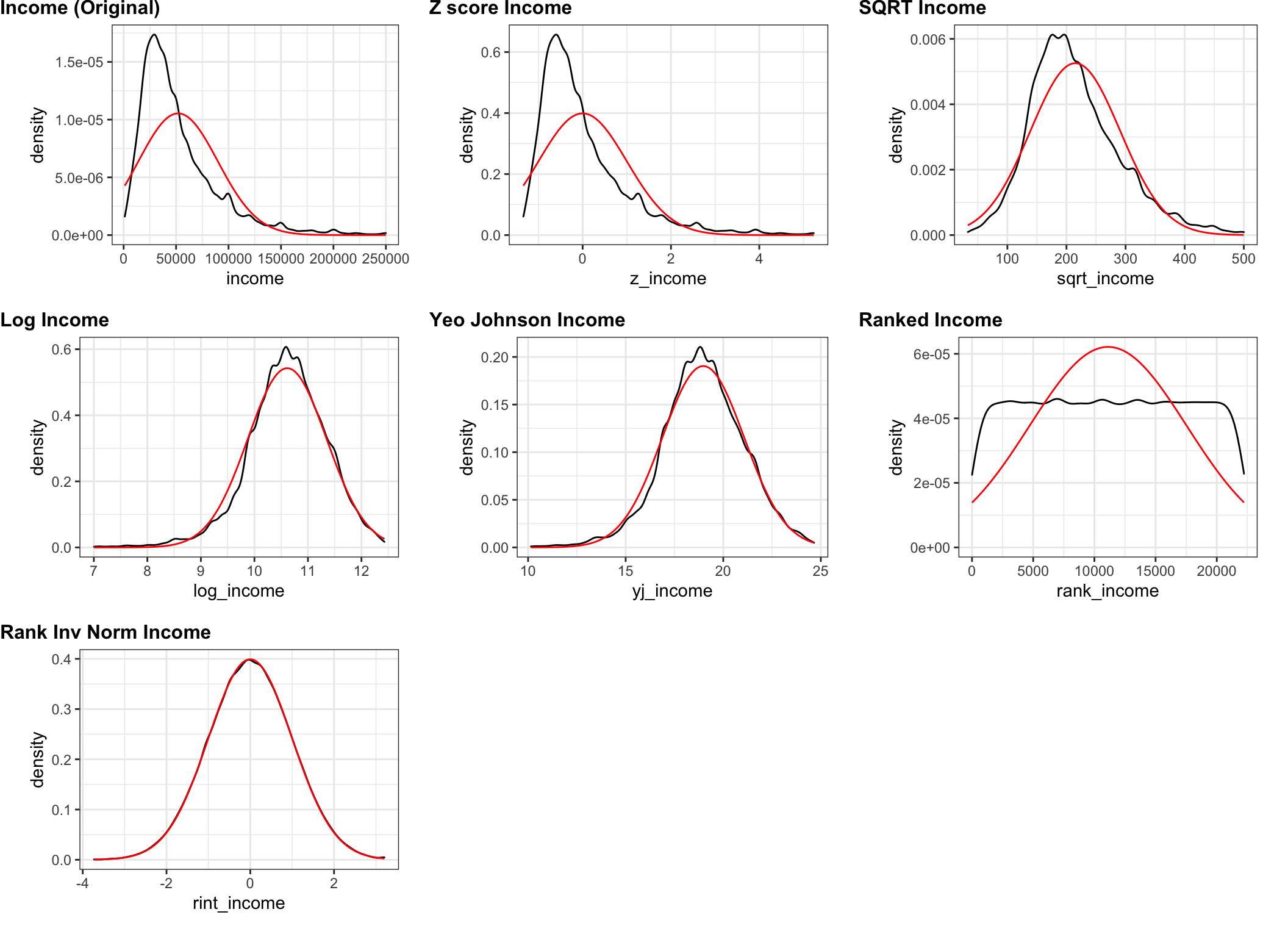
Not surprisingly the rank inverse normal transform works as advertised. We have
succeeded in taking the ranks and backing them into a near perfect normal curve.
That’s good but we did that work to prepare for comparing across employment
groups so we would be wise to take a look at our transformed income variable
rint_income by group. Once again we’ll make use of psych::describeBy. This
time we’ll also include the standard deviation since we’d like to have some
sense of whether the variances are at least roughly equal among the groups. While
we’re at it we’ll plot the density curves on a by group basis.
psych::describeBy(incomedata$rint_income,
                  group = incomedata$employment,
                  mat = TRUE,
                  digits = 2) %>%
  mutate(.data = .,
         Employment_Type = group1,
         trimmed_mean = trimmed) %>%
  select(Employment_Type,
         mean,
         sd,
         median,
         skew,
         n,
         trimmed_mean)
## Employment_Type mean sd median skew n trimmed_mean
## 1 Self Not Inc -0.40 1.10 -0.49 0.04 829 -0.41
## 2 Private for Profit -0.04 1.02 -0.05 0.09 16170 -0.05
## 3 State Government 0.14 0.80 0.18 -0.29 1028 0.17
## 4 Private Non Profit 0.10 0.89 0.12 -0.06 1573 0.10
## 5 Local Government 0.16 0.83 0.20 -0.51 1492 0.20
## 6 Federal Government 0.43 0.88 0.54 -0.71 580 0.49
## 7 Self Incorporated 0.31 1.13 0.27 0.02 569 0.31incomedata %>%
ggplot(aes(x = rint_income,
fill = employment,
color = employment)
) +
geom_density(alpha = .2)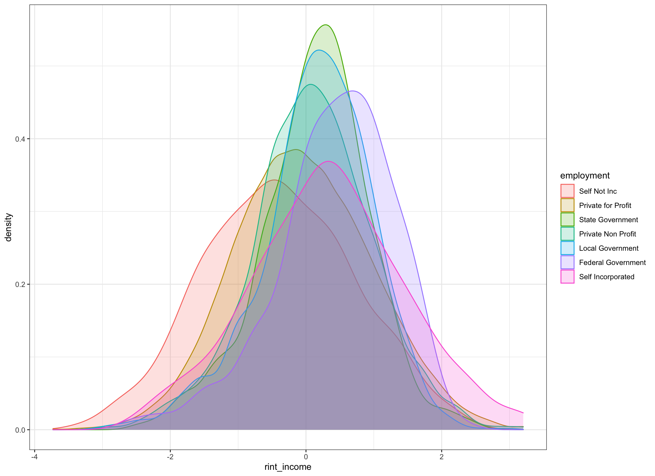
Well, we certainly seem to have improved the distributions and made them more suitable for parametric manipulation. Certainly looks like there are shifts in central tendency by group. For the astute observer yes I’ll acknowledge that the variances among groups aren’t “equal”. But an Fmax ratio of 2 isn’t that awful.
From last post let’s bring back our comparisons_list function which will
create a list of all the possible paired comparisons for us. We’ll store them in a
list called comp.list.
comparisons_list <- function(data,
                             x) {

  data <-
    dplyr::select(
      .data = data,
      x = !!rlang::enquo(x)
      ) %>%
    dplyr::mutate(.data = .,
                  x = droplevels(as.factor(x)))

  grouplevels <- levels(data$x)
  g1_list <- combn(grouplevels, 2)[1, ]
  g2_list <- combn(grouplevels, 2)[2, ]

  comparisons_list <- lapply(
    1:length(g1_list),
    function(i) c(
      combn(grouplevels, 2)[2, i],
      combn(grouplevels, 2)[1, i]
    )
  )

  return(comparisons_list)
}

comp.list <- comparisons_list(incomedata, employment)
Welcome back my friends to the show that never ends (ELP)
Last week we produced this plot using the original income data and using
ggsignif. We ran the wilcox.test against all the pairings to produce p
values on the plot. Here it is unretouched to refresh your memory. 
If Gelman and Zimmerman have steered me correctly (or lol if I paid enough
attention) we should be able to substitute in rint_income our ranked inverse
normalized transformed version of income and get very similar results using
the very same code and wilcox.test.
ggplot(data = incomedata,
       aes(
         x = employment,
         y = rint_income,
         fill = employment,
         group = employment
       )) +
  geom_boxplot(show.legend = FALSE) +
  geom_signif(
    comparisons = comp.list,
    step_increase = .1
  ) +
  scale_y_continuous(breaks = seq(from = -4,
                                  to = 4,
                                  by = 1)
                     ) +
  ggtitle(label = "ACS 2016 Rank Inverse Transformed Income by Employer Type",
subtitle = "Mann Whitney multiple comparisons non directional hypothesis using wilcox.test") 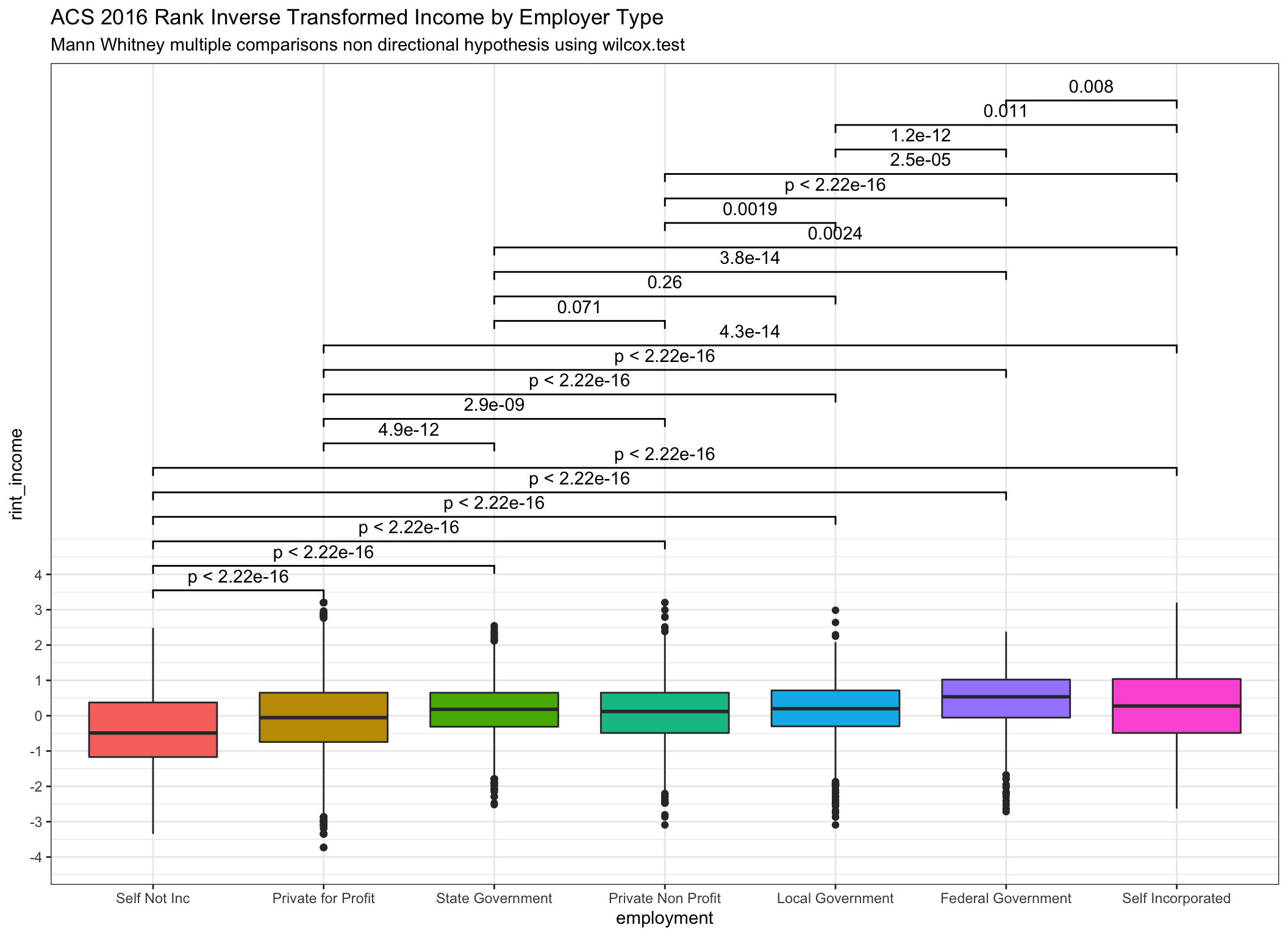
ggplot(data = incomedata,
       aes(
         x = employment,
         y = rank_income,
         fill = employment,
         group = employment
       )) +
  geom_boxplot(show.legend = FALSE) +
  geom_signif(
    comparisons = comp.list,
    step_increase = .1
  ) +
  scale_y_continuous(breaks = seq(from = 0,
                                  to = 25000,
                                  by = 5000)
                     ) +
  ggtitle(label = "ACS 2016 Ranked Income by Employer Type",
subtitle = "Mann Whitney multiple comparisons non directional hypothesis using wilcox.test") 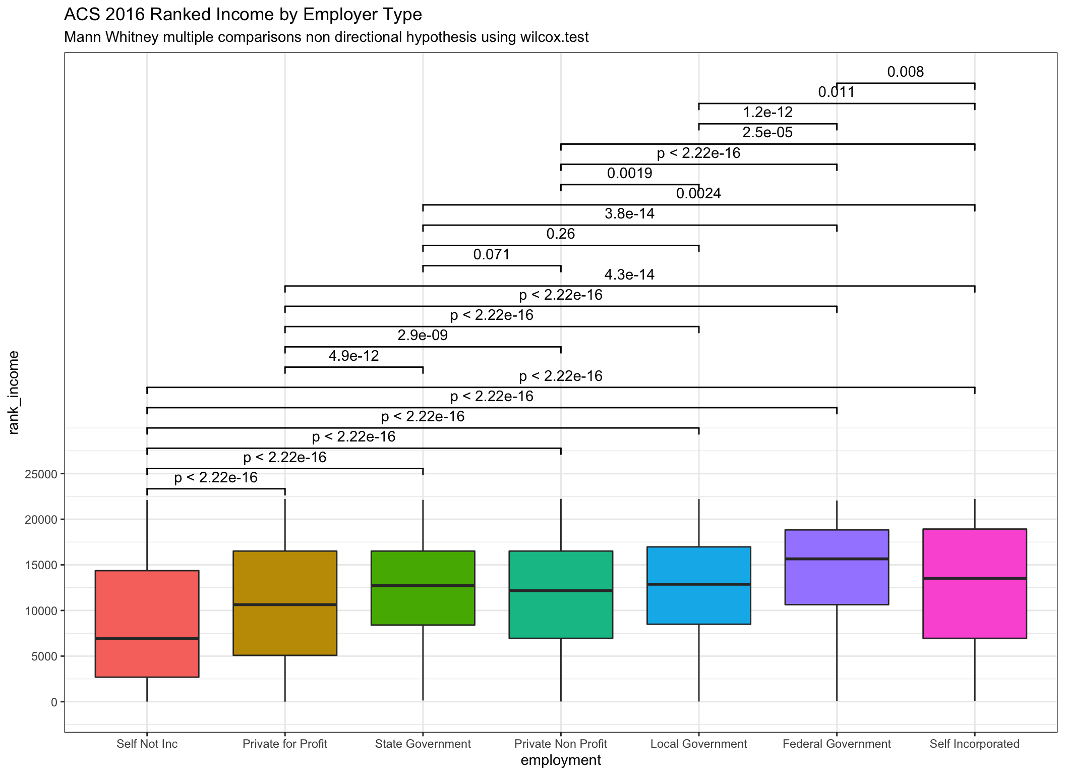
Reminder - Note that in the two-sample case the estimator for the difference in location parameters does not estimate the difference in medians (a common misconception) but rather the median of the difference between a sample from x and a sample from y.
Very similar indeed! Notice that the reported p values are essentially identical even as we can see from the box plots that the transformations are having an effect.
But of course this has all been prep work to this point. What I’m really after is to shift over to a bayesian framework and generate bayes factors that are the equivalent of the frequentist’s Mann Whitney. So let’s get on with that!
Not having been able to find the R code to do the work directly I’ve transformed
the income variable and will now apply the ttestBF function. Last
post
I wrote a little function called pairwise_bf that generates the bayes factors
and manipulates them in a way that makes them suitable for plotting with ggplot
and ggsignif. Here it is again.
pairwise_bf <- function(x = NULL,
                        y = NULL,
                        display_type = "bf",
                        k = 2) {
  results <- ttestBF(x = x, y = y) %>%
    extractBF() %>%
    mutate(support = case_when(
      bf < .01 ~ "extreme BF01",
      bf < .03 & bf >= .01 ~ "very strong BF01",
      bf < .1 & bf >= .03 ~ "strong BF01",
      bf < 1 / 3 & bf >= .1 ~ "moderate BF01",
      bf < 1 & bf >= 1 / 3 ~ "anecdotal BF01",
      bf >= 1 & bf < 3 ~ "anecdotal BF10",
      bf >= 3 & bf < 10 ~ "moderate BF10",
      bf >= 10 & bf < 30 ~ "strong BF10",
      bf >= 30 & bf < 100 ~ "very strong BF10",
      bf >= 100 ~ "extreme BF10"
    )) %>%
    mutate(logged = case_when(
      bf < 1 ~ paste("log(BF01) = ", round(log(1 / bf), k)),
      bf >= 1 ~ paste("log(BF10) = ", round(log(bf), k))
    )) %>%
    mutate(human = case_when(
      bf < .000001 ~ "BF01 >= 1,000,000 : 1",
      bf < .001 & bf >= .000001 ~ "BF01 >= 1,000 : 1",
      bf < .01 & bf >= .001 ~ "BF01 >= 100 : 1",
      bf < 1 & bf >= .01 ~ paste("BF01 = ", round(1 / bf, k), ": 1"),
      bf >= 1 & bf < 100 ~ paste("BF01 = ", round(bf, k), ": 1"),
      bf >= 100 & bf < 1000 ~ "BF10 >= 100 : 1",
      bf >= 1000 & bf < 1000000 ~ "BF10 >= 1,000 : 1",
      bf >= 1000000 ~ "BF10 >= 1,000,000 : 1"
    ))


  if (display_type == "support") {
    results <- mutate(results, p.value = support)
  } else if (display_type == "log") {
    results <- mutate(results, p.value = logged)
  } else if (display_type == "human") {
    results <- mutate(results, p.value = human)
  } else {
    results <- mutate(results, p.value = bf)
  }
  return(results)
}

# pairwise_bf(incomedata$employment, incomedata$rint_income)
comp.list2 <- comparisons_list(incomedata, empcategory)
theme_set(hrbrthemes::theme_ipsum())
Using the employment factor in the original dataset has been useful so far.
Having 7 levels has allowed us to make sure that the functions supported lots of
comparisons. The downside is the resulting plots have an overwhelming amount of
information. So let’s shift over to the variable empcategory which collapses
employment to just 3 levels. We’ll be comparing the self-employed, to those
employed in the private sector, to those employed in local, state or federal
jobs.
Seems reasonable to believe that the income levels across those broad categories, might be different. I don’t have any strong prior beliefs or information before this data. It’s not an area I study or have a lot of prior information amount. Clearly, it’s out there, the ACS survey has been running for years, but for now I’m perfectly happy to say my priors are flat.
What we’re going to do:
Show all the possible pairwise comparisons for
empcategoryas bayes factors inggplot(we’ve already built the list above incomp.list2)Change the theme just to make the plots nicer
theme_set(hrbrthemes::theme_ipsum())Apply the
ttestBFtest from theBayesFactorpackage to the data piped intoggplot. We’ll compareincome(the original untransformed data),rint_incomewhich is our rank inverse transformed variant, andrank_incomewhich is the income data with a simple rank transformation. N.B. - I’ve expressed the ranks so they are directionally equivalent to the raw data so the highest recorded income in our data is $250,000 which corresponds to rank of 22226.5 and after inverse transformation = 3.20299Display the BF10 and/or BF01 values that are between 1 and 100 as is (rounded to 2 digits) and then create ranges between 100 to 1,000, 1,000 to one million and greater than one million. At some point talking about odds over 100:1 (in my humble opinion) loses the need for precision. After all is there really much difference between odds of 1,000:1 versus 1,001:1?
Since this post is very much about
mean()versusmedian()both of them are plotted on top of the violin geom. The mean is displayed as a black box and the median is displayed as a dark red circle.
## Warning: `fun.y` is deprecated. Use `fun` instead.

## Warning: `fun.y` is deprecated. Use `fun` instead.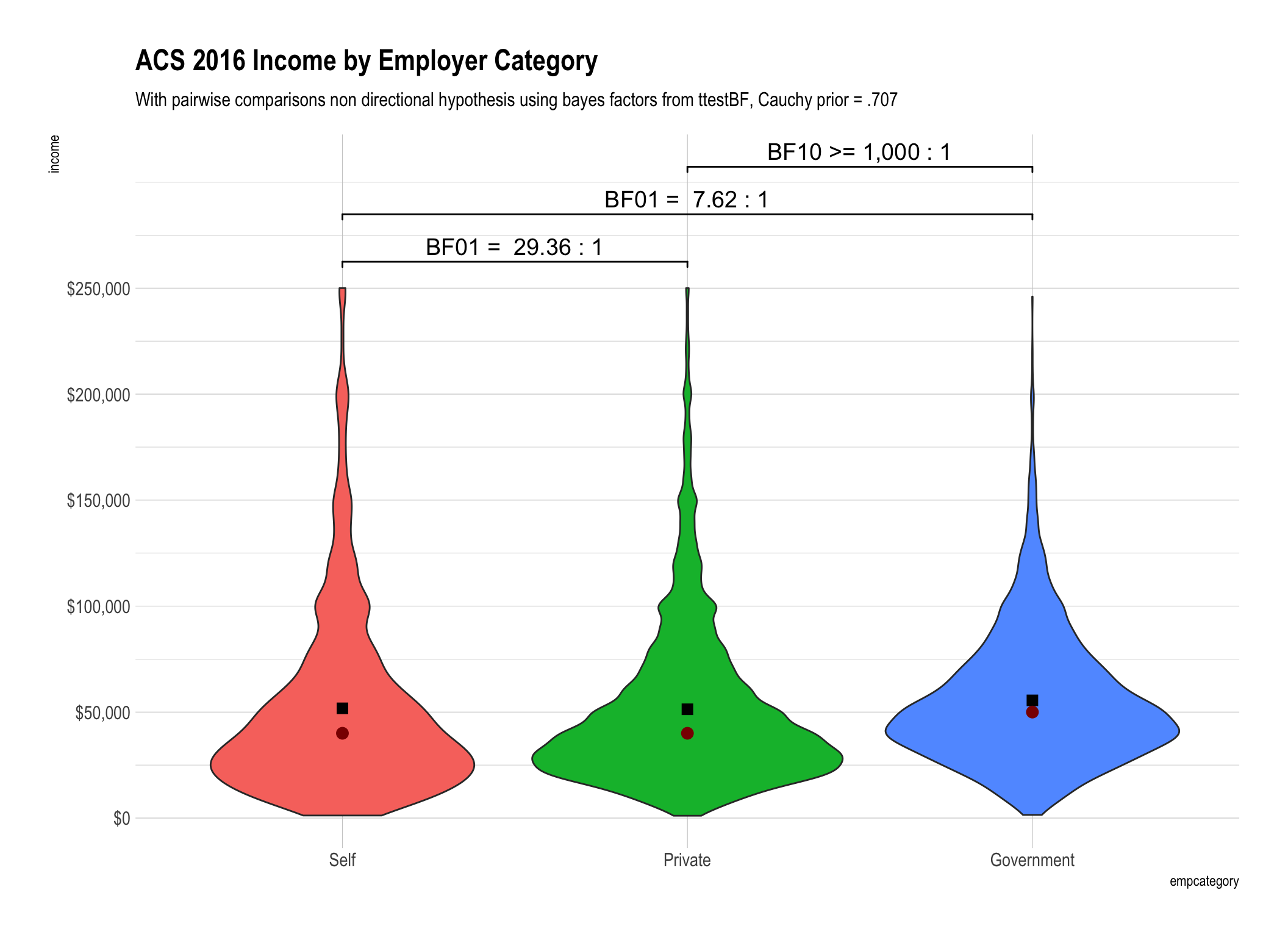
## Warning: `fun.y` is deprecated. Use `fun` instead.

## Warning: `fun.y` is deprecated. Use `fun` instead.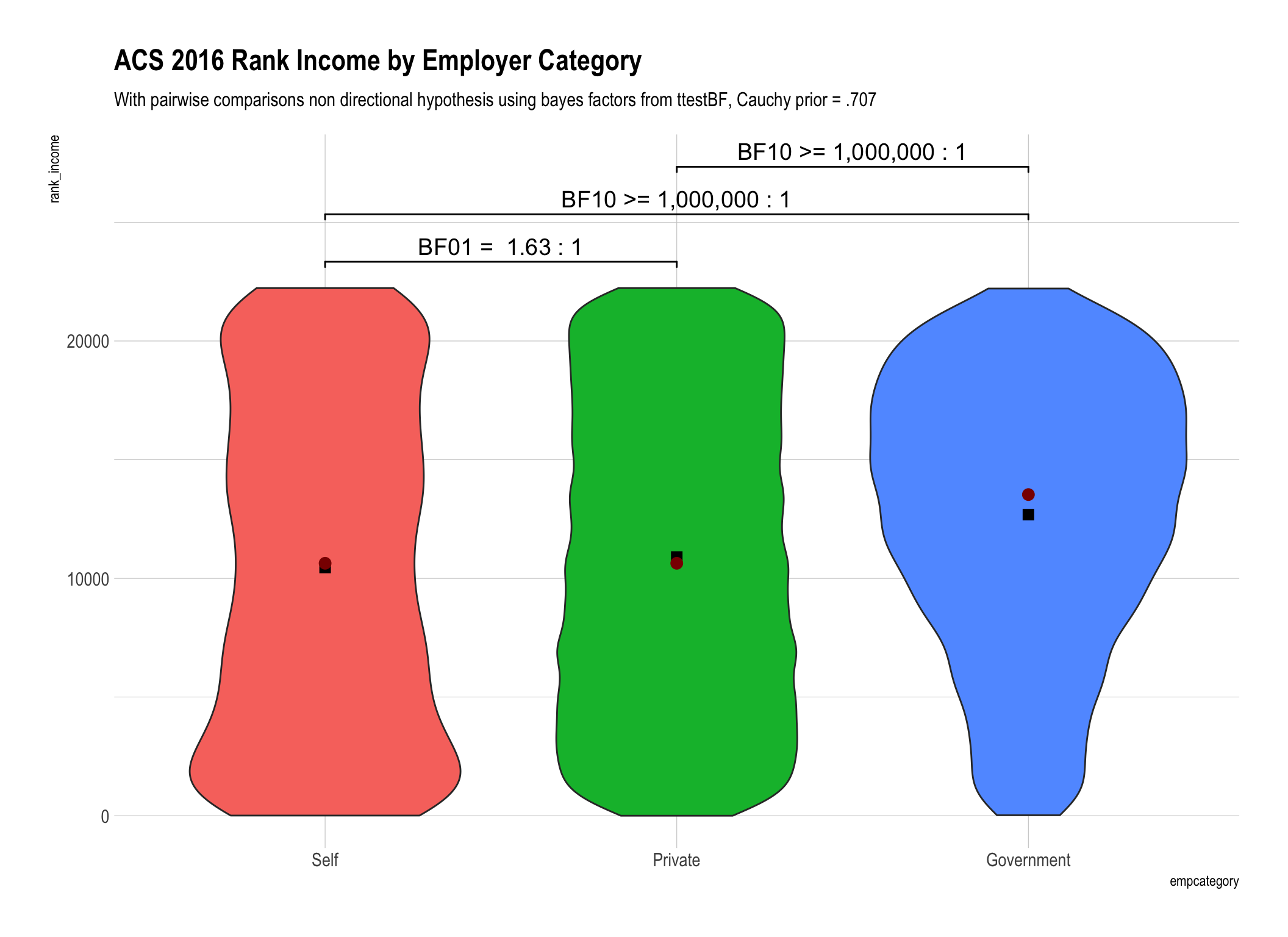
## Warning: `fun.y` is deprecated. Use `fun` instead.

## Warning: `fun.y` is deprecated. Use `fun` instead.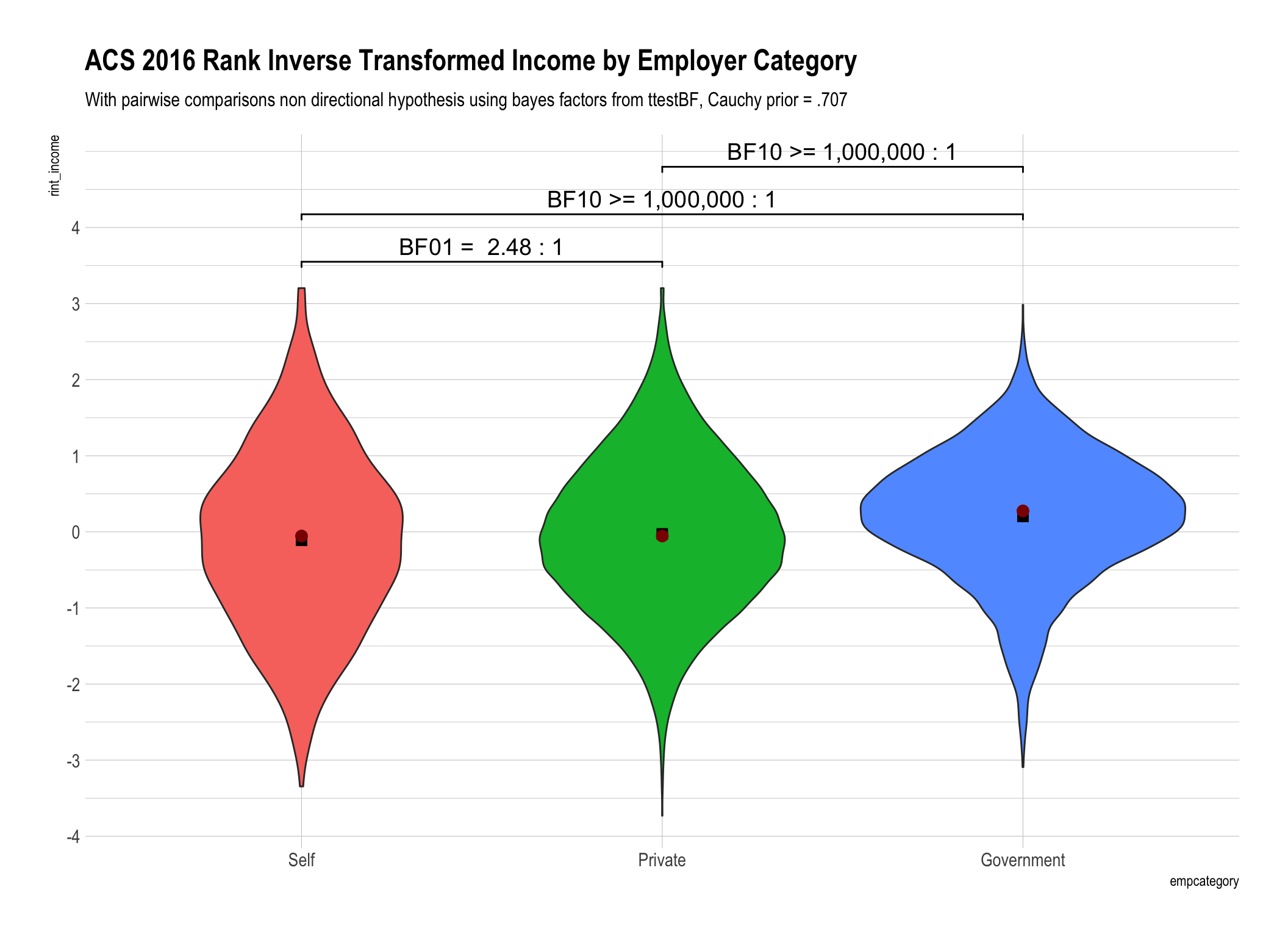
Caveat Emptor
Before I draw any conclusions about the results a reminder. While the data are “real” drawn from the U.S. Census Bureau they most assuredly are not totally representative of the entire U.S. population! The very fact that the max value for income is $250,000 tells us that this isn’t everyone and I’m not sure at all how “representative” it is. Please don’t stray from my desire to investigate the statistical properties of the methods to think I’m trying to convince you of some conclusion about the income levels of Americans.
Conclusions we can draw.
Distributions matter! There is a difference between investigating the mean() and the median() income and using bayesian methods doesn’t change that.
Bayes factors give us information in both directions! When you look at the first plot using the mean for untransformed income values BF01 = 29.36 tells you that the evidence is “strong” that the mean income for the self-employed is the same as those in the private sector.
Whether we use simple rank transformation or reverse inverse transformed ranks our overall conclusions are similar. We have weaker “anecdotal” evidence that there is no difference between the self-employed and those in the private sector. To say it differently we are less convinced from our data that there is no difference. On the other hand we have beyond very strong evidence that government employee income is different than either the self employed or those in the private sector.
The difference in the bayes factors generated by using ranks versus rank inverse transformation for our data were not substantively important in magnitude. Yes they were different, for example 1.63 versus 2.48, but don’t lead us to any practically different conclusions.
Not withstanding #4 above until there is a “true” equivalent to the Mann Whitney for bayesian analysis I personally am far more comfortable applying a “t-test” like analysis to the data distribution that results from RINT.
Let’s get credible
I know this post is already pretty long but I promised myself I’d capture what I learned about generating credible intervals as part of this workflow. I had been asked the question by a reader I did the work and posted it in a comment but now is my chance to capture it more formally.
In my usual fashion I’m not going to try and explain the concept of a credible interval in general when others have done so already and probably done a better job. So if you’re unfamiliar with the concept I recommend a trip to Wikipedia to read up. A simple Google search will also yield lots of informative answers.
What I will focus on for the remainder of this post is simply helping you with the mechanics of constructing credible intervals if you have been following this series of posts.
So far we have been making heavy use of BayesFactor::ttestBF to accomplish our
objectives. For example continuing with our last example our plot says the
difference between the mean income for the privately employed and government
workers is “BF10 >= 1,000:1”. We got that nice neat answer as a result of:
library(bayestestR)
tempdf <- incomedata %>%
  filter(empcategory == "Private" | empcategory == "Government") %>%
  droplevels %>%
  as.data.frame
ttestBF(formula = income ~ empcategory, data = tempdf)
## Bayes factor analysis
## --------------
## [1] Alt., r=0.707 : 357043.1 ±0%
##
## Against denominator:
## Null, mu1-mu2 = 0
## ---
## Bayes factor type: BFindepSample, JZSThere it is – 357,043:1 to be more precise. And note the part that says
“Null, mu1-mu2 = 0”. That looks familiar that’s a t test alright it is the
difference between the means = 0. So let’s take the output from that ttestBF
and but it in an object called bf.object. Sadly it’s a rather complex S4
object that doesn’t contain exactly what we need so a little more work is
required. What we need to do is run some Markov chain Monte Carlo
methods to sample from
the posterior distribution to get our answer. While that sounds wickedly complex
the function we need is built right into BayesFactor as posterior so one
line does the trick posterior.data <- posterior(bf.object, iterations = 10000). What’s in posterior.data? About 10,000 rows so let’s head it.
The first column mu is the overall mean, the second column beta (Private - Government) is exactly what we need to work on it’s the difference in means
“mu1-mu2” between Private and Government. The sign tells us that at least
for the first 7 rows Government is higher which agrees with our plot. I have no
desire to scroll through 10,000 rows so let’s get some summary information and
even a plot of our 10,000 samples.
bf.object <- ttestBF(formula = income ~ empcategory, data = tempdf)
posterior.data <- posterior(bf.object, iterations = 10000)
head(posterior.data)
## Markov Chain Monte Carlo (MCMC) output:
## Start = 1
## End = 7
## Thinning interval = 1
## mu beta (Private - Government) sig2 delta g
## [1,] 53561.49 -4038.896 1395801266 -0.10810628 0.1494593
## [2,] 53212.31 -4068.549 1404665553 -0.10855581 6.9421183
## [3,] 53596.74 -4163.078 1375094603 -0.11226601 0.1244661
## [4,] 53946.27 -4641.400 1394097484 -0.12430897 0.2774587
## [5,] 53787.24 -3764.657 1387330824 -0.10107304 0.3187737
## [6,] 53224.95 -3615.114 1412016885 -0.09620598 0.2283490
## [7,] 53109.83 -2832.885 1378115193 -0.07631084 0.8811414summary(posterior.data)##
## Iterations = 1:10000
## Thinning interval = 1
## Number of chains = 1
## Sample size per chain = 10000
##
## 1. Empirical mean and standard deviation for each variable,
## plus standard error of the mean:
##
## Mean SD Naive SE Time-series SE
## mu 5.342e+04 3.691e+02 3.691e+00 6.374e+00
## beta (Private - Government) -4.185e+03 7.346e+02 7.346e+00 1.289e+01
## sig2 1.395e+09 1.367e+07 1.367e+05 1.367e+05
## delta -1.120e-01 1.967e-02 1.967e-04 3.448e-04
## g 2.364e+00 2.590e+01 2.590e-01 3.012e-01
##
## 2. Quantiles for each variable:
##
## 2.5% 25% 50% 75%
## mu 5.269e+04 5.317e+04 5.343e+04 5.367e+04
## beta (Private - Government) -5.642e+03 -4.673e+03 -4.181e+03 -3.702e+03
## sig2 1.369e+09 1.386e+09 1.395e+09 1.405e+09
## delta -1.510e-01 -1.250e-01 -1.119e-01 -9.909e-02
## g 6.932e-02 1.902e-01 3.773e-01 9.108e-01
## 97.5%
## mu 5.414e+04
## beta (Private - Government) -2.740e+03
## sig2 1.422e+09
## delta -7.325e-02
## g 1.039e+01plot(posterior.data[,"beta (Private - Government)"])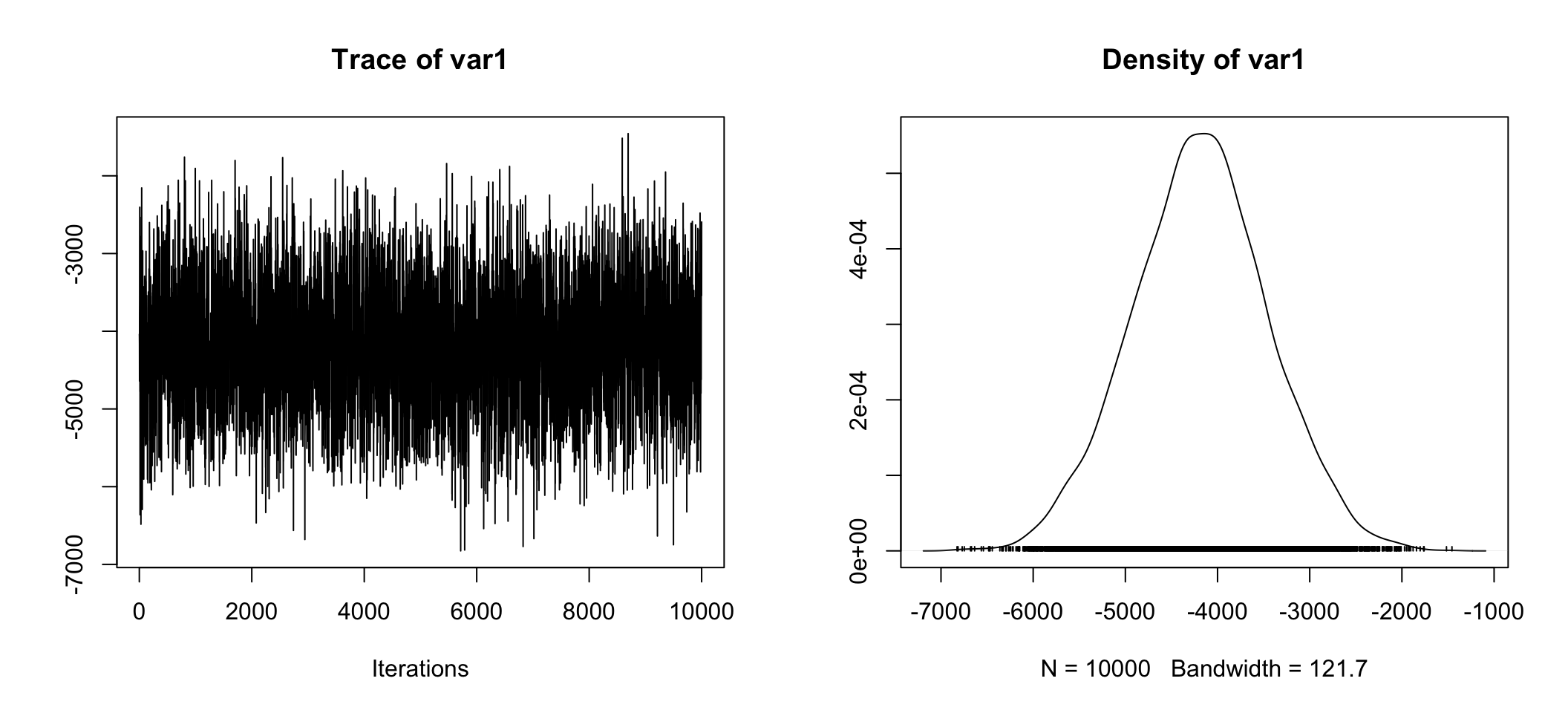
Whether we look at the right hand plot, or the tabular information Mean = -4.188e+03, 50% = -4.182e+03, sure looks like the difference estimate is about ~ -$4,180. Also telling is 2.5% = -5.615e+03 and 97.5% = -2.775e+03 which means 95% of our estimates were between -$5,615 and -$2,775! Anyone care to guess what the 95% credible interval is?
Well of course we don’t have to guess. We can take our posterior.data object and change it to a dataframe. After we’ve done that we can use bayestestR::ci (you may have noticed I loaded the library a few lines back). And there you have it the 89% credible interval is [-5352.79, -3042.40]. Wait. What? 89%????
posterior.data <- as.data.frame(posterior.data)
str(posterior.data)
## 'data.frame': 10000 obs. of 5 variables:
## $ mu : num 53561 53212 53597 53946 53787 ...
## $ beta (Private - Government): num -4039 -4069 -4163 -4641 -3765 ...
## $ sig2 : num 1.40e+09 1.40e+09 1.38e+09 1.39e+09 1.39e+09 ...
## $ delta : num -0.108 -0.109 -0.112 -0.124 -0.101 ...
## $ g : num 0.149 6.942 0.124 0.277 0.319 ...bayestestR::ci(posterior.data$`beta (Private - Government)`)## # Equal-Tailed Interval
##
## 89% ETI
## --------------------
## [-5370.74, -2998.33]For an explanation of why please see the bayestestR
documentation.
While you’re there good chance to review what a credible interval is, how it is
interpreted, and our next topic which is that there are at least two equally
valid ways of computing it. The first we used already it’s the Equal-tailed
Interval (ETI) which is the default when you invoke ci. The other is Highest
Density Interval (HDI) hdi(). They do a good job of
explaining
so I won’t repeat merely show you how.
ci() will accept a vector with multiple cut-offs so let’s do 89% and 95% once
with equal-tailed and then with highest density. To be fair at least for the
equal tailed you can use base R’s quantile function to get the same answers.
BTW back a little bit when we were looking at summary(posterior.data) the
answer for 95% was right there just hard to pick out.
ci(posterior.data$`beta (Private - Government)`,
   ci = c(.89, .95))
## # Equal-Tailed Intervals
##
## 89% ETI
## --------------------
## [-5370.74, -2998.33]
##
##
## 95% ETI
## --------------------
## [-5641.72, -2740.31]hdi(posterior.data$`beta (Private - Government)`,
ci = c(.89, .95))## # Highest Density Intervals
##
## 89% HDI
## --------------------
## [-5371.36, -3002.55]
##
##
## 95% HDI
## --------------------
## [-5629.60, -2729.79]round(quantile(posterior.data$`beta (Private - Government)`,
probs = c(.025,
.055,
(1 - .055),
(1 - .025)
)
),
2)## 2.5% 5.5% 94.5% 97.5%
## -5641.72 -5370.74 -2998.33 -2740.31So given our observed data, the mean difference in income between the private sector respondents and the government employed respondents has a 95% probability of falling between -$5,614.99 and -$2,774.84.
We can preform the exact same operations on rint_income if we want to convince
ourselves that the mean difference (which for rint_income is more akin to the
median difference) is not equal to zero). The problem of course is that it
doesn’t return a dollar value and our transformations are non-linear.
bf.object <- ttestBF(formula = rint_income ~ empcategory, data = tempdf)
posterior.data <- posterior(bf.object, iterations = 10000)
summary(posterior.data)
##
## Iterations = 1:10000
## Thinning interval = 1
## Number of chains = 1
## Sample size per chain = 10000
##
## 1. Empirical mean and standard deviation for each variable,
## plus standard error of the mean:
##
## Mean SD Naive SE Time-series SE
## mu 0.08814 0.009554 9.554e-05 1.612e-04
## beta (Private - Government) -0.22957 0.019015 1.901e-04 3.191e-04
## sig2 0.96654 0.009428 9.428e-05 9.428e-05
## delta -0.23352 0.019378 1.938e-04 3.248e-04
## g 2.06437 20.075695 2.008e-01 2.008e-01
##
## 2. Quantiles for each variable:
##
## 2.5% 25% 50% 75% 97.5%
## mu 0.06976 0.0815 0.08792 0.0947 0.1071
## beta (Private - Government) -0.26716 -0.2425 -0.22939 -0.2165 -0.1926
## sig2 0.94833 0.9601 0.96653 0.9728 0.9851
## delta -0.27228 -0.2467 -0.23335 -0.2203 -0.1960
## g 0.07624 0.2006 0.39943 0.9836 10.5321plot(posterior.data[,"beta (Private - Government)"])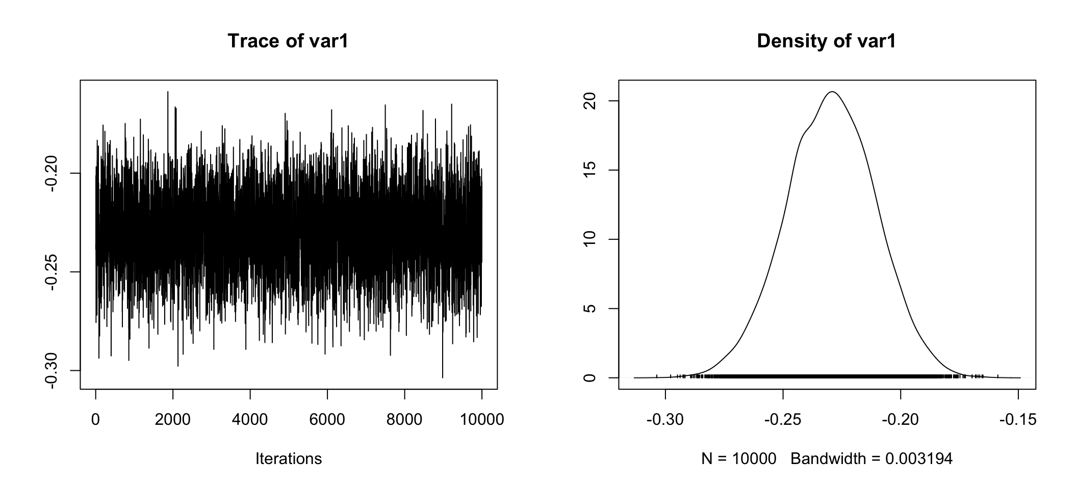
posterior.data <- as.data.frame(posterior.data)
bayestestR::ci(posterior.data$`beta (Private - Government)`)
## # Equal-Tailed Interval
##
## 89% ETI
## --------------
## [-0.26, -0.20]ci(posterior.data$`beta (Private - Government)`,
ci = c(.89, .95))## # Equal-Tailed Intervals
##
## 89% ETI
## --------------
## [-0.26, -0.20]
##
##
## 95% ETI
## --------------
## [-0.27, -0.19]hdi(posterior.data$`beta (Private - Government)`,
ci = c(.89, .95))## # Highest Density Intervals
##
## 89% HDI
## --------------
## [-0.26, -0.20]
##
##
## 95% HDI
## --------------
## [-0.27, -0.19]A final look at why it matters
So I wanted to end this post by reinforcing why mean() vs median() matters.
Continuing to focus on the differences between income in the private sector and
government employees remember we saw the BF associated with the difference
between the two groups increase an order of magnitude when we shifted from
assessing mean differences to median differences. Why?
Well take a look at the differences expressed in the original dollar units. The mean difference is about ~$4,200, the median difference is more than twice as much at ~$10,000, that’s a big difference.
psych::describeBy(incomedata$income,
                  group = incomedata$empcategory,
                  mat = TRUE,
                  digits = 2) %>%
  mutate(.data = .,
         Employment_Type = group1,
         trimmed_mean = trimmed) %>%
  select(Employment_Type,
         mean,
         sd,
         median,
         skew,
         n,
         trimmed_mean)
## Employment_Type mean sd median skew n trimmed_mean
## 1 Self 51771.00 44154.93 40000 1.82 1398 44342.71
## 2 Private 51326.42 38381.11 40000 1.82 17743 45221.13
## 3 Government 55521.62 30830.33 50000 1.28 3100 52263.65a <- median(incomedata[incomedata$empcategory == "Private", "income"])
b <- median(incomedata[incomedata$empcategory == "Government", "income"])
c <- mean(incomedata[incomedata$empcategory == "Private", "income"])
d <- mean(incomedata[incomedata$empcategory == "Government", "income"])
median_diff_priv_govt <- a - b
median_diff_priv_govt## [1] -10000mean_diff_priv_govt <- c - d
mean_diff_priv_govt## [1] -4195.196For a final plot we’ll show it in the original units and then to make it easier
to see give you a zoomed perspective with coord_cartesian(). The dashed lines
are the median values by group (which are color-coded) and the solid lines are
the mean.
tempdf %>%
  ggplot(aes(x = income,
             fill = empcategory,
             color = empcategory)
         ) +
  geom_density(alpha = .3) +
  geom_vline(xintercept = a, linetype = 5, color = "coral1") +
  geom_vline(xintercept = b, linetype = 5, color = "cyan3") +
  geom_vline(xintercept = c, color = "coral1") +
  geom_vline(xintercept = d, color = "cyan3") +
  scale_x_continuous(label = dollar)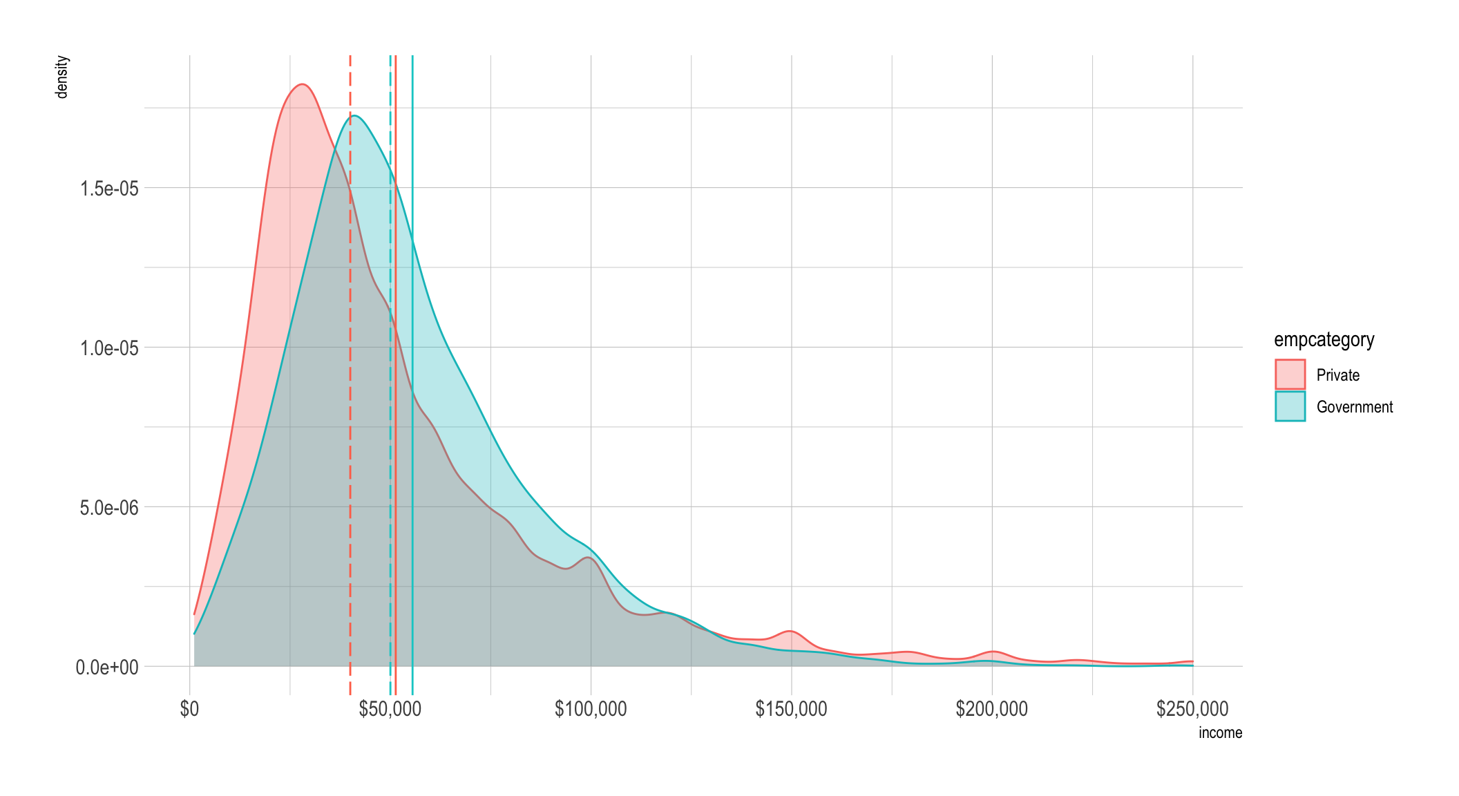
tempdf %>%
  ggplot(aes(x = income,
             fill = empcategory,
             color = empcategory)
         ) +
  geom_density(alpha = .3) +
  geom_vline(xintercept = a, linetype = 5, color = "coral1") +
  geom_vline(xintercept = b, linetype = 5, color = "cyan3") +
  geom_vline(xintercept = c, color = "coral1") +
  geom_vline(xintercept = d, color = "cyan3") +
  scale_x_continuous(label = dollar) +
  coord_cartesian(xlim = c(10000, 100000))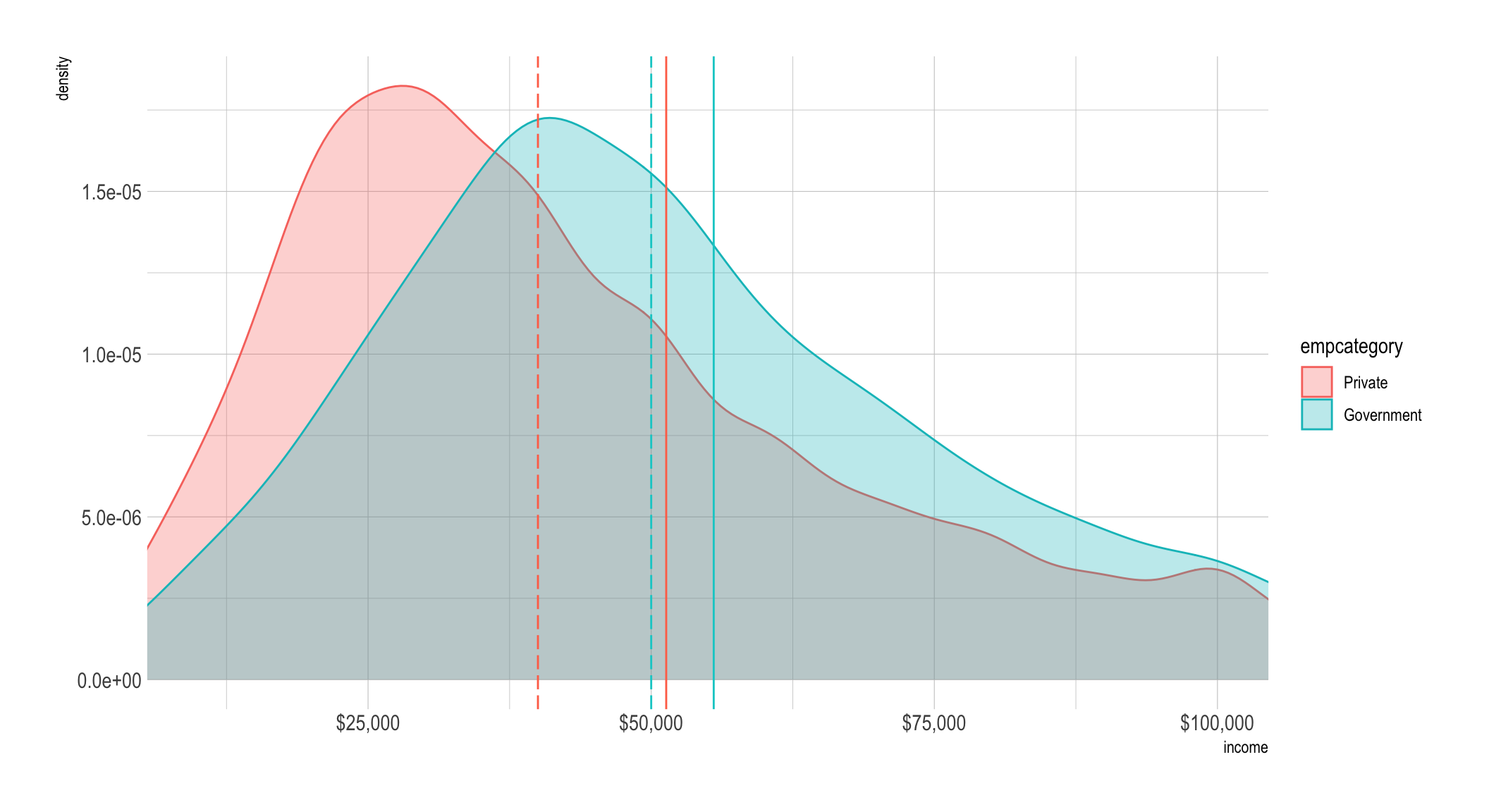
Done
Hope you enjoyed the post. Comments always welcomed.
Chuck
This work is licensed under a Creative Commons Attribution-ShareAlike 4.0 International License

