Analyzing churn with chaid
This post tries to accomplish several things concisely. I’m making available a
new function (chaid_table()) inside my own little
CGPfunctions package,
reviewing some graphing options and revisiting our old friend CHAID – Chi
Squared \(\chi^2\) Automated Interaction Detection – to look at modeling a “real
world” business problem.
It’s based on a blog post
from Learning Machines and investigates customer
churn for a wireless provider. The original blog post does a nice job of
describing a package called rattle and how it was used. I’m going to use
RStudio with a variety of packages that I’ll mention along the way.
The situation is drawn from the book Quantitative Methods for Management. A Practical Approach, (Authors: Canela, Miguel Angel; Alegre, Inés; Ibarra, Alberto) and the data are publicly available, you can access it from their Github repository as churn.csv and save it to a directory of your choice. We’re being asked to imagine we’re a wireless provider and we have a sample of 5,000 customers with 13 possible predictor variables, a unique ID number, and data about whether a customer did (Yes) leave us for a different provider, or stayed with us (No).
The predictors are a nice mix of things we might know about our customers, how long they have been with us, what sort of data and international calling plan they have, how often they call us for support, how often they call other customers of ours, etc., etc.. The original blog post has a nice little table listing all the variables that I won’t reproduce here.
Looks like in the book they took a classic linear regression approach, and the
blog post builds on a classic decision tree model. Both well known approaches
with plenty of supporters. As I’ve written before
I actually love CHAID as an early modeling and explanation tool. Not necessarily
because it is the most accurate, or the fastest, or the most modern but rather
because it is easy to explain to our business customer, easy to
understand the results, easy to use, and makes very few assumptions about the
nature of our data.
Our objective
Let’s imagine that this is our first attempt at using the data we have on hand to predict “churn” and to look for opportunities to reduce it. Note that it is also good in a business setting to avoid unnecessary costs and reduce waste. So yes obviously we’d like to stop people from dropping our service and look for potential ways to retain them. We’d also like to avoid spending money or resources to induce people to stay when there is very little likelihood of them leaving. In other words, we are nearly equally interested in predicting who will leave and who will stay.
I’d also press the case that since this is our first attempt at modelling and since we are likely to be explaining our results to people who don’t natively talk about “p values” or “decision trees” or “model accuracy” that we should focus on being able to clearly explain our results rather than focus on how deep we go or how utterly accurate our model is.
For this post then, we’re going to explore a relatively shallow CHAID model
and some tools for exploring the results in tabular and graphical format. Read
on! I’ll say it again below but comments and critique are always welcomed via
disqus or email. You’ll have no trouble finding the icon links in a couple of
places.
Let’s load dplyr and CHAID (which requires partykit) and grab the dataset
from github.
library(dplyr)
library(ggplot2)
library(paletteer)
theme_set(theme_bw())
library(forcats)
library(ggmosaic)
# library(ggrepel)
# install.packages("partykit")
# install.packages("CHAID", repos="http://R-Forge.R-project.org")
library(CHAID)
# devtools::install_github("ibecav/CGPfunctions", build_vignettes = TRUE)
library(CGPfunctions)
library(knitr)
# churn <- read.csv("https://raw.githubusercontent.com/quants-book/CSV_Files/master/churn.csv")
churn <- read.csv("churn.csv")
str(churn)
## 'data.frame': 5000 obs. of 15 variables:
## $ ID : chr "409-8978" "444-7077" "401-9132" "409-2971" ...
## $ ACLENGTH: int 77 105 121 115 133 95 50 157 35 96 ...
## $ INTPLAN : int 0 0 0 0 0 0 1 0 0 0 ...
## $ DATAPLAN: int 0 0 1 0 1 1 0 1 1 0 ...
## $ DATAGB : chr "0" "0" "1.5G" "0" ...
## $ OMMIN : num 80.8 131.8 212.1 186.1 166.5 ...
## $ OMCALL : int 70 66 57 64 61 85 96 73 56 99 ...
## $ OTMIN : num 166 132 195 231 176 ...
## $ OTCALL : int 67 105 140 125 74 98 73 71 77 99 ...
## $ NGMIN : num 18.6 5.1 14.9 26.5 36.1 11.1 34.5 15.3 21.6 12.4 ...
## $ NGCALL : int 6 6 14 16 11 2 10 8 7 2 ...
## $ IMIN : num 9.5 6.7 28.6 9.9 5.3 0 18.4 11.3 0 5.2 ...
## $ ICALL : int 4 2 8 4 2 0 7 3 0 2 ...
## $ CUSCALL : int 1 0 1 1 1 1 1 3 0 0 ...
## $ CHURN : int 0 0 0 0 0 1 1 0 1 0 ...Prepping the data
Okay we have the data we need. The original blog post does a good job of talking about the raw data and exploring distributions. I’m not going to repeat that work here. I’ll simply focus on what we need to do to prepare it for our CHAID analysis.
The variables INTPLAN, DATAPLAN, and CHURN are currently stored as
integers 0/1 let’s make them true factors and label them No/Yes respectively
just for clarity. We’ll do that with a mutate_at command.
DATAGB needs a little cleanup. It’s stored as a factor but the order is wrong
because it was initially a character string. Far more convenient to store it as
an ordered factor and specify the right order. You could reorder using base R
but I’m going to use forcats::fct_relevel as clearer cleaner code.
The remainder of the variables are either real numbers or integers. These we’re going to convert to factors by cutting them into five more or less equal bins per variable. We’ll also use consistent ordering and labeling (“Low”, “MedLow”, “Medium”, “MedHigh”, “High”). For a much longer discussion of this see my earlier article.
But first we have CUSCALL, which doesn’t want to be broken into 5 bins so we’ll
make it 4 bins and label them clearly (“0”, “1”, “2”, and “More than 2”) using
fct_lump from forcats.
NB: There is a real difference between how factors and ordered factors are handled by
CHAIDbecause there are differences between nominal and ordinal variables. Factors can be split in any fashion. Ordered factors will always have sequence honored so you can’t have a split of 1:5 as 1, 2, and 5 vs 3, and 4. Make sure you know which you wish to use and why.
Our code and the resulting dataframe look like this.
churn <-
  churn %>% mutate_at(c("INTPLAN", "DATAPLAN", "CHURN"),
                      factor,
                      labels = c("No", "Yes"))

churn$DATAGB <- as.ordered(forcats::fct_relevel(churn$DATAGB,
                                                "0",
                                                "100M",
                                                "250M",
                                                "500M",
                                                "1G",
                                                "1.5G",
                                                "2G"))

table(churn$DATAGB)
##
## 0 100M 250M 500M 1G 1.5G 2G
## 3449 74 168 291 410 522 86churn$CUSCALL <- as.ordered(fct_lump(as_factor(churn$CUSCALL),
other_level = "More than 2"))
table(churn$CUSCALL)##
## 0 1 2 More than 2
## 1095 1680 1277 948churn <-
churn %>%
mutate_if(is.numeric,
~ ggplot2::cut_number(.,
n=5,
labels = FALSE)
) %>%
mutate_if(is.integer,
~ factor(.,
labels = c("Low", "MedLow", "Medium", "MedHigh", "High"),
ordered = TRUE)
)
churn <- churn %>% select(-ID)
str(churn)## 'data.frame': 5000 obs. of 14 variables:
## $ ACLENGTH: Ord.factor w/ 5 levels "Low"<"MedLow"<..: 2 3 4 4 4 3 1 5 1 3 ...
## $ INTPLAN : Factor w/ 2 levels "No","Yes": 1 1 1 1 1 1 2 1 1 1 ...
## $ DATAPLAN: Factor w/ 2 levels "No","Yes": 1 1 2 1 2 2 1 2 2 1 ...
## $ DATAGB : Ord.factor w/ 7 levels "0"<"100M"<"250M"<..: 1 1 6 1 6 4 1 7 4 1 ...
## $ OMMIN : Ord.factor w/ 5 levels "Low"<"MedLow"<..: 1 1 4 3 3 4 2 1 3 3 ...
## $ OMCALL : Ord.factor w/ 5 levels "Low"<"MedLow"<..: 3 2 2 2 2 4 5 3 2 5 ...
## $ OTMIN : Ord.factor w/ 5 levels "Low"<"MedLow"<..: 2 1 3 4 2 3 2 1 2 3 ...
## $ OTCALL : Ord.factor w/ 5 levels "Low"<"MedLow"<..: 1 4 5 5 1 3 1 1 2 3 ...
## $ NGMIN : Ord.factor w/ 5 levels "Low"<"MedLow"<..: 3 1 3 4 5 2 5 3 4 2 ...
## $ NGCALL : Ord.factor w/ 5 levels "Low"<"MedLow"<..: 2 2 5 5 4 1 3 2 2 1 ...
## $ IMIN : Ord.factor w/ 5 levels "Low"<"MedLow"<..: 3 2 5 3 2 1 5 3 1 2 ...
## $ ICALL : Ord.factor w/ 5 levels "Low"<"MedLow"<..: 4 2 5 4 2 1 5 3 1 2 ...
## $ CUSCALL : Ord.factor w/ 4 levels "0"<"1"<"2"<"More than 2": 2 1 2 2 2 2 2 4 1 1 ...
## $ CHURN : Factor w/ 2 levels "No","Yes": 1 1 1 1 1 2 2 1 2 1 ...Build the model
Now that we have the data organized the way we want it we can let CHAID do
its’ thing and tell us what we want to know. What combination of our 13
predictor variables best explain or predict why our customers are leaving us (or
as I mentioned before which customers are most likely to stay). The way it does
that is devilishly simple and elegant. For all 13 predictors it runs a \(\chi^2\)
test of independence (a.k.a. association) between the predictor and our outcome
churn. Unlike some other tree models it can be a multi-way split. It will
compute a p value for all these possible splits (see note above about ordinal
versus nominal splits) and choose the split out of all possible splits with the
smallest Bonferroni adjusted p value. That is the simplest explanation please
see the ?chaid help page for complete details.
Just to break up the long passages of text and because I’m a visual learner let’s
make a mosaic plot using ggmosaic of
CUSCALL vs CHURN. We’ll even do a little magic to display the percentage of
churn within the categories of CUSCALL. chaid will test not only this 4 x 2
table but also see if combining any adjacent categories is a better split.
p <-
  ggplot(data = churn) +
  geom_mosaic(aes(x = product(CUSCALL), fill = CHURN))

xxx <- ggplot_build(p)$data[[1]]

XXX <- xxx %>%
  group_by_at(vars(ends_with("__CUSCALL"))) %>%
  mutate(NN = sum(.wt)) %>%
  mutate(pct = paste0(round(.wt/NN*100, 1), "%")) %>%
  select(-(xmin:weight))

p + geom_text(data = xxx,
              aes(x = (xmin + xmax)/2,
                  y = (ymin + ymax)/2,
                  label = XXX$pct)) +
  labs(y = NULL,
       x = "Number of Customer Calls",
       title = "Amount of Churn by # of Customer Calls") +
  scale_y_continuous(labels = scales::label_percent(accuracy = 1.0),
                     breaks = seq(from = 0,
                                  to = 1,
                                  by = 0.10),
                     minor_breaks = seq(from = 0.05,
                                        to = 0.95,
                                        by = 0.10))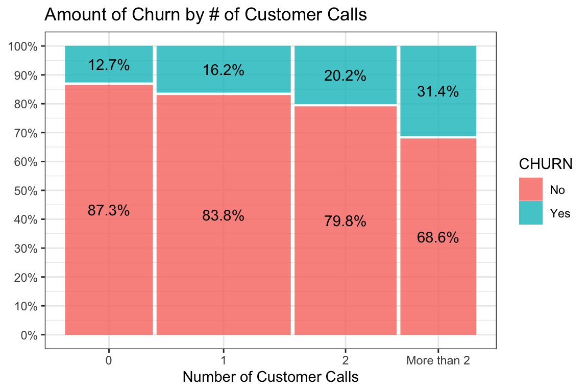
Clearly, visually, something is going on but we’ll let the algorithm decide what the best splits are. It will keep on going until it runs out of significant splits or some other criteria we set such as the size of the bins or the number of levels we want in the model.
Since we’re pretending this is our first time through the data, and since we
want clear, easy to understand, recommendations to give our business leaders to
act on, we’re going to tell chaid to limit itself to just three “levels” of
prediction. If you want a better understanding of what you can change to control
the chaid model I suggest you go back to
one of my earlier posts here.
Let’s build a “solution” and put it in an object called solution and then
print and plot it using the built-in methods from partykit.
solution <- CHAID::chaid(CHURN ~ .,
                         data = churn,
                         control = chaid_control(maxheight = 3))

print(solution)
##
## Model formula:
## CHURN ~ ACLENGTH + INTPLAN + DATAPLAN + DATAGB + OMMIN + OMCALL +
## OTMIN + OTCALL + NGMIN + NGCALL + IMIN + ICALL + CUSCALL
##
## Fitted party:
## [1] root
## | [2] INTPLAN in No
## | | [3] CUSCALL in 0
## | | | [4] OMMIN in Low: No (n = 206, err = 3.4%)
## | | | [5] OMMIN in MedLow, Medium, MedHigh: No (n = 593, err = 7.4%)
## | | | [6] OMMIN in High: No (n = 179, err = 15.6%)
## | | [7] CUSCALL in 1
## | | | [8] OMMIN in Low, MedLow: No (n = 577, err = 6.4%)
## | | | [9] OMMIN in Medium, MedHigh: No (n = 597, err = 10.9%)
## | | | [10] OMMIN in High: No (n = 330, err = 19.1%)
## | | [11] CUSCALL in 2
## | | | [12] OMMIN in Low, MedLow: No (n = 466, err = 8.4%)
## | | | [13] OMMIN in Medium, MedHigh, High: No (n = 679, err = 19.0%)
## | | [14] CUSCALL in More than 2
## | | | [15] OMMIN in Low, MedLow, Medium: No (n = 516, err = 20.0%)
## | | | [16] OMMIN in MedHigh, High: No (n = 334, err = 36.8%)
## | [17] INTPLAN in Yes
## | | [18] OMMIN in Low, MedLow
## | | | [19] OMCALL in Low, MedLow, Medium: No (n = 186, err = 46.2%)
## | | | [20] OMCALL in MedHigh, High: Yes (n = 32, err = 21.9%)
## | | [21] OMMIN in Medium, MedHigh, High
## | | | [22] IMIN in Low, MedLow, Medium: No (n = 33, err = 45.5%)
## | | | [23] IMIN in MedHigh, High: Yes (n = 272, err = 25.0%)
##
## Number of inner nodes: 9
## Number of terminal nodes: 14plot(solution,
main = "churn dataset, maxheight = 3",
gp = gpar(
lty = "solid",
lwd = 2,
fontsize = 8
))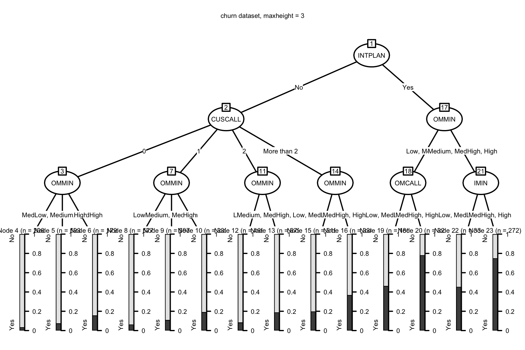
With an overall churn rate of about 20% we can see that even this simple chaid
model gives us a much clearer picture of where our risks and opportunities lie.
(A reminder that you can review how to interpret the print and plot output
here.) We can identify hundreds of
customers who pose little risk of changing carriers on the left side of the
plot and conversely several high risk hotspots towards the right with the
prediction for churn approaching 80%!
Makes sense at this point to check the accuracy of our model. if we were primarily interested in squeezing as much accuracy as possible we might follow the approach I demonstrate here but for a very simple first step I’m happy to sacrifice details and the risk of over-fitting for the simplicity of this design and the ease with which we can make suggestions for changing business practice.
caret::confusionMatrix(predict(solution), churn$CHURN)## Confusion Matrix and Statistics
##
## Reference
## Prediction No Yes
## No 3957 739
## Yes 75 229
##
## Accuracy : 0.8372
## 95% CI : (0.8267, 0.8473)
## No Information Rate : 0.8064
## P-Value [Acc > NIR] : 1.013e-08
##
## Kappa : 0.2948
##
## Mcnemar's Test P-Value : < 2.2e-16
##
## Sensitivity : 0.9814
## Specificity : 0.2366
## Pos Pred Value : 0.8426
## Neg Pred Value : 0.7533
## Prevalence : 0.8064
## Detection Rate : 0.7914
## Detection Prevalence : 0.9392
## Balanced Accuracy : 0.6090
##
## 'Positive' Class : No
## As with the original blog post we can clearly tell our management team that additional focus is needed on our clients who have international calling plans.
More with what we have
I have to give partykit credit, the print and plot methods pack a lot of
information into some efficient space. But they also leave me wanting for
information, especially with regards to the “inner nodes”. To be fair, part of
the problem is that chaid is a bit old and doesn’t take maximum advantage of
partykit but regardless I’m a big fan of getting back an object I can do more
analysis on.
That’s what I told myself when I started writing a function I called
chaid_table(). It takes our solution object and converts it to a tibble
that is chock full of information about our analysis/model.
A quick look at the first 5 rows should give you an idea of what’s in there.
Hopefully nodeID, parent, NodeN, No, and Yes are obvious. Note that
“no” and “yes” are actually pulled from the levels of the outcome variable so it
will match your data. “ruletext” is a plain English summary of the complete rule
to arrive at this node. “split.variable” is the variable that will be used to
split the current node and produce child nodes.
“chisq” is obvious, “df” is the degrees of freedom, “adjustedp” is the p value after the bonferroni correction while “rawpvalue” is the uncorrected value. The split rule columns are the R code that would produce the split.
review_me <- CGPfunctions::chaid_table(solution)

kable(review_me[1:5, ])| nodeID | parent | NodeN | No | Yes | ruletext | split.variable | chisq | df | adjustedp | rawpvalue | splitrule | split1 | split2 | split3 |
|---|---|---|---|---|---|---|---|---|---|---|---|---|---|---|
| 1 | NA | 5000 | 4032 | 968 | NA | INTPLAN | 715.70973 | 1 | 0.0000000 | 0.00e+00 | NA | NA | NA | NA |
| 2 | 1 | 4477 | 3839 | 638 | INTPLAN is ‘No’ | CUSCALL | 149.78455 | 3 | 0.0000000 | 0.00e+00 | INTPLAN %in% c(‘No’) | INTPLAN %in% c(‘No’) | NA | NA |
| 3 | 2 | 978 | 899 | 79 | INTPLAN is ‘No’ & CUSCALL is ‘0’ | OMMIN | 20.21648 | 2 | 0.0002445 | 4.07e-05 | INTPLAN %in% c(‘No’) & CUSCALL %in% c(‘0’) | INTPLAN %in% c(‘No’) | CUSCALL %in% c(‘0’) | NA |
| 4 | 3 | 206 | 199 | 7 | INTPLAN is ‘No’ & CUSCALL is ‘0’ & OMMIN is ‘Low’ | NA | NA | NA | NA | NA | INTPLAN %in% c(‘No’) & CUSCALL %in% c(‘0’) & OMMIN %in% c(‘Low’) | INTPLAN %in% c(‘No’) | CUSCALL %in% c(‘0’) | OMMIN %in% c(‘Low’) |
| 5 | 3 | 593 | 549 | 44 | INTPLAN is ‘No’ & CUSCALL is ‘0’ & OMMIN is ‘MedLow’, ‘Medium’, ‘MedHigh’ | NA | NA | NA | NA | NA | INTPLAN %in% c(‘No’) & CUSCALL %in% c(‘0’) & OMMIN %in% c(‘MedLow’, ‘Medium’, ‘MedHigh’) | INTPLAN %in% c(‘No’) | CUSCALL %in% c(‘0’) | OMMIN %in% c(‘MedLow’, ‘Medium’, ‘MedHigh’) |
The best part IMHO about this tibble format is that you can ask the data lots of
additional questions in a dplyr pipeline. here are two obvious ones:
What percentage of customers are leaving if they have an international plan versus don’t? (14% versus 63%)
Can you provide an ordered list of where our churns are most likely to occur? (of course – allows us to make good business decisions. For example while node # 20 has the most churn at 78% there’s only 30 some people in that node while #23 has slightly less churn and a lot more people to influence.)
# Question #1
review_me %>%
  select(nodeID:ruletext) %>%
  mutate(pctLeaving = Yes/NodeN * 100) %>%
  filter(parent == 1) %>%
kable(digits = 1, caption = "Question #1 answer")| nodeID | parent | NodeN | No | Yes | ruletext | pctLeaving |
|---|---|---|---|---|---|---|
| 2 | 1 | 4477 | 3839 | 638 | INTPLAN is ‘No’ | 14.3 |
| 17 | 1 | 523 | 193 | 330 | INTPLAN is ‘Yes’ | 63.1 |
# Question #2
review_me %>%
  select(nodeID:split.variable) %>%
  mutate(pctLeaving = Yes/NodeN * 100) %>%
  filter(is.na(split.variable)) %>%
  select(-parent, -split.variable) %>%
  arrange(desc(pctLeaving)) %>%
kable(digits = 1, caption = "Question #2 answer")| nodeID | NodeN | No | Yes | ruletext | pctLeaving |
|---|---|---|---|---|---|
| 20 | 32 | 7 | 25 | INTPLAN is ‘Yes’ & OMMIN is ‘Low’, ‘MedLow’ & OMCALL is ‘MedHigh’, ‘High’ | 78.1 |
| 23 | 272 | 68 | 204 | INTPLAN is ‘Yes’ & OMMIN is ‘Medium’, ‘MedHigh’, ‘High’ & IMIN is ‘MedHigh’, ‘High’ | 75.0 |
| 19 | 186 | 100 | 86 | INTPLAN is ‘Yes’ & OMMIN is ‘Low’, ‘MedLow’ & OMCALL is ‘Low’, ‘MedLow’, ‘Medium’ | 46.2 |
| 22 | 33 | 18 | 15 | INTPLAN is ‘Yes’ & OMMIN is ‘Medium’, ‘MedHigh’, ‘High’ & IMIN is ‘Low’, ‘MedLow’, ‘Medium’ | 45.5 |
| 16 | 334 | 211 | 123 | INTPLAN is ‘No’ & CUSCALL is ‘More than 2’ & OMMIN is ‘MedHigh’, ‘High’ | 36.8 |
| 15 | 516 | 413 | 103 | INTPLAN is ‘No’ & CUSCALL is ‘More than 2’ & OMMIN is ‘Low’, ‘MedLow’, ‘Medium’ | 20.0 |
| 10 | 330 | 267 | 63 | INTPLAN is ‘No’ & CUSCALL is ‘1’ & OMMIN is ‘High’ | 19.1 |
| 13 | 679 | 550 | 129 | INTPLAN is ‘No’ & CUSCALL is ‘2’ & OMMIN is ‘Medium’, ‘MedHigh’, ‘High’ | 19.0 |
| 6 | 179 | 151 | 28 | INTPLAN is ‘No’ & CUSCALL is ‘0’ & OMMIN is ‘High’ | 15.6 |
| 9 | 597 | 532 | 65 | INTPLAN is ‘No’ & CUSCALL is ‘1’ & OMMIN is ‘Medium’, ‘MedHigh’ | 10.9 |
| 12 | 466 | 427 | 39 | INTPLAN is ‘No’ & CUSCALL is ‘2’ & OMMIN is ‘Low’, ‘MedLow’ | 8.4 |
| 5 | 593 | 549 | 44 | INTPLAN is ‘No’ & CUSCALL is ‘0’ & OMMIN is ‘MedLow’, ‘Medium’, ‘MedHigh’ | 7.4 |
| 8 | 577 | 540 | 37 | INTPLAN is ‘No’ & CUSCALL is ‘1’ & OMMIN is ‘Low’, ‘MedLow’ | 6.4 |
| 4 | 206 | 199 | 7 | INTPLAN is ‘No’ & CUSCALL is ‘0’ & OMMIN is ‘Low’ | 3.4 |
Those are just a sample of what you can do with the data in a tibble. Feel free to experiment.
A plot is worth a thousand words
I’m a huge fan of displaying data graphically any time it can be done. I find it
helps to drive home your messaging from data science projects. The other new
function I added to my package
recently is PlotXTabs2() which is built to display bivariate crosstabs. I
borrowed heavily from ggstatsplot to allow you to optionally include
statistical information.
Let’s use it to display information about the relationship between churn and our clients international plan. First some simple plots just displaying different x and y axis orientation and with and without pipelining. There are too many options to talk about here so please refer to the online pages.. My next project is to bring mosaic plots to the function.
CGPfunctions::PlotXTabs2(churn,
                         CHURN,
                         INTPLAN,
                         bf.display = "sensible")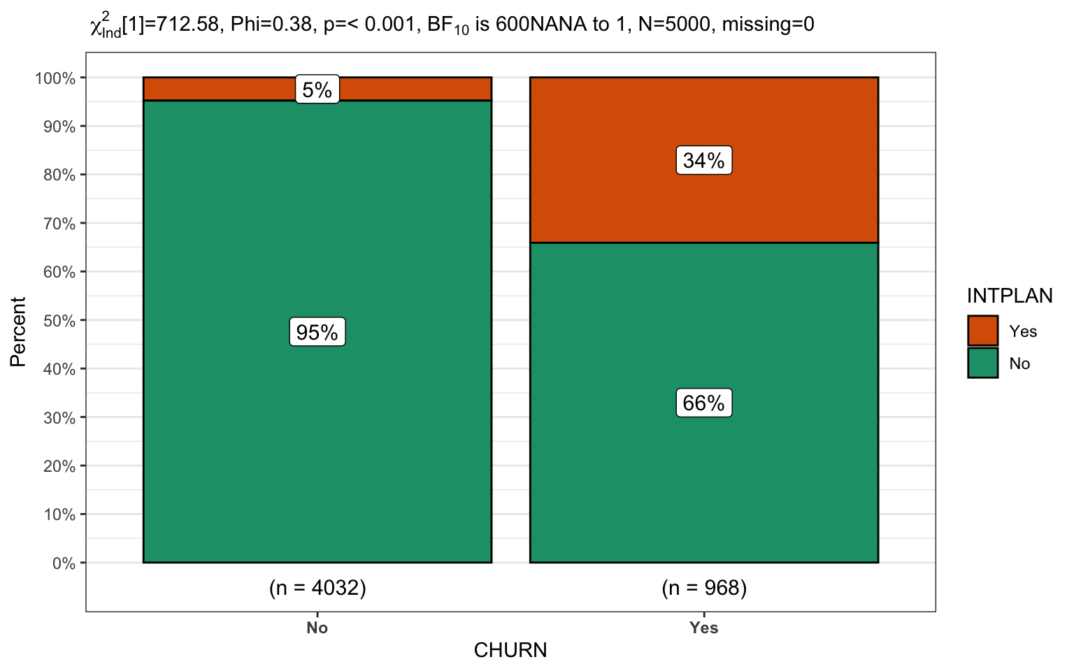
churn %>% CGPfunctions::PlotXTabs2(INTPLAN,
                                   CHURN,
                                   bf.display = "sensible")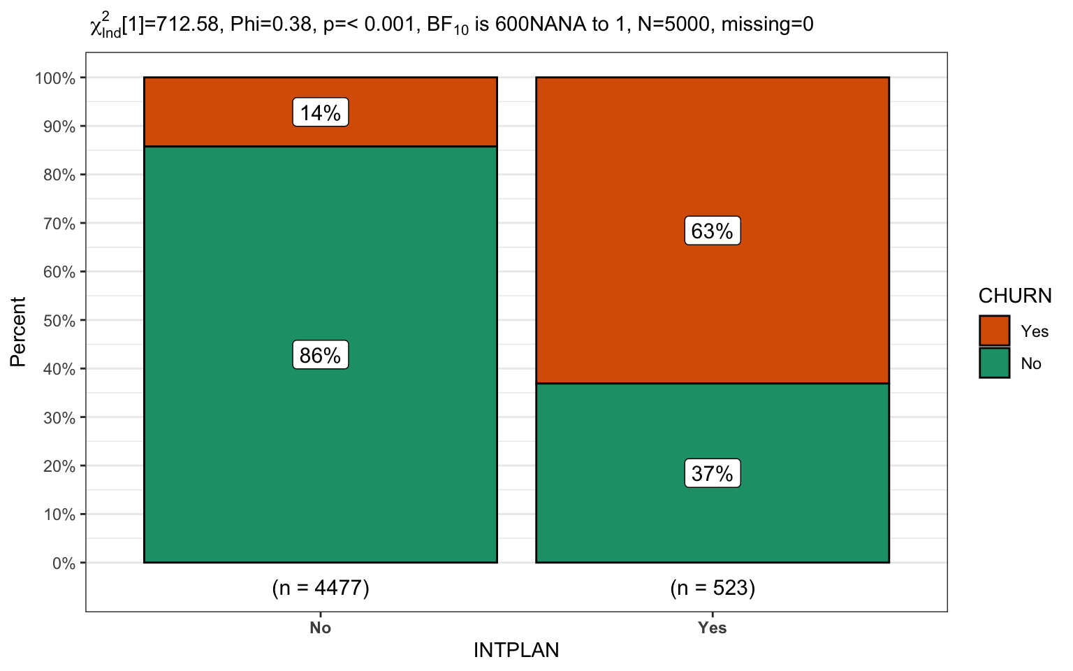
The ability to pipe from the data to the graph is immensely useful for displaying practical data. The two final plots will focus on the second level of the model, where our customers have no international calling plan. Once again we’ll display the same data in reversed x/y order and in the second plot since there are more levels we’ll select a palette that is more friendly to users with potential sight challenges.
churn %>%
  filter(INTPLAN == "No") %>%
  CGPfunctions::PlotXTabs2(CUSCALL,
                           CHURN,
                           bf.display = "sensible")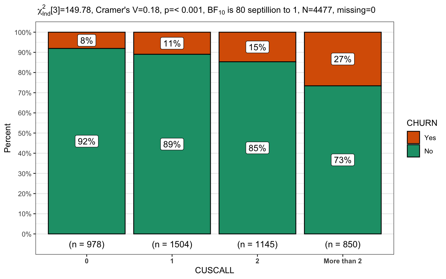
churn %>%
  filter(INTPLAN == "No") %>%
  CGPfunctions::PlotXTabs2(CHURN,
                           CUSCALL,
                           bf.display = "sensible")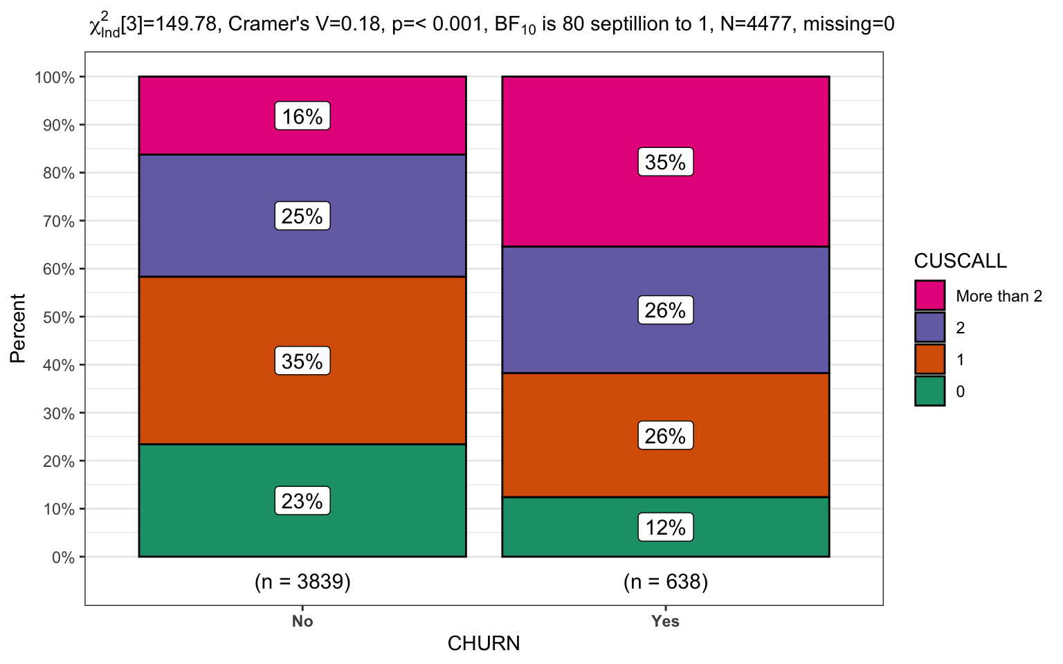
A final look at why it matters
So I wanted to end this post by reinforcing why chaid can be a useful tool
even if it isn’t the newest algorithm or the coolest. Note that the accuracy
wasn’t quite as good as some other methods but it is a fantastic tool for
initial modelling. Note that it is also very robust and gives you answers that
are easily explained to business leaders.
Done
Hope you enjoyed the post. Comments always welcomed. Especially please let me know if you actually use the tools and find them useful.
Chuck
This work is licensed under a Creative Commons Attribution-ShareAlike 4.0 International License

